Craftsy Class Review--Beyond Basic Machine Quilting with Ann Petersen

Craftsy Logo

...And so, I've decided I'm done. I didn't finish off the details of the class project, but I've done about 80% of it at this stage and have tried out every stitch design she demonstrates. Since I've got a multitude of other machine quilting classes in my queue, I decided it was time to move on.

I really liked this class quite a bit. This is the second machine quilting class I've completed on Craftsy. (Click here for my review of the Wendy Butler Berns Machine Quilting class.) WBB's class is a little more free-wheeling, "whimsical," which is a great way to get yourself started. Beyond Basic does get a little more complex, but I'd rate it, as they say, Confident Beginner. Or Rank Beginner if you're just a little adventuresome. I think she assumes you've already done some machine quilting and doesn't spend a whole lot of time talking about setting yourself up for quilting, although she does some--and talks about threads. Although she also does get into more complex designs than I recall in WBB's class, Petersen works you up to them by starting at an easier level and getting progressively more complex.

Through the course of the first several lessons, Petersen demonstrates a few ways of creating quilt designs, including no-mark methods. She starts by teaching you how to create a stencil by sewing (without thread) through the quilt design on paper. I've done this technique a few times before so I did well at this step. The difficulty I had was keeping my stitch length long enough that I wasn't just slicing the paper on the lines. Just have to keep my hands moving faster!


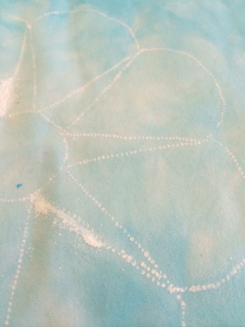
After you perforate the paper with the needle, you then rub some pounce powder or chalk dust through the holes of the paper to mark your quilt. She  gives a different technique for how to apply the pounce powder so I was able to try that out. Because I'd over-perforated some areas, I got a few globs of powder that obscured the line a bit. Plus, I was using white powder on a very light blue background, so I did have problems seeing where I was going. I do have blue powder but was a little concerned about how easily it would come off. Not sure why I was concerned with that small detail when I knew for darn-tootin' this wasn't going to be a show quilt anyway. Apparently sometimes I do sweat the small stuff. Go figure.


And so, my first flower looks a bit like a 3rd grader drew it. Actually, lots of 3rd graders would've done better. That being said, I think I started with the hardest one.


They got better as I went along...

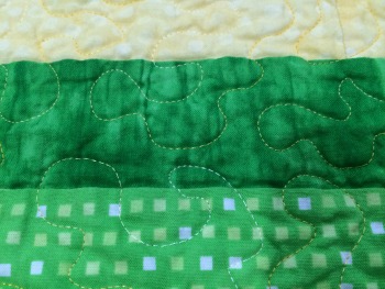
One of the main things I learned in this class is that the first lines you quilt are not always the most important. Although none of these flowers are even close to being what I'd want to have showing up on a quilt for public use, those first wavery lines tended to fade into the background as I added more layers to the quilting later.


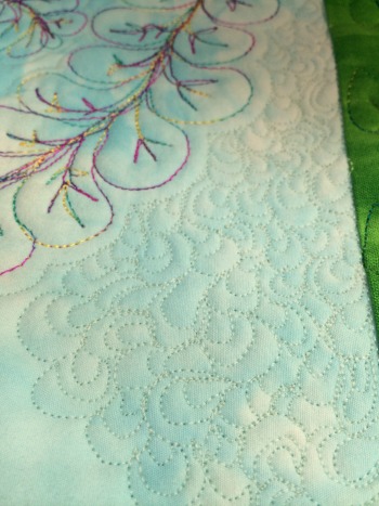
And then we move onto feathers and feather variations. The variations include whether you're marking them first and, if so, how you're marking them (she demonstrates a couple of different methods), as well as different shapes and sizes of plumes, and also adding some funky extra touches here and there. She also has you go through straight feathers and curved feathers, and later you go back and embellish the feathers with different kinds of veins. I did okay on the feathers after the first few plumes; at least, I got more confident about just diving in. Still need lots of practice. This picture is one of my better ones.

I'm right-handed, but I was far better at the plumes on the left side. Does that make sense or is it bass-ackwards?


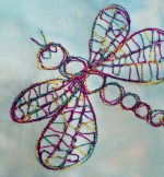
And then there's the dragonfly. He's cute. Apparently mine got into a bar-room brawl at some point and broke his tail and it never healed correctly. That's my story and I'm sticking to it.

(That's a different feather in the background. I had been dissatisfied with my first take on the plumes on this one so, knowing that sometimes the best thing to do when something is off is to just keep doing it over and over until it looks intentional, I went back over all the plumes a couple more times. It actually worked! Definitely improved.)

She also has you embellish all the flowers and leaves with various designs as well. I'd never given a whole lot of thought about the order in which you quilt your designs--I always just work center out. She has a different approach that makes a whole lot of sense. But you'll need to take her class to find out. I'm not giving away the farm, here.


And then there were the cornerstones and borders. I'd bagged adding cornerstones when I was putting together my project so I just drew them in and pretended they were there for quilting purposes--which worked just fine. Let's just say that I stink at pumpkin seeds. Yep, definitely lots more practice needed there. I also discovered the downside to using variegated thread on pumpkin seeds: You completely lose the design. Which was fine in my case since I'd lost the design several times along the way anyway. (Working backwards that small? Yikes!) My borders were a hot mess but her design options here aren't really my style, so nothing I'd likely use anytime soon. So I did it as-is in one border using one of her design options, then just used the rest of the borders to practice more feather plumes, echo stitching, and the like.


I did decently well on the echo quilting and practiced some of the background filler as well, but used a thread that blends. So it looks good, but who knows? You can't actually really see it that well--bonus!

To completely finish this, I'd have had to spend a lot more time on the borders and filler background--and I've just got too many other projects I need to get cranking on! Therefore, I decided I'd learned what I needed to learn and it was time to move on.


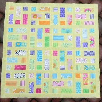
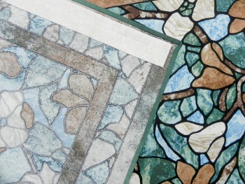
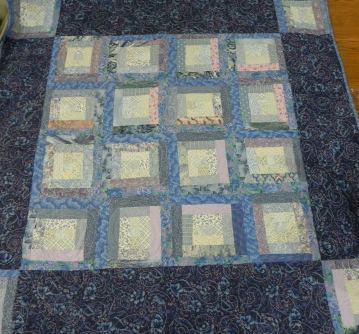
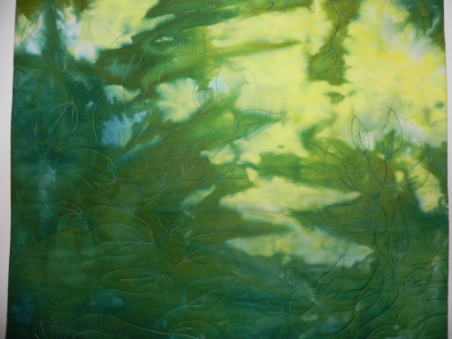
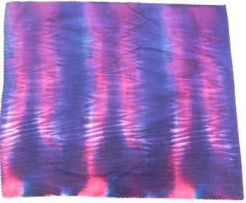
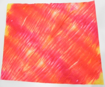
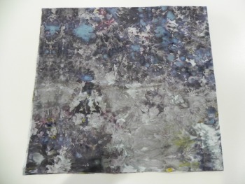
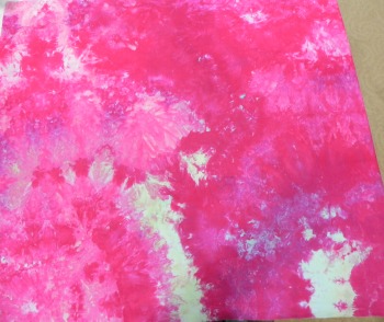
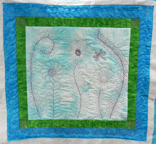
Therefore, now you've seen all the bits and pieces, here's the as-finished-as-it'll-ever-be class project.

In summary: Even though I didn't finish the project, I did get a whole lot more comfortable with machine quilting during this class. I got some good ideas for how to fill things in, and picked up a few new tricks along the way.

Ann Petersen is a very good teacher. She's calm, doesn't have any annoying mannerisms or habits; she's not a laugh-a-minute but feels like someone you could sit and have coffee with. I enjoyed her presence. I would definitely recommend this class if you're just starting out or looking for a few more designs to practice.

The basics:

  • 13 lessons, ranging from about 13 minutes to close to an hour in length. (You really get your money's worth in this one--lots of content!)
  • Lessons include supplies, basting and marking, starting to stitch, three lessons on feathers of various types, embellishing your designs (with stitching, not with beading or anything), the dragonfly, border treatments, quilted "lace" design, echoing and background stitches, and the final lesson is on blocking your quilt and dealing with ruffly edges.
  • You don't need to do the class project, of course, but it is kind of a fun one; although, as I said earlier, to finish it will take time. I have another project I'm working on for which some of these designs and techniques directly translate so I'm definitely getting the bang for my buck!

Again, that's Ann Petersen's Beyond Basic Machine Quilting, definitely recommended! And now, on to my next class!

(Usual transparency statement: Clicking on Craftsy links in this blog post help to support this blog and podcast. Thanks!)


Finally, Flimsy Finished! Phew!

"Good Morning" is finally totally complete! Despite advanced levels of exhaustion yesterday, I managed to get it quilted and bound.


The quilting is a simple meander using a yellow variegated thread (from dark yellow to light yellow--extremely subtle). It may have actually helped that I was as tired as I was: I've found that I do the same thing machine quilting as I do driving when overtired--I develop a light-foot. My foot keeps drifting up and off the speed pedal and I find myself going slower and slower....

So, whether it be due to all the FMQ practice I've been getting in lately with Craftsy classes and other projects, or due to exhaustion-induced-light-foot on my foot pedal, or due to the fact that maybe I'm actually getting the hang of this, I had zero problems with the machine quilting. No puckers, no skipped stitches, no eyelashes...Bam! I also used my water soluble basting thread again and really loved having that--and it seems to have washed out beautifully.

I used bamboo batting so it's wonderfully soft and cuddly. I did the binding by hand this time as I felt the need for something more personal. 

I had to piece the back as adding the borders on meant I no longer had enough of the purple to go on its own. Fortunately, I had plenty of the green border fabric to widen things up a bit. You can see the label in the corner--I hadn't filled it in yet when I took this picture.

Again, just to be sure to give credit where credit is due, this quilt is the Building Blocks pattern by Jackie of @sewexcitedquilt and her blog can be found at Sew Excited Quilts.

I also got word that the Dr. Seuss baby quilt, mailed off last week, was received with great excitement! Woo! And the disappearing pinwheel was also greatly appreciated by it's recipient. It's been a happy quilty couple of weeks all around! So, tonight, I'm back to working on that Craftsy class. I'll have it finished yet!

Flimsy Finish Finished Further

You may recall an earlier version of this sans borders from a post last week or thereabouts.

I decided to give it borders as I wanted it somewhat bigger. A search at an LQS turned up one of the fabrics that was in the original charm pack. I'd wanted a funky happy floral border but couldn't find one that worked. I wasn't thrilled with the border fabric until I got home and was able to find a good inner border fabric in my stash that set everything off nicely. I'd still have preferred a floral, but this works. At the moment, I'm just calling it "Good Morning," which is terribly uncreative as that's the name of the fabric line of the charm pack. But, like the border, it works.

I had to piece my backing--never my fave task--because I didn't have quite enough of any one fabric. I'll do a picture of that when it's finished.

It's all basted and ready for me to quilt. I may not get to that before I skip town for work in a couple of days...we'll see...

BTW, I'd be remiss if I didn't mention Craftsy is having a big summer sale from Thursday 6/5 through Monday, 6/9--all online classes are up to 50% off. I may have to move one from my wish list to my "to be completed" list! Gotta love half off!

**This post contains affiliate links and I will be compensated if you make a purchase after clicking on my links.

May Craftsy Class Update

Ahem.

Ain't he cute? A little whonky, but cute!

Ain't he cute? A little whonky, but cute!

I'm still working on Ann Petersen's Beyond Basic Machine Quilting. At least I've made a lot of progress on it, finally! I debated going ahead and posting my review even though I'm not actually done with it yet, but I've decided to stay honest and wait until I'm really completely done--or, at least, whatever I've determined will define "done" on this project. I probably won't get it finished this week due to some travel but next week looks good.

A quick reminder here: I'm doing these posts to meet one of my 2014 Quilty Resolutions. Are you still working on yours? I'll be doing a quarterly check-in and giveaway at the end of June, so check your list and get ready to 'fess up...I mean...report in on your own progress!

New Completions

Online Quilting Classes

Nada. But progress!

Classes in Progress

Current count: 2

  • Beyond Basic Machine Quilting with Ann Petersen.
  • Thread Art with Lola Jenkins. Well, in my head, anyway.
  • I might return to one of my cooking classes in the next couple of weeks: I have a couple I started but never finished. I just haven't had the time to do much cooking lately so those have languished a bit.

Classes added this month

None. The ones I'm working on are keeping me too busy to check out new ones!

Classes To Be Completed

Current count: 18 (no change)

Completed Classes (all topics)

Current count: 22 (no change)

(Usual transparency statement: This post contains affiliate links and I will be compensated if you make a purchase after clicking on my links. Thanks for supporting this podcast and blog!

One of my favorite quilt books is available again...

I don't have time to do a full-on review this week, but I wanted to get the word out that one of my favorite quilt design study books, which had been out of print for a year or so, is now available for sale again. Woohoo!!!

Check out Heather Thomas' A Fiber Artist's Guide to Color and Design. It's available on Amazon (in paperback) or through Landauer Publishing (in print or ebook).

It should suffice as enough of a review to say that my quilt design study group has used Thomas' book for the last year and it has been far and away our favorite book to work with. To whit: we're nearly finished with all the workshops in the book. When we have completed them, we have decided to "wing it" by each member of our group taking a month and choosing a topic to lead the rest of the group through, still using this book as our foundational text. We'll pull in other resources as well based on whatever the challenge is that month, but we all really like this book and feel there's more we can get out of it if we spend even more time with it.

It really is a great book--good content, good layout, good explanations in the workshops (practice sessions)...all around very useful resource. You should definitely check it out!

OT: A Weekend Jaunt (No Quilting Involved)

Although the now-traditional Memorial Day Sew-In (#MDSI) was alive and well this weekend, I was unable to participate because I was off doing other things. DH and I have been ships passing in the night the last several weeks due to both of our travel schedules and evening work engagements and such, so we took a slightly-spur-of-the-moment trip up to Stratford, Ontario, for the Shakespeare Festival. My husband did the math for how long our relationship with Stratford was...math that can only make one feel very old. Stratford was our first big consistent weekend trip when we were first together. We were laughing this past weekend about how in some ways, we "grew up" at Stratford. We attended plays there almost every year for the first 12-15 years of our marriage before we switched to going to Niagara on the Lake (also in Ontario) more frequently. Now that our kids are (sort of) launched, we've decided to start a new tradition of going to Stratford in the spring/early summer and staying with NOTL for our anniversary weekend in the fall. Nice bookends to the season.

We left Friday afternoon--after a rather tempestuous morning involving having to put in an emergency call to the plumber. Ahem.

Fortunately, what looked at first like it would be hugely expensive and quite possibly require ripping out a lot of the tiling in our upstairs bathroom turned out to be a simple and inexpensive fix.

At least, plumbing-wise. The ceiling may be another matter. (No tiling was harmed in the making of this photo.) But we'd planned on getting some painting done anyway, so this probably just pushed the matter up a bit on our timetable. In any case, we were able to leave on vacation only about 90 minutes later than we'd planned; we still made our dinner reservations in Stratford Friday night.

Also despite a very rainy Friday, the rest of our weekend was absolutely perfect weather-wise. Mid-to-high 70s, brilliant sun, gorgeous. We went paddleboating on the Avon River (yes, it's really called that in Ontario, too) Saturday morning, saw "Crazy for You" Saturday afternoon, and "King Lear" Saturday night. Long day, but really nice. Both performances were phenomenal, although I have to admit that "Crazy for You" was a bit more fun. "King Lear" is, of course, just all-out depressing (spoiler alert: just about everyone dies), but it was very well performed and included Colm Feore in the lead.

There are no shows on Sunday so we were able to just "chillax," do more walking in the sun, have leisurely meals, and even spend a couple of hours in our little coach-house studio suite at the B&B reading. Perfect vacation. We zoomed home on Monday to make it in time for a ballgame with DH's family--we have a minor league team here in my hometown. Again, perfect weather.

The results of the weekend are (1) a more relaxed spirit, (2) a renewed memory of how much we love plays at Stratford, (3) fun times with family, and (4) a little bit of a sun tan to start the season.

Here's the photo gallery:

A Finish and a Flimsy (or: A Flimsy Finish)

One of my last minute impulse retreat projects was "Building Blocks," a pattern by #twilter and listener Jackie of Sew Excited Quilts (@sewexcitedquilt). Her pattern is available on Craftsy.

I had bought it and printed it off a couple of months ago because when I saw her posting about it on her blog, I immediately thought it would make a great donation quilt. When I was packing for retreat last week, I stumbled across the print-out of the pattern and checked the fabric requirements: one charm pack and/or 36 5" squares, 1 1/4 yard fabric for background, plus backing and binding. I thought, "Why not? I've got me some charm packs!" (I talk more about the whole 5" square thing and why I didn't use my scrap squares in this week's podcast episode.)

Laying fabrics out to avoid having three of the same pattern appear in a single block, like they do above. (This got changed before sewing!)

Laying fabrics out to avoid having three of the same pattern appear in a single block, like they do above. (This got changed before sewing!)

It was a great impulse project! It only took me maybe three hours, all-in, to have the top cut and pieced, including what I finished up at home. At that, it probably only took me that long because I took my time piecing the blocks together on the top to try to make sure fabrics weren't crowding up together and such. If I'd been in get-er-done mode, it would've gone a lot faster.

The charm pack is "Good Morning," by Moda. Can't tell you what the background fabric was--it was from my stash. But I loved that sunny yellow with the charm pack. Good morning, indeed!

So here's the top complete.

It was a very foggy morning when I took this picture on my back patio so the colors are off. It's a little more saturated than this. Hopefully when I get it quilted and am ready for the full reveal I'll have a better picture.

Still n' all, won't this be a cute donation quilt for a baby? (It finishes up somewhere in the neighborhood of 42"x42".)

I may have to do another of these. Did I already say I got me some charm packs?

So the other finish this week was something that was also quite spur of the moment. In moving some fabrics around on my shelves I came across a Stonehenge panel and four coordinating fat quarters I'd bought maybe...ummm...four or five years ago? Every now and again I pick them up, look at them, think, "I should use these or give them away," realize I'm not quite ready to do either, and put them back on the shelf.

I'd done that again this week. Only this time, my daughter happened to wander into the sewing room, and she fell in love. As I was explaining the problem (four fat quarters not being quite enough fabric to actually do anything simple in terms of borders and such, and me not wanting to spend the time at the moment to get all creative on its little fabric butt), she said, "But the panel would be great to hang in a window like stained glass!"

Since she's game to do that in her dorm room next fall (senior year!), I pulled out my fusible 1/4" Steam a Seam and went to town.

So here's her new window dressing. This is simply the panel with the selvedges cut off either end, and the edges pressed to the back and fused down.

I love fusible.

The only little bit of sewing I did was on the ends of the hanging sleeve, although I could've fused that too, certainly. I just went into auto-mode and was sitting at my sewing machine before I even thought about it.

Here's a picture of the back--the fused edges (pressed 1/4" inch, then folded over another 1/4" to fused so it'd have a clean edge) and the hanging sleeve. The sleeve is made the way you often make sleeves, but I fused it to the back instead of sewing it because I didn't want any sewing showing up on the front. Depending on what kind of window she has, she should be able to slide a tension rod in there to hang it up. We'll see what happens.

The four fat quarters? Well, they'll either go into my stash or end up being a giveaway at some point. But at least now this is one less bunch of fabric sitting unused on my shelf mocking me!

Retreat Report with Pics!

To listen to my report on last weekend's guild retreat, check out the latest episode of my podcast. Meanwhile, here are a few pics! This isn't the complete photo-report as some projects will be photographed later.

So, for now, here are the blocks I finished on my jelly roll sampler, a project that's been in the works for a few years.

Jelly Roll Sampler block 10

Jelly Roll Sampler block 10

Jelly Roll Sampler block 11

Jelly Roll Sampler block 11

Jelly Roll Sampler block 12

Jelly Roll Sampler block 12

And, ta da, all 12 blocks together. Approximately three years of piecing. (Well, okay, three years of a couple of hours at a time on retreats.) As you can see, it's mostly a low-volume quilt although that dark burgundy fabric really jumps out in these pictures. It's not quite that stark in real life. I'm going to let these blocks brew on my shelf for a bit until I have time to get them to a quilt shop to find the perfect sashing/border fabric. 

Sorry, I really don't remember the name of the jelly roll. By 2011 when I started this it had already been on my shelf for awhile, and I may have inherited from my Mom. So who knows hold old the line is now?

Here's the (in)famous scrap bag/pin cushion retreat project. And yes, true to what I said in my podcast that my friend would be able to finish the second one off right-quick, she's already emailed me that it's done.


Here's the electric seam ripper I talked about on my blog--this was my friend's (I took the picture at retreat). I immediately came home and ordered one for myself. I've got it in hand now, although haven't had to rip a seam out with it yet!

And you know what else I figured out? I've been thinking about getting one of those seam rippers that has the big eraser-like knob on the end that helps you get the broken thread pieces out of the seam after you're done ripping it. Well, I discovered on retreat that the end of my Fons & Porter stiletto works the same way!

I just held it like an eraser, rubbed it across the threads in the seam lines, and they brushed right off. O, joy! I just saved myself $7 or whatever that other seam ripper costs. Let's not do the math with what I just spent on the electric seam ripper, though.

And here's a general photo gallery of shots from around the grounds. A couple are panoramic if they work well in this gallery setting. Also, I discovered I could mess with the panoramic feature on the phone, so there are a couple of photos that I've entitled "When Worlds Collide" and "The Edge of the Earth." See if you can figure out which they are.

Another Momufo complete--and not by me!

When Mom passed away in 2009, I was the only quilter daughter. Technically speaking, I'm still the only quilter daughter although now I have a sister who's--ahem--dabbled her toes a bit. In any case, at the time, going through Mom's incomplete projects mostly fell to me. I sorted them out into those I wanted to complete myself versus those I'd be okay giving away to others to complete.

Those I was okay with sending off to other homes, I brought to a guild meeting one evening and asked if anyone would be interested. Several folks took the bait and I distributed most of those I had brought with me. The rest went into various donation locations. 

This week, one of Mom's UFOs (long ago designated as Momufos) came back home to roost. This one had originally been taken by Jan, then, when she was cleaning out some of her stash last year, Lori saw it in a stack and liberated it to go home with her. Where it then sat for awhile.

You see, the issue was mostly that it was round and had no border or anything, so although (to my recollection) the top was pieced, it would've taken some doing to finish it off adequately. Frankly, my guess is that's why it had been a UFO in the first place--Mom probably lost steam! 

When Lori heard about my niece having the first baby of the next generation on my side of the family, she looked at this piece again and sudden inspiration hit. At our guild meeting earlier this week, she presented me with the reworked UFO as a completed baby quilt. It's adorable. I said I'd likely keep it at my house for my great-niece to use when she's here, but also to give me the option of having it to give to another baby whenever my great-niece gets a sibling or a cousin. (My great-niece has several baby quilts to her name now, between me, her daddy's mother who's also a quilter, and my non-quilter-so-far-sister who made her a cuddly minky blanket. So I don't mind holding this one off for awhile!)

Thanks, Jan, for keeping it safe for a bit, and thanks, Lori, for the inspiration that made you finish it off! It's a nice memory of my Mom to be able to hand down to another generation at some point. 


Hand-Dyed Results--A Little More Experimentation

I did some more ice-dyeing last weekend; I'm not entirely thrilled with some of the results but that's the serendipity of this method--you never entirely know what you're going to get. Most times, it's a wonderful surprise and you get funky-fun things you could've never managed if you'd tried to control what was going on. Once in awhile, though, you get the other kind of funky. The not-so-good kind. That being said, beauty is the in eye of the beholder so who knows?

Some background: I've been testing out different types of dyeable clothing and accessories to see what I might want to continue working with. So far, I've not landed on anything other than scarves--and possibly the wrist-wrist warmers--that I've loved. Well, other than baby clothes. Those are just dang cute. In any case, you'll see here some more of my testing.

First up: A tshirt done with Fuschia, Grape, and Boysenberry dyes.

I ended up piling too much ice on this one in an attempt to cover all the pieces I was doing in this one dye bath. The items were therefore soaking in dyed ice-melt and blurred some of the normal ice-dyed effect. I'm also not keen on the way the t-shirt fits, although it's wearable. So, the results are nice enough but nothing to dance a jig over.

Twist-shirt front

Twist-shirt front

Next up, another style of t-shirt. This one has a twist in the center. I actually own a few store-bought shirts in this style, so I was jazzed when I saw a dyeable version on Dharma's website. However, I'm also not keen on the way this one fits--I ordered it in the larger size I used to wear rather than the size I'm wearing now, knowing that typically dyeables run a bit small. And yet, it's still tighter than I like. I knew that before I dyed it so I was more willing to try out a new color combination as well as a new fabric-manipulation technique on the shirt as I had nothing to lose--I wouldn't be wearing it in public anyway. (BTW, I've now ordered one in a size larger than I've ever worn in my life. We'll see if that one works!)

Twist-front back--the spiral is a little more evident here, as is the migrated purple dye

Twist-front back--the spiral is a little more evident here, as is the migrated purple dye

This one was done with Antique Gold and Old Rose, and I spiraled the shirt before putting it under the ice to echo the twist on the front. I think I sort of like the color results, although it's not a combination I can wear myself--not particularly flattering for me. Yellows are generally not my friend. I do like the spiral effect, though you can't see it as well on the shirt as you can on another example coming up. What I'm a little annoyed at with this one, though, is that I followed a tutorial on a hand-dyer's blog about using Retayne and she swore she dumps all her colors in one bucket and has never had a problem. I trusted her. And yet, some of the purple migrated onto this shirt. I'll be going back to separating my colors. Not blaming the blog--there are just too many variables.

And then, just for kicks n' giggles, I threw in a few scrunchies.

They're not exciting, though not bad (although the gold/rose is a little more muddy on these). It's not worth doing ice-dye on them because there's not enough surface area to really see that effect. So if I do more of these in the future I'll use different techniques.

And then there was the fabric.

First, one that was in the fuschia/boysenberry/grape container--I like this color combo. I'll probably use it again in the future.

However, again, too much ice = too much water = muted ice-dye effect. Nice, but not exciting. Still n' all, I could see this being a background for something or getting cut up into smaller pieces for a scrappy-project or...whatevs. It's nice enough.

Then there's a more standard and striking ice-dye. I tweaked up my current-fave combo of Teal and Black (629? Can't remember which I used) by adding in some Intense Blue. I very much like that combination. This is one that'll sit on my cutting table for awhile so I can play "Rorshach Test" with it: IOW, "What does this design look like to you?"

And, finally, I spiraled this fat quarter the same way I did the twist-front t-shirt, but in this sample you can really see the spiral.

Again, this is the Antique Gold and Old Rose combination. I think I could like it as long as I'm not wearing it. It's kind of weird, but sometimes weird can be good. (It looks a hair more green in this picture than in real life--lighting is such a difficult thing!)

I also did a few more onesies as a gift for a new grandma in our guild. (I'm posting this after she'll get the gift so it should be okay!) The baby is a boy so I went for the gender-stereotyped-darker colors. It was fun playing around with mixing my dyes to get colors I liked. I used Ann Johnston's trick of having a piece of fabric that you drip a little of your dye combination onto to see what color you're making and what you might want to add to it. Helpful, plus I'm developing quite a fun piece of fabric with multi-colored splatters on it!

I photo-edited a big black box over the one that's personalized. You can see the last letter because last time I posted photos of a onesie I'd personalized without showing the actual personalization for privacy reasons, I got a couple of requests to see how the lettering worked.

And here's a closeup of the lettering. This is done with a stencil and Color Magnet. I've learned that Color Magnet works best with diluted versions of the dye color; that way, it's more obvious where the Color Magnet has drawn more dye. If the dye is too saturated, the Color Magnet disappears altogether.

The stencil has sort of a "Disney's Animal Kingdom" feel to the font. If I'm going to keep personalizing stuff, I should probably buy more lettering stencils. But it's kind of a pain and time-consuming to do so I don't see a ton of it happening in my future.

I had a few other results too, but can't post them at the moment for reasons best left unexplained. Until later. I've already got ideas for what I want to work on next in my dye studio, but it's likely to be another couple of weeks before I can get back down to the basement--which means I may completely change my mind about what happens once I'm there!

A Finish! Scrapitude--or, as it's known in my house, ScrapiBonzaTude

It's finally totally, completely, without a doubt, done!

Scrapitude done and on my bed!

Scrapitude done and on my bed!

I had it quilted at Mt. Pleasant Quilting Company. I only asked for a pantograph (all over design) on this because to do anything else on a quilt this size would've been too expensive. I left it up to "quilter's choice" on the pattern and just ask for a thread that would blend. Here's a detail of the design. (The thread is a light beige.)

And finally, the lovely border fabric that pulled it all together. I think I already talked about finding this fabric in a previous blog post--it wasn't what I went looking for, but it just made the quilt sing! The motif speaks well to the shape of the star in the blocks, and it echoes many of the more prominent colors in the quilt. Love it.

Because of the motif, my borders are something like 9" wide. So the entire quilt came out to around 96" square--which was, as it turned out, just the size I needed to drape over our tall mattresses and reach to the top of the box spring with it's dust ruffle. I've never had a blanket or bed covering that did that on this bed. Woo! I hadn't planned that specifically when I chose the border, but boy, was it a nice outcome!

Because this quilt is so large, and because the border fabric is an Australian aboriginal fabric design (Stella Black by designer Cathy Turner), I pulled in my Head Australian Quilting Consultant, @ozzypip, and asked her for any Australian slang terms that meant "stinking huge." (Okay, I may not have included the word "stinking" in my query, but it was definitely in my head!) Philippa consulted with some of her compatriots and sent me a list of possibilities. Although she warned me that "Bonza" is older slang, I decided it was the one that worked best in this case. Hence, "ScrapiBonzaTude" was born!

And so, ScrapiBonzaTude is finally complete. Just in time, too. Yep, I'm already working on a secret mystery project scheduled for launch in early 2015... (and this message will self-destruct in five seconds...)

Craftsy Class Review--Creative Ways with Whole Grains

Craftsy Logo

I've finished watching the five lessons of the class "Creative Ways with Whole Grains," with Anna Bullett, executive chef at Cooking Light. I haven't done any of the recipes from the class (so I don't have any pics--sorry!) but certainly picked up a few tips for the next time I use quinoa or make a risotto. This is a freebie class so I figured I had nothing to lose and might pick up some healthy ideas along the way.

After the short introduction that assumes you don't know anything about Craftsy (that's why they offer these freebies, after all), there are four lessons that move from definitions and general information about whole grains, to pilafs and bakes, breakfast, and risotto.

I think I'm particularly intrigued by lesson four, which is using whole grains for breakfast. Beyond oatmeal, Bullett offers a few new ideas for some breakfast grains. Quinoa for breakfast? Definitely a thought! She cooks it in light coconut milk mixed with water, adds a bit of brown sugar and a little bit of salt. Throw some fruit on the top when it's done and you've got a healthy, filling breakfast with a tropical flare. I believe I'll be trying that out sometime in the next couple of weeks. She also talks about steel-cut oats in the slow-cooker--which I'm already a fan of! She suggests a tweak to my usual recipe, though, that I'm willing to give a shot--sounds tasty.

Anna is easy to watch, although I'd wish for just a little more of a natural feeling to her presentation. She's a good teacher, but it does feel a little overly scripted compared to some of the other food-related classes I've taken on Craftsy. Still, that doesn't take away from what you learn and...again...it's free!

So, if you're looking for a quick cooking lesson with some healthy new ideas, I'd definitely recommend this class. And...did I already mention...it's free?

The Basics:

  • Five lessons, from about 9 mins to 17 mins (absent the <1 min intro lesson).
    • Lesson 1: Intro to Craftsy
    • Lesson 2: About Whole Grains--great background information about what makes a whole grain a whole grain, what to look for on labels, why they're healthy, etc.
    • Lesson 3: Pilafs and Grain Bakes
    • Lesson 4: Whole Grains for Breakfast
    • Lesson 5: Whole-Grain Risotto

Again, that link is "Creative Ways with Whole Grains," with Anna Bullett. I'll post pics later on if I do the breakfast quinoa thing!

(Transparency statement: Clicking on Craftsy links or banners on this page helps support this podcast and blog. Thanks!)

Birthdays all around!

birthdaytreat.jpg

Happy birthday to Bubba Jr, @ltdermdvm's Golden who's turning 14 today! Sammy sends birthday greetings and had a piece of birthday Milkbone in his honor. (It's blurry because although he posed for me he was a bit impatient to get at that treat! Princess Doggie's hindquarters in the background show her wagging tail as she quickly downed her birthday Milkbone. She's highly suspicious of cameras as a rule--no posing for her.)

Meanwhile, it's Craftsy's birthday too! They're having a big sale this weekend, through Sunday, May 11th, ad midnight Mountain Time. The banner on the right sidebar will take you to the sale, or you can just click here. Selected classes are up to 50% off. Yeah, I'll probably be checking it out myself, sigh. (Usual transparency statement: using Craftsy links on this page helps support this blog and podcast. Thanks!)

And, what am I doing for Mother's Day? Also a birthday of sorts--after all, it's a couple of births that got me the name "mother," right? Well, the day itself is still a bit under construction. I'm waiting for the first-born to let us know what hours he's working so we can plan around him. Meanwhile, yesterday the second-born came home from college for the summer, and she brought her bad cold with her. She ignored my pleas to pack those cold germs in a box and leave them there. I'm just hoping that cold doesn't turn out to be her Mother's Day gift to me.

I'm still recovering from a couple of back-to-back busy weeks with work, but I'm awake enough today to be decently productive. I got groceries this morning. Woo. Better than I did last weekend!

icedye51014.jpg

I also got this in the works.

Indeed, it's about 70-something degrees outside and our lilacs are a few days away from blooming, and yet I'm still ice-dyeing. I can't help myself. This batch is using some color combos I've not done before, and the one in the center is my new Antique Gold dye, so I'm anxious to see how that plays with the ice--as well as how it works with the Old Rose dye I combined it with. The one in front is Fushchia, Grape, and Boysenberry, and the one in back is Teal, Intense Blue, and a little Black (629, I think, but might be 628, not sure which one I grabbed off the shelf). I've got some fat quarters in each as well as some clothing items. Should be a fun rinse-out in the morning!

Groceries. Check. Ice-dye prepped. Check. Chicken breasts in marinade for grilling tonight. Check. Shower. Check. Lunch. Check.

Hmmm. I think it's time for some Scrapitude binding!

A finish! Disappearing Pinwheel

Remember how this all got started?

Well, it's finally done! Drum roll please:

I had it longarmed at my LQS and, as usual, said "quilter's choice." I didn't have a strong opinion about what I wanted, so I let the experts decide. Here's a close-up of the design and thread they chose. (Sorry it didn't come out very clearly--my portable quilt hanger had problems holding the quilt still while I was doing the close-up. Should've just used a table at that point.)


I'd picked it up a from the LQS a couple of days before I left town but didn't get to it; I was still half asleep from my week of meetings when I tackled the binding this weekend. Fortunately, binding is the kind of thing I can accomplish without having to be overly awake. That being said, I'm quite pleased with how much I've progressed in my skills with doing binding entirely by machine. This one turned out the best yet! I just need to go in and tack down the diagonal seam on the mitered corners by hand to make it look clean. Maybe I should always wait until I'm in full-on zombie mode before I sit to do a machine binding...

April Craftsy Class Update (Delayed)

Since I was out of town sitting in meetings this past week while the calendar changed from April to May, I'm a few days late posting my monthly update on progress made in Craftsy classes. That actually fits. I haven't made much progress in Craftsy classes anyway, so not like I was rushing with huge reports or anything.

Online Quilting Class

To whit: I'm still working on Ann Petersen's Beyond Basic Machine Quilting. I've been trying for a few weeks now to piece together the background I'm going to use for the class project. I mean, really--one big center piece of fabric, slap on a couple of borders, one with cornerstones. I could have it whipped out in a couple of hours on a Saturday. I've just had problems finding a couple of hours when I was (1) not awash in other more urgent projects, (2) not busy doing other stuff, or (3) not sick or recovering from trips! Yiminies. April was a tough month. (May doesn't promise to be much better so my May Craftsy Class update might be equally slim.)

New Completions

  • I completed Carol Ann Waugh's Stupendous Stitching class in early April. See the blog post with my review and completed project here.
  • This was a quick turnaround one: One of the Craftsy emails this month advertised several new freebie classes available, and I bit. I picked up Creative Ways with Whole Grains with Anna Bullett, executive chef at Cooking Light, and finished watching it within two or three days, even cooked a whole grain for dinner one of those nights (though not using her recipe). I'll do a review in later blog post.

Classes in Progress

Current count: 2

  • Thread Art with Lola Jenkins--still in the "thinking about" stage, although I did buy some Prisma colored pencils with a 50% off coupon at Joanns last weekend to use on this project.
  • Beyond Basic Machine Quilting with Ann Petersen. 'Nuff said.

Classes added this month

1 freebie. But completed immediately (see Newly Finished section above).

Classes To Be Completed

Current count: 18

Completed Classes (all topics)

Current count: 22 (+2 from last month)

(Usual transparency statement: This post contains affiliate links and I will be compensated if you make a purchase after clicking on my links. Thanks for supporting this podcast and blog!)

A Finish-- "A Walk in the Woods"

As I talked about in my most recent couple of episodes (154 and 155), I had some homework to do for my design study group around "luminosity." Luminosity, if you're not familiar with it, is making it look like there's an internal source of light in your quilt, as if it's glowing. This is a tricky thing to achieve--it all has to do with value and placement of colors next to one another and such. Just having contrast doesn't necessarily equal luminosity. (This is one of my favorite examples of a quilt with luminosity.)

In any case, I saw this as an opportunity to use one of my favorite hand-dyed pieces from last summer. This is one of several that I refer to as my "tapestry hand-dyeds," because they're a half-yard of fabric, measuring roughly 18" by 42" or thereabouts, and turned out such that I don't see myself ever wanting to cut them into smaller pieces; therefore, I imagine them becoming backdrops for some sort of a long, rectangular, "tapestry-like" wallhanging.

And so, I introduce you to "A Walk in the Woods."

Walk in the Woods complete

Walk in the Woods complete

I wanted the hand-dyed fabric to be the stand-out here, so I kept my quilting and choice of thread more subtle. As it turned out, perhaps I went a little too subtle: When it's on the wall and you stand more than about five feet away, you almost can't see that it's been quilted at all. Oh well, I'm still quite pleased with the way it turned out.

Quilting in progress

Quilting in progress

The above was a picture I took of my quilting in progress. I'm still learning my FMQ and decided to just haul off and have at this one, trying to stay loose and happy while I was doing it. It actually turned out pretty well. A few places got a bit whonky, but again, can't see it from five feet away anyway!

Detail of bottom

Detail of bottom

Detail of quilting around the middle-ish

Detail of quilting around the middle-ish

Detail of quilting at top

Detail of quilting at top

I also did a little perspective, though not religiously so, on the leaves--the ones at the bottom are, for the most part, larger, and the ones at the top are, for the most part, smaller. I tried to make it all one continuous vine but I did end up having two different places, if I recall, that I had to end and start over somewhere else because I worked my way into a corner and would have had to backtrack over my own lines further than I really wanted to. But you can't see it, so let's let that be our own little secret, shall we?

Faced binding detail

Faced binding detail

This was the first time I did a faced binding. I like it. I want to do it again. And again. And maybe even again. Thanks to Susan Brubaker Knapp for her tutorial!

Oh, and I got all those purple scarves done.

(The ones on the bottom of the right-hand pile were my first three test scarves.)

Sprouting Purple Scarves

I may not have crocuses, but I've got me some scarves!

Purple is the signature color of my organization; consequently, I spend a lot of time dyeing things purple for work-related purposes. I'm doing some scarves that we'll be using for a special event coming up, so I started the process this weekend.

First things first: I have to decide, "Which purple?" I own three variants of purple dye. Two are new to me, the other I've used a few times but it behaves differently depending on the fabric. So this weekend I dyed three scarves, one of each purple, so I could compare to see which one comes closest to our signature color.

Left to right: Boysenberry (MX 802), Grape (MX 801), Reddish Purple (MX 804)

Left to right: Boysenberry (MX 802), Grape (MX 801), Reddish Purple (MX 804)

Reddish Purple (804)--on the far right--is the one I've been using for the last year. Unfortunately, when I mixed up my dye concentrates I realized I was nearly out of that one, so it's a more dilute version than the others. It would be more obviously red-purple if it were full strength. However, I think I like the Grape (801) well enough; it's the more blue-purple scarf in the center. After dropping a bundle at Lancaster I'm trying to hold off buying any more dye for awhile, so I'm going to hold off replacing that 804 and work with the 801 instead for the time being.

Boysenberry is dang pretty, but not even in the ballpark of signature so the scarf will find other uses. And I'll have fun using the color in future dye projects!

So, now that I know what color I'm going to use, the next decision I have to make is: How fancy do I want to get? Stay tuned...


Ice-Dyed Neutrals Report

I only had a little time for fabric arts this week, so I stuck a couple more half yards in an ice-dye bath with the neutrals again. I just love seeing how these colors break and mix and meld.

To begin with, though, this is the first time I've had snow dyes and ice dyes side-by-side (especially using the same dyes) so I can see the difference in results. They're both very nice, so it just depends on what you're looking for.

Here is my original snow-dye from last week (this may be a better picture than the one used for the original post because I was trying to conserve space due to the volume of photos!):


Snow-dye with nuetrals

Snow-dye with nuetrals

Other than the fold lines--sorry--you can see that the design and colors are more muted, more "swooshy" than crystalline. And because of the way I had manipulated the fabric and put the dye on, it ended up with a very nice gradation (not intentional, but a wonderful surprise!) The effect reminds me of photos from nebula in space and such.

And here are the two ice-dyeds using the same colors this week:

Ice-dye neutrals version 1

Ice-dye neutrals version 1

Ice-dyed neutrals version 2

Ice-dyed neutrals version 2

The first one I just sort of scrunched and mooshed up before putting the ice on; the second one I did a little more of a pleat, though not a strong one, and then circled it around a bit to get it to fit under the ice. That creates that sort of...ummm...spinal effect, if that's not too creepy a description.

The four colors used: Stormy Grey (MX 6160), Old Rose (MX 5220), Ecru (MX 5223), and Camel (MX 5181). (Names are Prochem.)

I have a friend who's already expressed interest in buying one of these though I'm waiting to confirm. I just have to figure out some details!

By the way, Craftsy is having a Spring Flash Sale this weekend--selected classes up to 50% off through midnight Mountain Time Sunday! (Using this link helps to support this podcast and blog--thanks!)

Talkin' 'bout some hand-dyes, oh yeah

Yes, indeedy, the mad quilt scientist (who even has her own hashtag, 'cause she's just that cool) has been busy in the basement again.

The stationary tub has been cured. Oh, my, but water slurping down a drain as it should is such a lovely sound.

To catch up on dye progress since my last post on the subject...get ready for a boatload of pictures! (Some of the pics are singles, others are galleries. The galleries are set to autoplay but also have controls so you can move through them at your own pace. If you're getting this by email and the galleries don't work, you may have to view it on the website.)

This time I re-did the pastel version of the gradations from the Frieda Anderson class in Lancaster (and her book). The Lancaster ones are on the right, the new ones are on the left.

Just as in the first gradations re-do, most are about the same but a couple of colors vary pretty significantly. And, just as in the first gradations re-do, there are oh so many possible reasons why.

I do think I didn't dilute my concentrate quite as much as we must have in Lancaster, since mine aren't quite as pastel-y. But I'm quite okay with that.

Still n' all, I like what I ended up with, so all's fair in the world of hand-dyeing.


Then I did a different kind of gradation--gradation all on one piece of fabric.

I'd taken a picture of these in their dye baths so you could see the before-n-afters, but can't find the picture now. Sorry about that. I did sort of a loose pleat on one and a scrunch on the other, folded them in the middle to get them to fit the container, and laid them lengthwise. Then I poured three different colored dyes on them in sections--one in the reverse order of the other. These were still the pastel (diluted) versions of the dye concentrates--turquoise, fuschia, and yellow, which is why they look a little washed out. They're half-yard lengths, if you're curious. Don't even ask what I'll do with these. No idea, but that's not really the point for me!

And here's a gallery of other random bits I dyed trying to use up the rest of this set of dye concentrates so I could move on. I included the picture of one in the dye bath--it's a great example of how some colors are quicker to move into available space than others. That turquoise, he's an aggressive little fella. "Me first! Me first!"

And there was evening and there was morning, the second day. (Well, okay, a few "second days" later.)

This past weekend, I finally got myself over to Lowes to ask if they had the equivalent of a remnant bin of PVC pipes. I only needed sections about 12" or so long, and didn't want to ask them to cut that length off several different widths. I was hoping they'd have a scrap bin or something. Some of you may already have your eyebrows raised. "Has this woman never bought PVC pipe before?" Nope. I've now learned that home stores routinely carry 2-foot lengths of certain widths to be used as couplings or whatever. I am now the proud owner of four PVC pipe tubes ranging in diameter from 1 1/2" to 4". Whee! I was finally ready to do some shibori!

Shibori has all sorts of facets to it (I own this book for future playing), but what most people are familiar with is wrapping fabric around a cylinder and either tying it tightly with string or using rubber bands. The wrapped fabric then gets shoved down to the bottom of the cylinder creating a number of folds. When it's dyed, the folds create visual texture.

I was using Mixing Red, Lemon Yellow, and Deep Navy Blue on this one. The navy blue is a new dye for me so I wasn't sure how it would behave. Turns out, it's just as aggressive, if not more so, than the turquoise.

Here's a photo of the shibori dye bath.

shibori.jpg

And that turned into these...

I did one with just the navy blue because I wanted sort of an indigo effect. However, due to it's aggressive nature, the blue paid very little attention to the resist of the rubber bands so the resulting shibori pattern is very subtle. I like it, but next time I'll dilute the dye more so perhaps it becomes a little more humble in its approach.

And then I went back to my ice-dyes. As I've mentioned before, ice-dyeing is the best way to break a compound color to see all the colors that go into making it. I decided to ice-dye my two black dyes (628 and 629) side-by-side to see if, by breaking down the colors, I could see a difference.

Here's 628.

Kind of fun to see all the blue, yellow, and a bit of red appear here and there!

And here's 629.

According to ProChem's website, 628 is more of a blue-ish black, and 629 has more of a green cast to it. They were described to me as one being a bit warmer and the other a bit cooler. I've yet to use either in a circumstance in which it seemed to make a difference, but I haven't really pushed the envelope yet either.

Going back in time a little bit: The weekend before last we had a spring snowstorm. Not altogether unusual around here, though the 11" in my backyard the next morning was pushing it, in my opinion. I decided to find the silver lining and did some snow dyeing.

Yummy. Love this one. I used Stormy Grey, Old Rose, Camel, and Ecru (ProChem names) because I thought these neutrals would break in interesting ways. I was right!

Next up, turquoise and fuschia. This one didn't have as interesting a result because (1) turquoise and fushchia are pure colors so nothing breaks and (2) they were the leftover pastel versions of the dye concentrates I'd mixed, and with the snow, they just became even more dilute. Still, pretty enough...

And, for the last bit of snow-dyeing, I went back to my standard favorite mix: teal and purple. I just can't stay away from these--different results every time but always gorgeous!

And the last little gallery--all the other bits I tossed into dye baths. Some more yellows since I'm working on "luminosity" for my design study group (although after this I found something else that's just PERFECT to use for that homework assignment...but I'll keep that under my hat until later); a tshirt of mine that had gotten stained so I tossed it into a dyebath of colors I had handy, not overly worrying about whether the color would work with the embroidery; and my first test run of wrist warmers. Which I love and have been wearing for the last two days, so I'll definitely be making more of those!


Just a quick note

With thanks to someone who left a (friendly but) anonymous comment on my blog pointing me in the direction of a website I'd not seen before, I've now been able to add a button in the right hand sidebar that allows you to convert any blog post to a printer-friendly PDF file. I've updated the recent post about Scrapitude accordingly. You'll also want to check out www.printfriendly.com. You can add it as a bookmarklet to your browser and convert most websites.

I love it when people let me know about things that make my life easier...