Back in June I finished up a couple more hand-dyeing adventures so it's about time I did some show n' tell.
You may remember awhile back when I posted about having done the Stones & Shells Gradation sampler kit from Prochemical & Dye. Here it is again, just to remind you...
Stones & Shells Gradation Sampler Kit from Prochemical & Dye
Someone asked what three dyes these were--sorry I hadn't posted that before. It's Procion MX Camel (5181), Old Rose (5220), and Stormy Grey (6160)--all names and numbers are the ProChem labels; Dharma would have different names.
I loved what came from the combination of those three dyes so much I now own each of those colors.
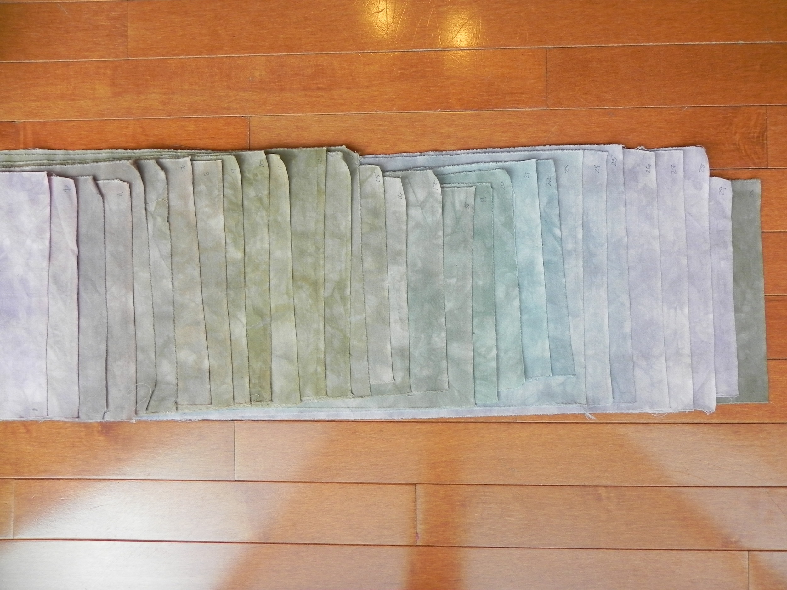
I had a second sampler pack kit named "Rainforest" that I finally got done in June.

By the way--I'm not entirely sure they're in exactly the right order. Here's the problem with dark dye baths: They tend to conceal the notes one made to oneself using a black Sharpie in the corners of the fabric pre-dyeing. Oops.
The three colors used here are Olive (708), Bright Green (7158), and Kilt Green (7218). I haven't bought any of these yet since largely I've been able to produce greens I like from dyes I already have. May well purchase some in the future, though--I especially liked the teal nature of the Kilt Green. I did find one thing very interesting: Note the Bright Green pure sample right in the middle of the bottom row, and notice how much it completely changes when only a half tablespoon of either Olive (to the right of it), or Kilt Green (to the left of it) are added. That has a much more drastic change than any of the other colors.
Finally, what I really wanted to start playing with was creating blacks and grays using value gradations. When I was in Paducah and doing some serious damage at the ProChem booth, I bought two black dyes: 628 and 629. They were described to me as one being a "warm black," and one being a "cool black." I dyed them side by side so I could see what the difference might be.

Blacks value gradations
628 is on top; 629 is on bottom. One can sort of see a bit of a difference, but not much. I suspect there may be more involvement when I'm mixing black with a color to get a muddier tone--then it may matter quite a bit which I use. Also, the method I used to get gradations didn't work very well in this instance; I'd probably have been better off doing the parfait method. They also lived in the dye baths for several days because I got quite busy suddenly and couldn't get to my rinse-out when I'd originally planned, so they are VERY dyed!
My next plan with these blacks is to use them as an opportunity to play with some discharges. Wheee!

Gifts from Kansas
Then, just because they're pretty and it was a wonderful moment, I must show you this too. I was gifted with some beautiful batiks in thanks for my keynoting at a women's conference in Kansas in early June. They know I'm a quilter, and one of the women on the planning team was also a quilter, so she knew the best thank-you gift they could give me! Apparently Kansas has a big shop-hop every year and Kaufmann Fabrics produces the sunflower batik especially for that shop-hop; I was told it was the only place you can get it. The women then had fun putting together several coordinating fat quarters for me. No idea what I'm going to use these for yet, but I can't keep my hands off them! (If you're curious, they were from the Material Girls quilt shop in Wichita. I was also given a very nice clear vinyl totebag with zippered top from the same shop that is now my hand-embroidery project bag.)
Okay, I think that finally catches me up with show n' tell! I should have one more finish (new one) before the week is out...