I'm now testing out methods in different books to see what method, or combo package thereof, gives me the results I'm looking for at any given time. What I'm finding is that, of course, each has its pros and cons. As in most things quilty, being adept at a variety of techniques allows you to pick and choose what works best in a particular situation.
But on to the pictures, because I know that's what you're really waiting for. (Captions explain what you're looking at.)

Descending to my basement...I prep some dye concentrates. These have kept me company all week.

New toy from Pro-Chem booth at Paducah: Color Magnet. Stencil or paint it onto fabric, and let dry for 24 hours, then dye.

And the results. Color Magnet draws more dye to the areas where it's painted. (I know--sloppy job with matching up stencil on the top but I was just trying to get 'er done.) Oh...the possibilities!
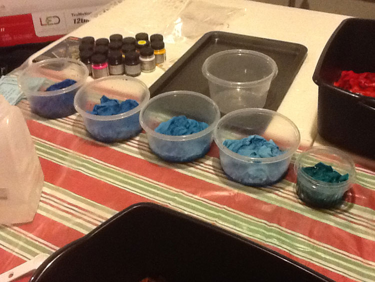
Bought two new colors: Intense Blue and Fuschia. I tested proportions of dye concentrate to water to get different values. Here's the Intense Blue dyebath (with the color magnet dye bath sitting to the right).

And here are the Intense Blue values. The two in the middle are a little more different from each other when you see the whole piece, but not much. Notes were taken.
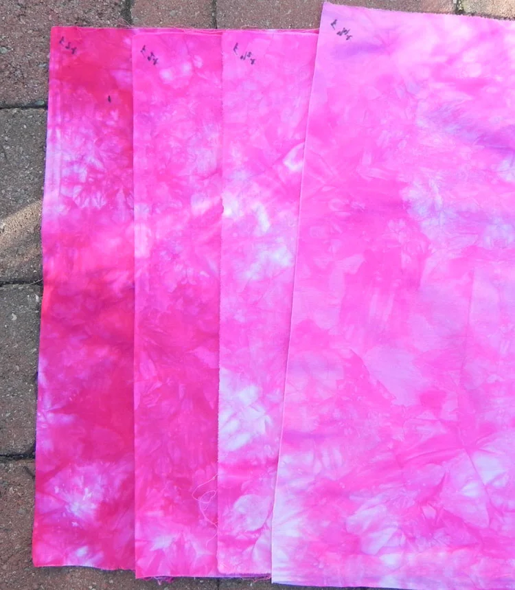
And here's the same set of dilution proportions done in my other new color, Fuschia. (Same thing here with the two in the middle, although these are a little more distinct from each other if you look at the whole piece of each.) The black markings in the corner is my code for tracking which was which.

Looks like very runny lasagna, doesn't it? This is using a method to get a gradated fabric from the book I'm working through first.

Dunno what this one looks like. It may look like a mess here, but oh, just you wait.
Gradation #1: Sunny Yellow, Golden Yellow, Mixing Red, Fuschia. Seriously yummy!

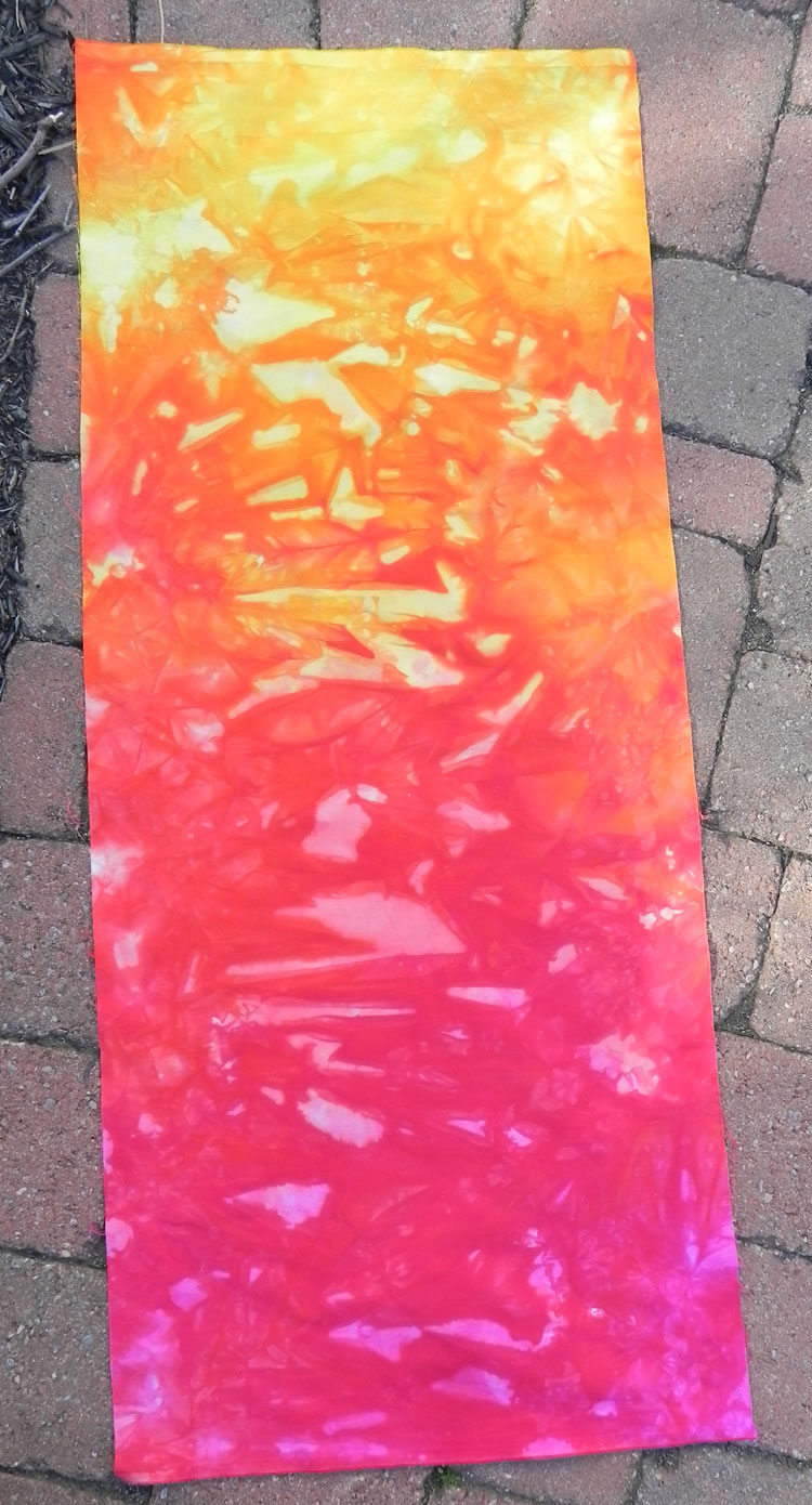
And oh, so-freaking-cool! Gradation #2: Sunny Yellow (I think--forgot to write down which yellow on this one), Fuschia, Turquoise. Neither of these gradations are getting cut up into anything. I'm letting my imagination wander for a bit. But every time I look at them, I grin and do just a little bit of a hop in place. Must. Do. More.
Stay tuned. As you know, I have a boatload more stuff to play with!