Here's another off-topic post for you, although it does very loosely relate to quilting and embroidery as it's all about color. Operative term being "loosely."
Even though I'm good at working with color in quiltmaking, and with my hand-dyeing past I have spent years studying color, color relationships, color schemes, and the like, when it comes to wearing color or putting color on my face in the form of cosmetics...well, somehow that's a completely different thing.
I kinda-sorta know what colors worked for me. And I didn't. All at the same time. It felt like now was the perfect opportunity--as I'm working my way through a few different wardrobes this year--to create a far more strategic closet only including things that look great on me and I feel great wearing. I've mentioned doing Imogen Lamport's Ignite Your Style Genius workshop--that's where I started really thinking about colors and contrast when it comes to my outfits. I know I'm a "high value contrast" person as I have dark hair and eyes but relatively fair skin. Generally that means I'll look and feel best in high contrast outfits. I'd already sussed that one out myself. In Imogen's system, I'm also a "low color contrast" person since my hair and eyes are both brown (as opposed to a redhead with green eyes, for example, who would be a "high color contrast" person.) Technically, that suggests I'd do well in monochromatic outfits, but that's not really my jam. I prefer more color going on than that. But beyond that, I really had problems figuring out what colors and color schemes really worked best on me.
And now I know why. As it turns out, I'm a human bridge! Or, perhaps, I'm deeply complex. A mystery wrapped in an enigma.... Whichever image makes me seem more fascinating, that's the one I'll roll with.
I did a little research but really didn't want to rely on online color analyses working from photos or Skype. Too much margin for error with computer monitors. I wanted to do something in person, so I went to Kerry Jones of IndigoTones. She had rave reviews and she travels all over doing color analysis for people and groups so I thought it was worth a shot, and boy am I glad I did it. It was an extremely educational hour for me!
Not only did we determine my best colors, but we also talked about my style (I'm a "natural" with a splash of "creative" going by the five categories she used) and how I could work to integrate my new color knowledge into my current wardrobe--which has a whole lot of my not-so-best colors in it at the moment. She also had me bring my makeup with me, which could fit in one small bag as I'm terrible at choosing eye shadows and blushes that actually look good on me--and lipstick is a complete loss (don't like to wear it much anyway)--so I've been throwing out a lot of what I'd collected over the years. Once we determined my color "season," she put some different makeup on me and it was a pretty amazing difference. I actually looked awake!
So--the results are:
I'm a Bright Spring!
Why could I never entirely decide whether I was "cool" or "warm?" Because I'm actually neutral--which means I'm a little of both, but on the flip side, some colors of either tone also look really bad on me. Boy, did that answer a lot of questions!
Additionally, whenever I tried to do my own analysis with online processes, I would tag myself as one of the winters but never felt like it was exactly right. Bright spring (aka "clear spring") shares some elements with "clear winter," hence my confusion there too. IOW, there are some clear winter colors I could get away with wearing and they'd look okay, but not as good as the bright spring/clear spring colors.
I've always loved bright colors but my career has moved me away from them--my felt need to dress fairly conservatively--and because I have dark hair and eyes in my formative years I'd often been steered towards the darker colors. I remember being told once as a teenager I should "always wear brown" because I have brown hair and brown eyes. All I could think was, "how incredibly boring!" (As a point of interest: ever since then, I've rarely worn brown. Don't tell me I "should always" do anything. That's the fastest way to make me never do it.)
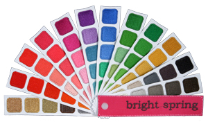
Bright Spring color swatch from Indigotones.com
But guess what? It's time to let my Bright Spring come out and play! I'm far enough along in my career now that I have a much better sense of what I can get away with and where versus where I have to tone it down--plus, well, I gotta be me. My three color words to remember are "Bright" (the highest priority), "Light," and "Warm." Where I was most interested in the nuances was in the neutrals--black actually washes me out a bit, where as the warmer grays make me look brighter. Interesting. Not ditching my host of black cardis quite yet but will probably mostly weed them out over the next year.
After my analysis was done, I immediately stopped in a consignment shop with my color fan and picked up a gorgeous mint green blouse, a coral and purple sleeveless top, and a soft gray casual tunic top that will be great with leggings; plus, because it made me giggle, I picked up a shocking-coral colored funky necklace*. For us bright springs those funky necklaces are all da bomb. I have a penchant for funky jewelry anyway (note the "creative" in my style words above), so that's an easy one. Plus, that's one of the tips for working with my current wardrobe--take a less-than-great-colored top, throw a "bright spring" scarf or necklace with it and it'll make it look a whole lot better on me.
Something in me is very excited to let my Fuschia out.
*Consignment stores are my new best friend. I've scouted out a handful of excellent ones in the area with quality clothes aimed at me as a target audience rather than at teenagers. Gotta love getting a great pair of gray suede booties for $18. And bonus: They're already broken in and incredibly comfortable! My favorite "chain" consignment store is Clothes Mentor. Check to see if there's one near you.


