
This one’s done, “All But Quilting” (or ABQ). Finally! Five years in the works! I haven’t decided how to quilt it yet. I did a little Pinterest research on quilt designs for quilts with embroidery in them and most seemed to go for an overall design of some sort that would help hold the embroidery in place. I don’t want to do much as I don’t want to spend a lot of time on it (it’s just a goofy Halloween wallhanging after all) and the quilting needs to not distract from the embroidery, which is what I took five freakin’ years to finish.
Anyway….Any suggestions? Corner-to-corner diagonals for a diamond grid? Meander? What color thread? I’m pondering, so ponder with me!
And so, on to a new start. I had a bit of a reprieve on the wedding quilt I had designed for my niece out in California. Their wedding was scheduled last April. Due to the pandemic, they ended up getting married on the beach with just parents and a couple of very close friends, and none of us right-coast family flew out. At that point, they said they’d do a reception in August, so I put aside what I’d designed while I dealt with all sorts of other pandemic-stress, and returned to it for a few days to get ready for an August finish date.
Then August got cancelled. So it got put aside again, but this time with no definite deadline.
Now they’re talking about trying again next April. At this point, I’ve decided not to worry about a date so much (‘cause I’m skeptical we’ll be traveling yet in April 2021) but I’d love to get it done and off my mind.
I’m doing a traditional Storm at Sea using the Accuquilt block die, which finishes to 9”. Since I’m making a King-sized quilt, roughly, this puppy has 120 blocks involved.
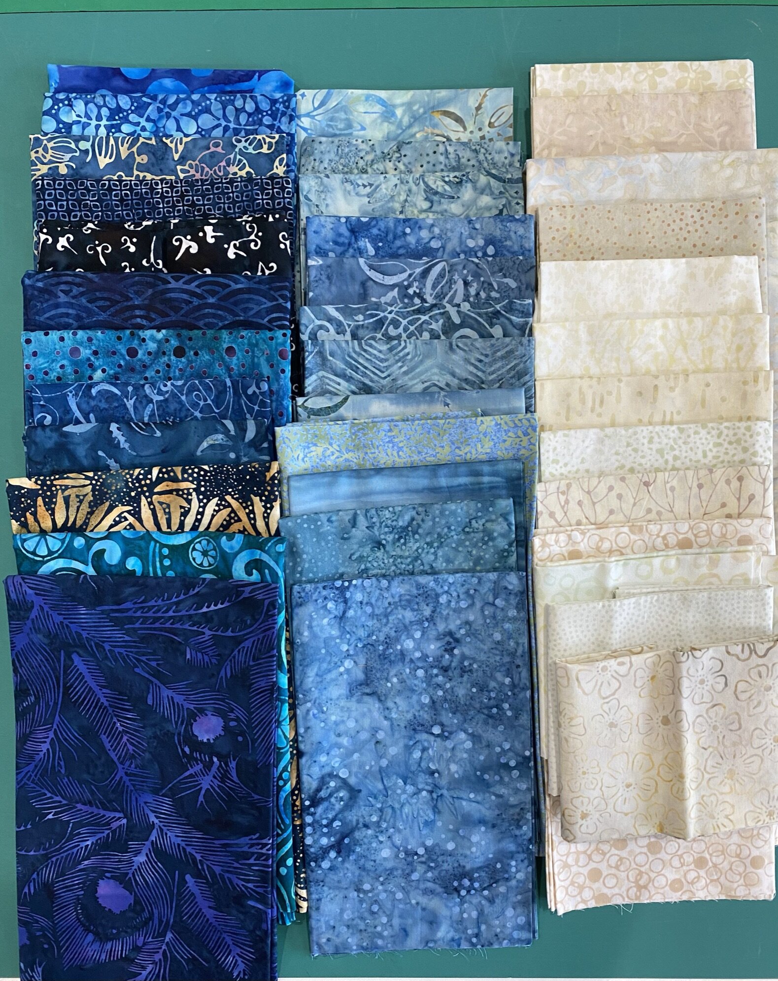
I’m doing it in beachy colors—blues and “sand”—and all in batiks.
I’d collected fabrics over a period of months for this but it had all gotten mixed in with my stash at some point, so I had to go digging again. That actually helped me as I realized how much of my original collecting had veered towards same-same, so I was able to mix it up with some other stuff that’s been in my stash for awhile. I felt like it had a little more spark when I was done.
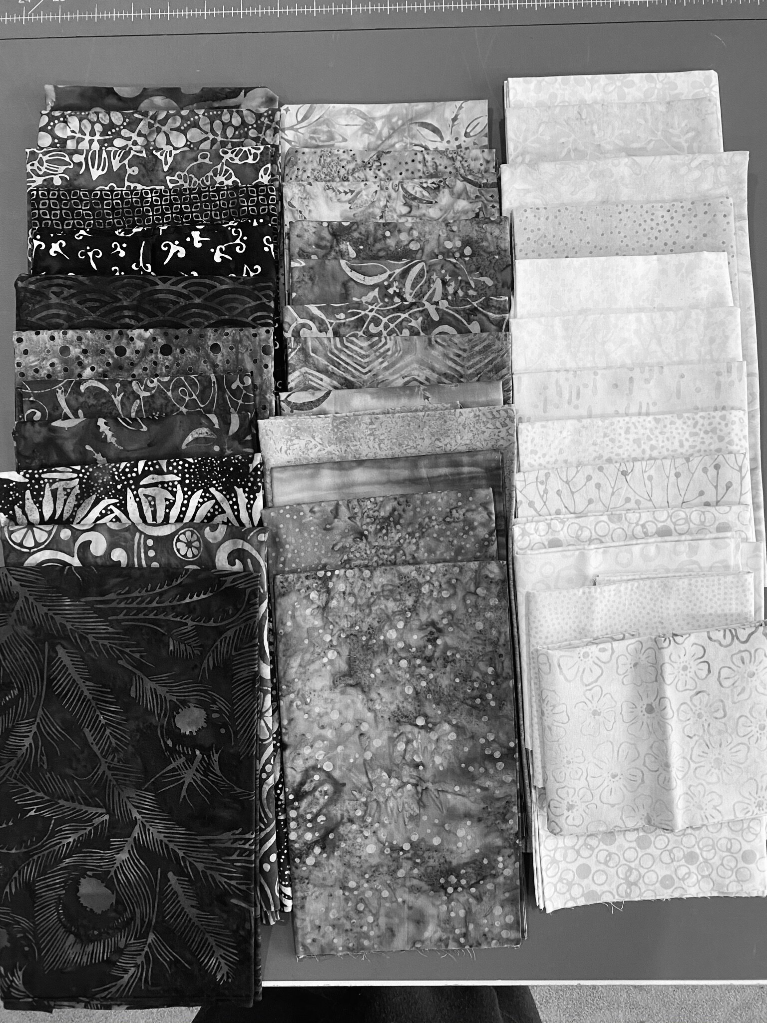
I was a good little quilter and did a b&w version so I could check values. Some of my darks veer just a bit into the medium in the monochrome version but I’m not worried.
I love the look of batiks but the resulting quilt isn’t exactly “cozy.” They never really soften up in the way the way woven cottons do. At least I think batiks are more durable, and as it’s going to live with young adults with dogs and a still-transient lifestyle, durable is a necessity.
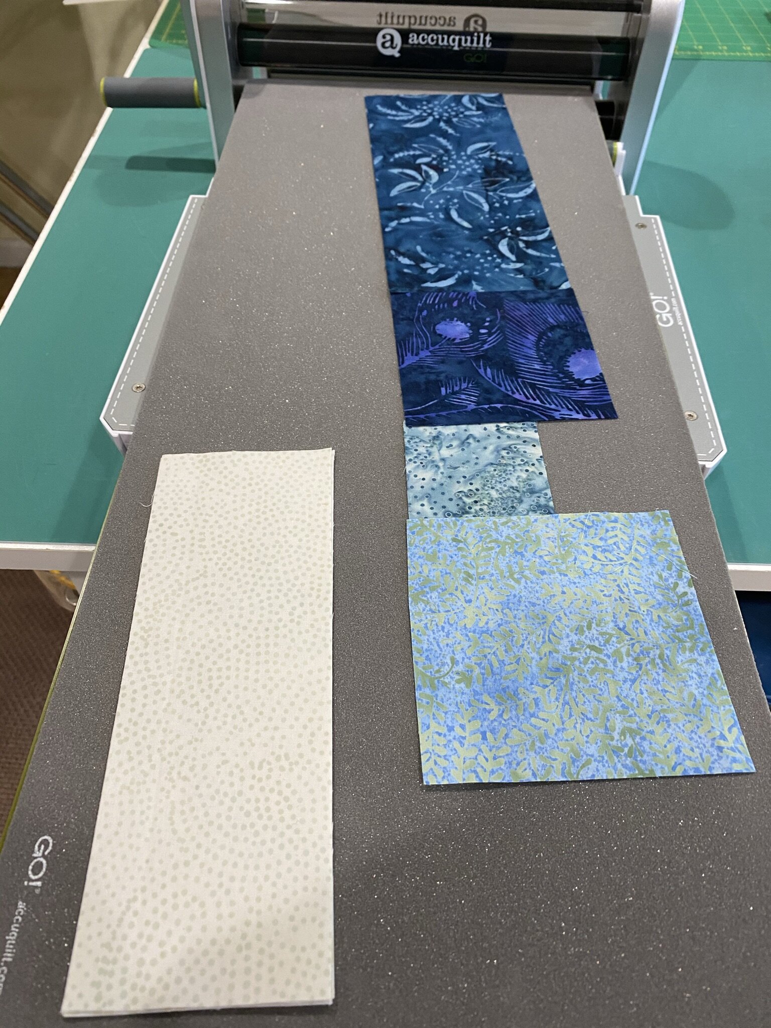
I sat down and did the math of how many pieces I’d need to cut—subcuts and final cuts included. (Subcutting, for those of you who don’t have an Accuquilt, is when you cut a piece of fabric to a size just slightly larger than the die itself. It’s not absolutely necessary but for something like this it’s helping me stay organized.)
This took me a little while as I’m doing it scrappy, so I had to figure out roughly how many pieces of which fabric I needed. Then I got to the end of a bunch of calculations and added “and whatever else I end up cutting.” If I cut too many, I’ll throw in a pillowcase or two.
I subcut a handful of fabrics so I could run a set through the die to make sure I’d thought it through correctly. This is how it looks when it’s laid out on the die.

And this is the final (pre-sewn) version.
(Boy, that light looks super-light in this photo. It’s really much more sand colored.)
Pretty nifty. I’m digging this Accuquilt thing. If I’d put my mind to it, I probably could’ve had most of the quilt cut out in a couple of hours.
I didn’t sew this test together as I want more variety of fabrics in each block, but I was able to see the basic layout and make sure I’d done my figuring correctly. Once I have more fabrics cut, I’ll take another pause and sew together a few test blocks.
I’m so excited. I’ve been wanting to do a Storm at Sea for so stinkin’ long!