If you're a podcast listener you know I was working on some things to be donated to my organization for our annual fundraiser auction. Pretty much every year I plan on contributing something quilted and in my 11 summers with the organization I've only managed to do that once. I'm very impressed with myself that I actually managed to get done what I wanted to get done this year! Before I start stuffing things in suitcases, though, I figured you might be interested in seeing the results.
I hand-dyed three silk scarves. I was aiming for our organization's signature colors (purple for the women, teal for the girls). I bought a purple dye specifically for this that's pretty dang close to the purple in our women's logo. As for teal, I figured I could probably come close given the dyes I already had.
What I learned is that although the dyes I'm using do work with silk, they work differently with silk than with cotton. (Still on that learning curve!)
Purple scarf with diamonds
This is one of two "standard" scarves. I believe they're something like 11" wide by 60" long...? Don't recall exactly. I used rubber bands on the end of this for the detail and interestingly, the circles all came out more as diamonds. Lesson #1: Since silk handles differently than cotton, the geometry turns out differently--go figure. (Sorry about the tag showing in the picture--kept trying to prevent that but it's a little breezy today so I gave up.)
Purple scarf with diamonds detail
Here's a better shot of the diamonds. I did manage to get them roughly evenly spaced on both sides, just eyeballing it. Yay, me.
Purple cowl scarf
This is a funky scarf--a large circle that you loop around your neck to form a cowl. You can also flip it up over your head if you need to protect your hairstyle. Me, I don't really have a hairstyle to protect. 'Nuff said.
Love the color again, but I'd hoped this would come out much more mottled so it would have a little more visual interest. However, (lesson #2 learned), silk wicks dye much more readily than cotton does, as it turns out. I had it scrunched pretty tightly and it didn't have a whole lot of liquid in the dye bath--if it had been cotton, it would've been extremely unevenly dyed, which is a really cool effect. This came out almost solid. You can see a little mottling here and there but it almost looks like a mistake rather than intentional. I think it'll still be a popular item. Our women sure do love their "signature color" items to wear to show their support!
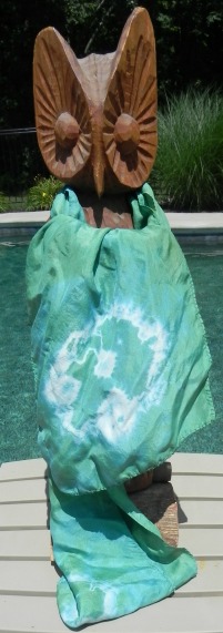
Teal scarf
This one was disappointing to me but my daughter loves it, so I'm getting over myself. The usual dye mix that I use at the moment to approximate teal looks very washed out done in silk. (Lesson #3) Apparently some of my dye colors just naturally "take" to silk better than others. I had a mix of fabrics in dye baths all at the same time which meant I could do an easy side-by-side comparison. The purple dyed about the same on cotton as on silk. The blue/green quasi-teal is much more vibrant and saturated on the cotton than on the silk. Interesting.
For the detail on this one I used one large rubber band on each end and then stuffed the middle that protruded at the top, once I was done banding it, back down into the center. I do like that effect quite a bit.
Yep, already have plans for next summer's conference and what items I'll be hand-dyeing!
Baby Quilt
There's always a theme for the auction, although generally very loosely interpreted. But this year's theme was a bit of a gimme for a quilter. The theme was "Oh, the Places You'll Go," as sort of a riff off a travel theme but also celebrating the future of the organization and so forth. I joked with the planning team, "Oh, I bet I could find fabric for that!" Certainly.
I bought the panel and a collection of fat quarters from Fat Quarter Shop. I actually had it in both colorways--the one shown here and one in primaries (clearly meant to be girls and boys, but let's not be so gender-biased about all this!). After I put this one together, though, and started on the primary color version, the panel was giving me fits because it wasn't printed even close to being on square. It was so obnoxious to deal with I finally pitched the panel into the trash, declared with fervor, "No one even remembers I said I'd do one quilt, let alone knowing I'd thought I might make two!", and stalked angrily out of my sewing room.
(Yes, because I know some of you just gasped in horror, a few days later, calmer heads prevailed and I fished the panel back out of the trash and stuffed it on my "to be given away" shelf. I have a friend who would probably love messing with it. More power to her. I just want it out of my life.)
I designed the quilt myself, in case you're curious. Nothing special, just sashing but playing with color placement. The binding was the remaining strips from the fat quarters that were left over, and the backing is pieced from the four remaining fat quarters that didn't get used anywhere on the front. I had to add narrow strips of a fabric from my stash to get the backing long enough but it was pretty close. And I just stitched in the ditch along all the seams--one, because I wanted it done; two, because I didn't want to have the text disappear behind quilting. But mostly one.
So that's my show n' tell. Here's hoping they do their part to raise much-needed funds for the organization!
And for your entertainment...another entry in my "Dogs with Quilts" series, although this one should be "Dog with Scarf." He was none too sure about the model.*
Dogs with Quilts
*No actual owls were harmed in the writing of this blog post.


