Total Color Tuesday--Last One!

We've done it! We've made our way through all the color harmonies presented in Color Magic for Quilters. By the way, this blog series in no way replaces you buying the book. I've only looked at the color harmonies. The book presents a wealth of other information, "workshop" exercises, tons of examples, and several patterns that will help you explore the harmonies in greater depth. This book is a fantastic reference--several women in my guild swear by it and I've really enjoyed my practice of working my way through each color harmony. Not only do I feel like I've broadened my color horizons, but I also know my stash a whole lot better. I'll be using this book as a reference forever after.

So put Color Magic for Quilters on your holiday gift wish list!

With no further adieu, onto the last two color harmonies.

Throw 'Em All in There

 For this color harmony, you just use 'em all. Or, at least, some significant quantity of the colors on the color wheel.

Your first thought might be, of course, scrap quilts. And yep, those are a great example of this color harmony. Some well-known quilters have said that the more colors you use in a quilt, the better they all work together. There is still some art to doing this well, though--you will want to consider having a place for the eye to rest and so forth. But as usual, it all depends on what effect you want to achieve in your quilt. Maybe you don't want anyone's eyes to rest anywhere!

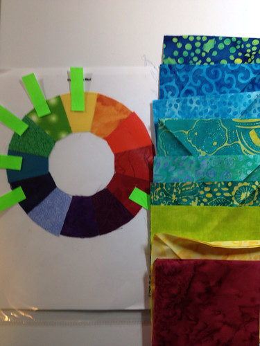
So here are a bunch of fat quarters I've matched up to various points on the color wheel. You'll note, of course, that several of the fat quarters are multi-colored. That, of course, works well in a color harmony that uses everything! Additionally, those kinds of fabrics will help everything play nicely together.

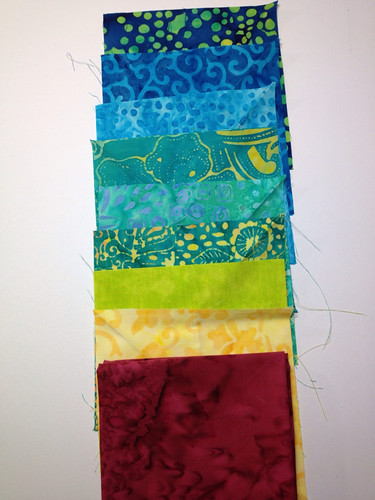
Here are the same fabrics re-arranged.

What do you think? Would you make a quilt like this?

I can see it.


Another way to approach this--and the way most of us are probably accustomed to--is to find a multi-colored focus fabric and then work off that, but pull several more of the colors off the focus fabric than we might usually. So here I have a multi-colored focus fabric that manages to hit almost every color on the color wheel (although sorry--I covered up some of them with my fat quarters). Then I found fat quarters that picked up a lot of the different colors. This is clearly an example of the multi-colored color harmony. Obviously quite workable.


Once again, the Ives Color Wheel (a.k.a. 24-Point, or the one used in Joen Wolfrom's 3-in-1 Color Tool) was intimidating to my stash. They cowered in fear. I just don't have enough fabrics to really work with the whole 24-pointer on this one.

Of course, this color harmony doesn't mean you have to use every color, just a lot of them. I simply moved on. I have other things I want to accomplish again!


Throw 'Em All in There, But Have One Stand Out

This is simply a twist on the one above. You're still using a boatload of colors, but you're using a bunch of one color to make it stand out. This one is, more simply speaking, multiple colors with one main color.

I didn't bother with the usual color wheel pictures on this one because, well, you get it. But it did give me a chance to mess with a fabric I just bought during the Black Friday weekend online fabric sales. I got the main focus fabric in this picture from Fat Quarter Shop on super-duper sale. I ordered two yards but they only had a yard and a half (plus a few inches) so I took whatever they had left. It's a wonderful, vibrant, chaotic fabric that I have no idea yet what I'll do with but I can't wait to figure it out! Serious love fest with this fabric going on!

Anyway, I pulled a bunch of greens to make that the main color, but it plays up against all the riot of color in the main fabric.

Yep, this would definitely work.


Play time!

This is it. Your last opportunity to play along. As usual, link up your blog posts as you play with these color harmonies. Let me know what you think--have you, or would you,actually use any of these types of harmonies in a quilt? (As a note--I'll leave all these links open until December 31 so you can play catch-up if you want. Thanks for your patience as I went through this process--I learned a lot, and hope you were able to expand your color horizons as well!

Total Color Tuesday--Gettin' Bizzy

Sorry--last week totally slipped my mind. I was in a Black Friday Sew-In Frenzy all weekend! Got a lot done, but completely blipped on Total Color Tuesday. However, I've discovered we only have two weeks left--this week and next, and we'll be done with our color study. Or, at least, we'll be done with this particular book. Next spring my design study group will be focusing on, yes, you guessed it.... color. So you may be seeing more but it'll have a very different feel. More show n' tell, I suspect.

In any case, back to Color Magic for Quilters and this week's color harmonies. We're gettin' bizzy and inviting all sorts of colors to the party!


Skip, Skip, Skip to My Lou

So in this week's first harmony, we're hopping around the color wheel on one foot and picking up every other color to use in our project.

This is a good harmony for you indecisive folks out there.

The technical term for this one, if you want to impress the troops at an upcoming holiday party, is "full range of alternates." Doesn't that make it sound all scientific-artsy?

I rather arbitrarily started with green and started hopping, which gave me green, blue, purple, red, orange, yellow. (My red looks a little purpley here but trust me, it's red.)

I could see this as a baby quilt, of course. Lots of fun contrast. I could also see doing a scrap quilt with this in a wide range of values--my colors here are all pretty saturated because it's faster for me to put together these harmonies that way. If I wanted to futz with it, I'd have some tints in there (those are hues with white blended in) to soften it up. Maybe even go all Easter Egg on it with a range of pastels. If you used shades (hues with black blended in) you'd be heading into Amish country.So, some definite possibilities there.


The Ives Color Wheel (CMYK, or the one that Joen Wolfrom favors) is a whole different matter on this one. I imagine these color harmonies would be defined somewhat differently. Skipping every other color on a 24-point color wheel looks very different from skipping every other color on a 12-point wheel. I didn't even bother going into my stash--I'd have been here all night.


Meet the Angles

 Now we're into triangle color harmonies. Toning it down a bit and sending a few colors home from the party early.

Colors on a triangle, which you may know as a "triad," is more familiar. These colors are naturally balanced--nature loves a triangle.

We're probably most familiar with the primary color triad: red, yellow, and blue. Can you say, "baby's room?"

There are, of course, the secondary color triad (orange, green, and violet), and the tertiary color triad (yellow-orange, blue-green, and red-violet).
 I went simple and stuck with the primaries. Again, my red is looking terribly purple-ish in this picture. Sorry about that!
 In the Ives color wheel, we have a lovely combination of yellow, turquoise, and magenta.


Margarita, anyone? There's not even any snow on the ground yet where I live and already I'm thinking of tropical beaches.


The Angles Bring a Friend


Start with your colors on the triangle, then jump across the color wheel from one of those colors to find an accent. 


I jumped across from red to pick up green.


For the Ives wheel, I went across from the turquoise to pick up orange.

Now I want a mojito. And a beach chair.


Play time!

Your turn! As usual, link up your blog posts as you play with these color harmonies. Let me know what you think--have you, or would you,actually use any of these types of harmonies in a quilt?

Total Color Tuesday--Skipping About


We're playing hopscotch all over the color wheel this week. Three color harmonies again. The first one is actually pretty closely related to last week's; the second two are related to each other.

Two Colors, Four Colors Apart

 Start somewhere on the color wheel and choose your color. Then count four colors over, and the fifth color would be the other color you would use.

You're pretty close to complementary so you've got the pizzazz of that combination but it's just enough of a tweak to the side to make it a little different.

I could see putting this red-purple and yellow together if I had a variety of tints and shades of  each of them. Could be pretty.


Using the 3-in-1 Color Tool, even at four colors apart the colors are much closer together on the color wheel than on the standard wheel. Divided into 24 segments, five colors apart on this wheel is the equivalent of 2 1/2 colors apart on the standard 12-point wheel.

So starting with yellow again, I land on blue-green for the second color. I dig this combination. Very tropical. It also works nicely because I have a blue-green that includes some yellow hiding in the background, so I could see myself putting these two into a quilt. I'd probably include a nice, bright white. Summer, here I come!


Three Colors, One Color Apart


In other words, choose a color, skip a color, choose a color, skip a color, choose a color...do si do, change partners, do it again...


I decided to stay on one side of the color wheel and did purple, blue, and green. You could, of course, start closer to the turning point and have both warm and cool colors in a single quilt with this color harmony for an entirely different effect.

I wasn't keen on the dark versions of all three colors together, so I decided to play a little more with contrast.


I switched out the dark blue for a light blue. I'm still not keen on this one. That being said, I could see doing something very scrappy with all sorts of purples, blues, and greens on a white background. That would probably work really nicely.


ZING! Here's the same color harmony on the 24-point color wheel. Again, subdivided more, you have less division between colors when you skip around. I ended up with magenta, orange, and red. Wowzer.

On the other hand, black background and you've got something funky going on. Again, with maybe a little more contrast happening (shades and tints of these colors), it could be pretty exciting.


Three Colors and an Accent


In other words, choose a color, skip a color, choose a color, skip a color, choose a color...then take a big leap across the color wheel and find the opposite of that middle color and grab its hand for a grande allemande...

Okay, so that's a little long for a square dance call. But you get the idea.


Back to the standard color wheel: I started with my three original colors: purple, blue, and green. That makes the accent color orange (the opposite of the middle color, blue).

This time I went into my fat quarter collection and I was able to put together four fat quarters I could easily imagine putting together in a quilt. Some of that is, of course, that my blue fabric also has green and hints of orange, so it pulls everything together.

This combination, I dig.


For the 24 point color wheel, the accent color becomes aqua green.

I've been in a very aqua and turquoise mode lately, so I have plenty of that in my stash suddenly. I used the same red, orange, and magenta fat quarters from earlier and pulled an aqua-green fat quarter to go with them. These particular values of these colors are a little intense but, you know, it would work on a black background? I could see something really interesting that was primarily the warm colors with just little bitty pops of the cool sprinkled through it. It would still be intense, but could be really eye catching.


Play time!

Your turn! As usual, link up your blog posts as you play with these color harmonies. Let me know what you think--have you, or would you,actually use any of these types of harmonies in a quilt?

Total Color Tuesday--Twosies All Around

We're doing three, count 'em, three color harmonies this week! They're all closely related, so just follow along in your songbook and we'll all hit the same note at the end.

Two Colors, One Color Apart

This one is pretty easy to figure out. Choose a color, skip a color, find the other color.


In some regards, this has a very similar effect as analagous colors would. You're still pretty dang close to one another on the color wheel, so you're related. But you're just far enough apart to create a little bit more visual pizzazz.

In my example here (let's look at the standard 12-point color wheel first), I started with purple, skipped over red-purple, and went right to red. If we'd included the red-purple in there, we'd have an analogous harmony.  It would be all sorts of calming, as analagous can tend to be. But by ripping out the center color and leaving the two outies, you get rid of a bit of the calm and find yourself feeling just a little bit zingy.

Pulling fabrics from my stash, here are my purple and red examples. I do actually really appreciate a good purple and red combination. If I used these two fabrics I'd want some blenders, or perhaps just shades and tones, to give it a little more interest. Or maybe just combining these with a bright white (if I wanted excitement) or a light gray (if I wanted to tone things down a bit). Pairing it with black would be heading in the direction of an Amish effect.


If you go back up to the first picture you'll see I also included the 3-in-1 Color Tool version of skipping a color. As always, since that's a 24-point color wheel, the two colors are a whole lot closer together. In that color wheel, violet and purple are the two colors and there isn't quite as much separating them visually.

I'm not sure I would do a quilt only using these colors, although honestly it just comes across to me as a straight-up analogous pair. This one doesn't jazz me as much.


Two Colors, Two Colors Apart

Next color harmony: Start with one color, hopscotch across two colors, then land with both feet on the third color. Bingo.

So now you've increased your contrast between the two colors and added just a little more zing. This one probably pushes our color boundaries a little more than others--it's not a combination we normally think of when we look at our color wheels. But with a good mix of shades, tints, and tones, or balanced out with some neutrals, this could still be a very effective color scheme.

Pictured--12-point color wheel and 24-point color wheel. I stayed with purple as my starting point both times. (Note here: The color I think of as purple, and is most often referred to as purple on the 12-point color wheel, is labeled "violet" in the 24-point wheel. I decided not to get overly sticky about terminology or I'd drive myself nuts. Feel free to mentally translate if you prefer one term or another. I know technically they're two different colors, that purple and that violet, but in the quilting world, I'm used to seeing what I call purple referred to as purple, so I'm rolling with it.)


 In my scenario with the 12-point wheel, my two colors are therefor purple (hop skip) and red-orange. Oooh. Jazzy.

By the way, have you ever noticed how hard it is to distinguish red from red-orange in your stash sometimes? The fabric I pulled as an exemplar here I always just think of as red, until I hold it up to my color wheel. Nope, guess it's actually red-orange. But if I held it up to another red-orange fabric, it would likely look more true-red. So color is often quite relative.
 Here's my sample for the 24-point color wheel. Starting with purple (oops, violet), skipping a couple of colors in the same direction as above lands me on fuschia. Boy, was I a fan of fuschia in college. It was all the thing back then, and I wore a lot of it!

Not so much anymore. I seem to be in a turquoise phase this year. But I digress.

I do like purple and fuschia together. In fact, I believe I wore a lot of purple and fuschia together in college. You might be able to recall what time period that was. For those of you alive back then, anyway...


And Finally, Two Colors/Two Colors and a Jazzy Friend

So for this one, we stick with the above color harmony but then jump directly across the color wheel and find the opposite. 

Okay, so it's a little tricky to find the opposite when there isn't a direct line. Color Magic for Quilters suggests you draw a line from your first two colors into the center of the color wheel, and then draw the tail of the "Y" from that center point to find your opposite color. Hmmm. To tell the truth, I couldn't exactly decide if I was going green, or yellow-green. It could actually be that I'm going somewhere in that spectrum of green to yellow-green. (Or it could've been that I was doing this at midnight and getting a little loopy with sleepiness.)

In any case, I pulled a green from my stash to accent my original purple and red-orange pairing. Looking at it, my green could just as easily be seen as yellow-green. Or somewhere between the two. This is where color theory becomes less of a science and more of an art.

The 24-point color wheel is even more problematic, trying to figure out exactly which color is directly across. Besides, mine's really really small and I was having problems seeing by then.

I ended up with violet, fuschia, and yellow-green set here. Eye-popping. Would be a really fun kids' quilt or teenage girl quilt!


Play time!

Your turn! As usual, link up your blog posts as you play with these color harmonies. Let me know what you think--have you, or would you,actually use either of these types of harmonies in a quilt?

Total Color Tuesday--Splits and Points

Happy election day! Have you voted? 


I looked ahead at how many color harmonies we still had to go in this book, and there are a lot. So the rest of these posts will be looking at two or three at a time. Mostly, those pairing/triplings will be very related color harmonies that are simply variations on each other. These two for this week, however, are two distinct color harmonies.

Splitting the Opposite

Making alien antennae with my color wheel. 'Cause that's how I roll.

This one is a variation on the basic complementary scheme, in which you choose one color and then jump across the color wheel to find its opposite. This time, however, when you find the opposite, you use the color to each side of it rather than using the complementary itself. This way you still get the excitement of the complementary harmony (which tends to be visually energetic), but more interest using more colors.


So, in my case, I started with purple, and then moved across to yellow. If I were to use this scheme, then, I'd be making a quilt with purple, yellow-green, and yellow-orange.


Rummaging through my stash, I came up with an approximation of what that might look like.

I have this wonderful purple print that someday I'll actually use.

In itself, it pretty much encapsulates this color harmonie, although there's some deeper reds and a straight-up yellow in there as well. I know in the past I tried not to cheat like this, but I just don't have a big enough stash to be a purist all the time!

So the green on the left is about as close to yellow-green as my stash gets, and then the yellow-orange on the right is my close-enough there as well. It's a little more yellow than orange, but it's pretty close

Using the Joen Wolfrom 3-in-1 Color Tool was fairly problematic for me again--it leads towards a much tighter mix of colors than what my stash can handle.

But hey, I got to play with chartreuse! (I've heard rumor that it's Frances of Off-Kilter Quilt's favorite color. Tee hee.)


I did actually have something that could be considered chartreuse in my stash. Go figure.

I think I came pretty close on these, didn't I? I'd never make a quilt out of this particular set of fabrics, though. I'd want to work with a wider selection to make this color harmony really sing.


Four Points on a Square

Issue an all points bulletin!

Yep, we're using compass points here, although you could choose any four colors, as long as they're equally distributed around the wheel. Technical term: tetrad. Roll that one out at a party to impress the troops, as my high school history teacher used to say.

This time, of course, you're combining two sets of complementary colors. So you've got some visual pizzazz again, but more variation for interest.

For simplicity's sake I started again with purple and yellow, since that's how I started above. This time, though, you would use the yellow, and then you'd also be using blue-green and red-orange.

I find this an odd combination. I think I'd like it better if I shifted everything one to the right--red-violet, orange, yellow-green, and blue. But that's just me.


I messed and messed and messed with this one, and just couldn't find a combination of fabrics in my stash that would work in the four colors the color wheel indicated.

Here's my best attempt. Ick.

This is one that I'd definitely have to take the color wheel into a quilt shop to find four fabrics that really work well together.


The Wolfrom Wheel (that's got a better ring to it, doesn't it?) actually worked in my favor this time--I liked the particular hues this one indicated together much better.

Violet, aqua green, red, and yellow. I could dig this.

Play time!

Your turn! As usual, link up your blog posts as you play with these color harmonies. Let me know what you think--have you, or would you,actually use either of these types of harmonies in a quilt?

Total Color Tuesday Returns! Woot! One Color and 3 Opposites

After something like a five or six month hiatus, Total Color Tuesday is back! We're getting close to the end of the book so I really wanted to finish this project. Since it's been so long, you might want to review past Total Color Tuesday posts.

This time we're looking at one color with three opposite colors.


So, for this one, you choose what your main fabric color is going to be. This might be your focus fabric, or just the color you start with. "I want to make a blue quilt," you might say, "But I want it to have some zip!"

Zip there is when you go directly across the color wheel to find its complement. (Remember that term from a few months back?) In this case, the complement to blue, using our traditional 12-point color wheel, is orange.

For this scheme, then, you also pull in the two colors on either side of that complementary color. In our example, you'd also be including yellow-orange and red-orange.


I dug into my stash. We've already established in previous Total Color Tuesday posts that I'm lacking in the orange department of my stash. That hasn't improved over the last several months that TCT has been on hiatus. However, I do have a fabric that's got both orange and yellow-orange in it, and then another that's got orange and red-orange in it. So in my example, I decided to use three fabrics to cover four colors. Probably not quite kosher, but it works for me. I could see doing a funky star quilt with this combo.


Again, if you recall, part of my challenge to myself on the TCT posts is also to look at the Joen Wolfrom 24-point CMYK color wheel to see if it would be different.

In this case, it didn't feel very different.


So now it's your play time! 

Put your linky here with a blog post of your own playing with color!

Total Color Tuesday--It's Becoming a Color Party!

For the last couple of weeks of our Total Color Tuesday play times, we've been adding friends here and there. This week, it's a crowd! We're doing two color harmonies again this week, so get ready.

First up, four colors are coming over to play.

Two Colors and Their Opposites

This one is a four-color harmony in which you start with two colors, then hop across the color wheel and pick each of their opposites. Color Magic for Quilters suggests that for this color harmony to work best, you should choose two colors separated by one color.

I decided to go with green and yellow, plus their complements, red and purple.

How in the world do I keep ending up back at yellow, when I have so little yellow in my stash?


This one worked out pretty well. I had a print fabric in my stash that includes both green and purple (not a surprise, since that's one of my fave color combos).

I then added another purple fabric just to emphasize that--and yes, despite the picture turning it blue, the purple is really an identical purple to what's in the print. Go figure.

Then red and yellow to round out the harmony. I could see using this in a quilt. If I were to do so, the yellow would just be a little accent here and there, and I'd throw in a white or some other very light fabric as well. But, not bad.


Then I turned to the Joen Wolfrom 3-in-1 color tool to see what the CMYK wheel would turn up.

I tried to stay with more or less the same color scheme as I'd used with the traditional color wheel, although the CMYK wheel changes it to yellow, yellow-green, violet, and magenta.

Surprisingly, I have a print that's got both violet and magenta in it. It looks more red in this picture but it's really a deep magenta. This could work, although I think I'd try to find a lighter yellow to counter-balance the intensity of the yellow-green in this one.


Now, onto the next color harmony. This time, our friendly four colors get party-crashed by some interlopers.

Three Colors and Their Opposites

Yikes. It's getting crowded in here. Turn down the music before the neighbors call the cops!

This time, you're choosing three side-by-side colors. No skipping. Then you find the complements, or opposites, for all three colors.

Color Magic says, "At first, the thought of working with six colors may seem daunting...."

Well, actually, I've worked with at least that many colors before. But trying to find colors in my stash that are this close together was a challenge. I came up with this set based on the standard color wheel. Same starter fabrics as above, but adding in a green and a purple to round out the harmony. This particular set probably wouldn't do it for me in a quilt, although maybe if I could find a lighter yellow and then just went with the very light and very dark as accents, I could make it work.

However, when it came to the CMYK version of the color wheel, I had a complete fail.

I just don't have a big enough stash to have fabrics that are so close together and yet still distinctly different. This one would require a trip to a quilt shop. Maybe a few.

I wonder if, in using the 24-point CMYK color wheel, I'd be better off doubling the number of colors "skipped?" In other words, where Color Magic, using the 12-point standard color wheel, suggests skipping one color for the best harmony, maybe in using the 24-point color wheel that means I should skip two colors? And if I don't skip any in the 12-point standard wheel, maybe I should skip one in the CMYK? It would provide a more clear differentation.

Not that there are any real rules, here. The six colors I've got fanned out in the photo would make a very pretty quilt. I just can't do it out of my stash.

But just to leave on a high note, aren't these pretty? (Stonehenge 2 1/2" strip package that I broke into to see if I could do the color harmony above. Nope. But I liked petting them, just the same.)


Play time!

Your turn! As usual, link up your blog posts as you play with these color harmonies. And here's hoping you do better at the three-colors -and-their-opposites than I did!


Total Color Tuesday--Finally Not Analogous!

Finally, we're not working with analogous colors this week! (That ought to make Jackie happy.)

However, we are working with complementary colors which, I believe, Nonnie has said she doesn't like.

Which all goes to show: While some of this is science, a lot of it is art, and most of it is simply personal preference.

But we move on.

Today we're doing two color harmonies because otherwise we'll never get through the dang book.

Opposite Colors

Colors opposite one another on the color wheel are called complementary

When you go opposite, you will always have one cool and one warm color, which automatically creates balance, as well as excitement. Putting two colors side-by-side also intensifies both of those colors. If you want to tone that effect down a bit, you can simply add a neutral (such as white, black, gray, etc.) to settle things. You can also use tints and shades, adding white or adding black to the main hue, to create even more interest but also settle things down a bit. Using each color in its most pure form will have the most dramatic effect.

Color Magic for Quilters has some interesting tips about how to determine the appropriate amount of each that I won't go into here since my goal isn't to render their book unnecessary. I encourage you to get the book for yourself--it's got great information in it!

Play Time--Complementary

I went for purple and yellow. I do like this combination, although if I were to turn this into a quilt, I'd definitely be using some tints and shades to make it a lot more interesting.

By the way, that darker fabric really is purple. Between the lighting and using my phone camera it came out a whole lot more blue. I tried doing some color adjusting to bring it back to its actual color but was only partially successful.


Using the Ives Color Wheel (CMYK) a la Joen Wolfrom, a complementary color scheme is green and magenta.


Here's green and magenta out of my stash. Although the colors work together, I don't like this combination of fabrics so probably wouldn't use it in a quilt, unless there was a whole lot else going on and one or both of these was smaller pieces.


I decided to get into my crosswoven fabric collection to see how that works in terms of the color wheel. I bought these at the Mid-Atlantic Quilt Festival from a wonderful vendor carrying fabrics from all over the world. These are from Indonesia.

If you're not familiar with crosswoven fabric, it's fabric woven from one color thread in the warp and a different color thread in the weft. The finished result is primarily one color, but you can see that other color when you hold it just the right way. Super cool.

Here's green and magenta. (Note that the green is crosswoven with blue, so it depends on the light which color you get more strongly. The magenta is crosswoven with green.)


 Just for kicks-n-giggles, here's complementary blue and yellow-orange in the crosswovens.


Moving on...

Opposite Colors with an Accent 

Our second color harmony for the day is kicking it up a notch: take those two complementary colors and add an accent. Any accent. You have a few colors to choose from when you're deciding on your accent.

Generally, that accent is most effective if it's at least one color removed around the color wheel from one of your two complementary colors. In fact, Color Magic for Quilters refers to this as "the preferred accent." Choose your complementary colors, then move two colors away to either side of one of them for the accent. Note that this technically gives you four different options of colors to use as the accent. However, as in everything, there's no hard-and-fast rule about that. Do what feels good!

Accents give the whole thing just a little more jazz, a little more excitement and interest. Not to say, however, that a straight-up complementary can't be really interesting! But if you're working on a complementary scheme and it's just not flipping your switch, try adding an accent.


Play Time--Complementary with Accent

Going back to my original complementary pair of purple and yellow, one accent I might choose would be green.

I do like this combination, although if I were to make this a quilt I wouldn't use these three fabrics. It needs contrast of print in there to make it really sing. But the purple-yellow-green thing feels like a garden to me.

Back to the crosswovens, just 'cause they're purdy n' I love them.

Yellow-green, red-violet, blue-violet. (I have to stretch the color wheel a bit with the crosswovens since they're not distinctly one color or the other!)


Blue, yellow-orange, purple-ish. I do like this set of three and could see it working. The crosswovens have sort of a funky Amish thing going on.


Back to my original combination of magenta and green using the Ives wheel, I picked up yellow for an accent.

This one would work! The floral in the middle pretty much has that entire color harmony in one fabric--yellow, green, magenta. Wouldn't this make a nice spring quilt?

If only I wanted to make a nice spring quilt right now, and didn't have fifty other projects in my head that I'd like to do first!


Your turn! As usual, link up your own blog posts showing us how you might approach these two color harmonies: opposite and opposite-with-an-accent, aka complementary and complementary-with-an-accent.

Total Color Tuesday--Fivesies and a Friend

I'm sorry, Jackie. Don't hate me.

We're still working our way through the analogous world. Last week: fivesies.

This week: fivesies with a friend.


Color Magic for Quilters refers to this as five side-by-side colors with an accent. Take five side-by-side colors, and then jump across the color wheel from any of those five and you'll have the accent.

I took it a little easy on myself again this week and turned to a package of Tonga Treats to start. (This is the Island Punch collection.) There I found my blue, blue-green, green, and yellow. I added in a yellow green from some scrap squares I have. I used some variations of some of the colors so there's more than five fabrics in that part, but they still live in the same segment of the color wheel.

I then jumped across the color wheel to find a red, and there it was, sitting in my fat quarter stash.


Here's a better picture of the fabrics.

It could work. If I were making this for realsies, I'd hunt more for a red accent that fit the milieu a little better, but this one could fly in a pinch.


Turning to the Ives (CMYK) color wheel favored by Joen Wolfrom, I pulled out Wolfrom's 3-in-1 Color Tool to see if I could do fivesies and a friend based on that wheel as well.

Unfortunately, since there are more colors on the Wolfrom-preferred color wheel, it's a lot harder to do this one from my stash. I just don't have the selection. But here's one option of what fivesies and a friend would look like if I had just the right fabrics.


Your turn!


Link up here with your own blog posts describing your playtime with fivesies and a friend. If you've already done this (because you were bored with straight analogous, perhaps), try doing a different set of colors just for fun. Looking forward to seeing your posts!


Total Color Tuesday--Fivesies

First, a big shout-out to the following who have been my playmates on Tuesdays so far:
Thanks so much for hanging out with me. It's so much fun seeing what y'all come up with! Everyone else, time to join in--it really is a lot of fun and it's a good excuse to pet fabric for awhile. Plus, I'm finding fabric I'd forgotten I had, and I don't even have that big a stash!

This week was a little tougher for me. I didn't come up with any combinations out of my stash that I thought would actually work in a quilt that I'd want to make. This is a color harmony that, if I should choose to use it, would make me take a road trip to my LQS, color wheel in hand.

This is also one in which it really did make a difference which version of the color wheel you're using--the standard 12-point one that we're mostly all used to using (see below), or the Ives/CMYK wheel with 24 points (pictured left): Notice how many more colors the Ives wheel--used here in the Joen Wolfrom 3-in-1 color tool--gives you to work with. More about that below.

This week:  Five side-by-side colors.

Or, analogous on steroids.

Technically, Color Magic for Quilters points out, this would be called an extended analogous color harmony.

I have a mug with an illustration from the original Winnie the Pooh books and the caption, "I am a bear of very little brain and long words bother me."

Fivesies it is.

Color Magic suggests that this color scheme is successful for the same reason that the standard analogous scheme is successful--the five colors all have a common root color with each color to either side, so they flow naturally from one to the next.

Depending on where you start on the wheel, you could have all warm colors, all cool colors, or a mix. However, because it moves step-by-step from warm to cool (or vice versa), it's not quite as shocking a color harmony as those that hop directly across the color wheel for an accent. It would still have a little of that feel to it, but it would be a little more of a peaceful transition.

Play time.


I struggled mightily with this one, like I said above.

I started out using the Ives/CMYK wheel (3-in-1 tool) and worked my way from blue violet to magenta. It goes: blue-violet, violet, red-violet, purple, magenta.

Issue #1: What the 3-in-1 color tool defines as purple sure looks like what I've always thought of as red-purple! Regardless of what it's named, though, I worked with the swatches on the tool itself, holding it up to my stash to find the fabrics that seemed to work best.

Issue #2: Using a 24-point color wheel means that your five colors are much closer together in nature than when you're using a 12-point color wheel. So it's harder to feel like there's much of an accent in there. It's still possible to go cool and warm, but it's going to be less of a transition from color to color.

Believe it or not, every fabric there really does match one of the swatches on each card--lighter or darker in tone/shade. I'd never make that quilt, though--which goes to show (as everyone knows) it's not just a matter of matching swatches. You really have to figure out which ones play nice together.

I bagged the purple thing--don't have enough of those five colors in my stash to find anything that was going to work.


Starting with green, and switching to the other standard 12-point color wheel, I worked my way around to orange. This was more successful, although I wasn't a fan of the dark dark green on the end.

(Technical difficulties--can't get the picture to stay rotated in position when I upload it. Sorry about that, but you can see what you need to see so hopefully the odd perspective doesn't make you woozy.)
I swapped out a couple of the greens and tried again. This one is more successful although, if I were a stickler about it, the one green has blue dots, which aren't part of this color harmony. And I still wouldn't make a quilt out of this combination. (Again, it won't rotate. Blogger is giving me fits today!)

So, your turn. Here's hoping you do a lot better than I did with this one! Can you do five side-by-side colors, or fivesies, from your stash? 


Total Color Tuesday--Analogous with an Accent

...and I don't mean a color scheme with a drawl. Ar ar.

This week we're looking at three side-by-side colors again, although this time we're twisting it up by jumping across the color wheel to the opposite side of any of the original three colors and choosing an accent color. Some legalists might suggest that you have to go opposite of the color in the middle, but really, you don't. The opposite color of any of the original analogous buddies will work just fine as an accent.

This has traditionally been referred to as "the pop of color," or "the zinger." I remember in my early quilting days a more experienced quilter told me, "You always have to have a zinger in your quilt." Well, you know how I feel about absolutes like "always" and "never." Really, you don't always have to. And, in fact, we've already dealt with two color harmonies that distinctly don't have a zinger. But it is a very effective color harmony to use and one that I do tend to find myself using fairly frequently. Things looking a little dull in your color choices? Take a quick hop across the color wheel and see what happens!

Color Magic for Quilters also points out that part of the reason that this works so well is because you're now automatically blending warm and cool colors in a single quilt. No matter where you are in the color wheel, the opposite side will be the opposite heat factor, so to speak. And that just makes things cook.

Let's Play!


I started out my experiments by going back to my analogous choices from last week, and hopping across the color wheel. Well, that was really too easy, since that same collection had already done that for me with one of the other fabrics in the same line.

Yellow-green, green, and blue-green--skippity hoppity and you've got red in any of its shades or tones. In this case, a nice dusty rose/pink.

Lots of prints use this color harmony, by the way. It's pretty easy to find a print and then pull fabrics with colors from that print, and discover you've done an "analogous with an accent" color scheme without even trying.

But I wanted to try. So I put those fabrics away and started over.

I got this poppy little fabric on sale from Hancock's of Paducah last week. It looked fun to play with, since I'm working smaller scale now and could get any number of color combinations or textural elements if I use little bitty pieces from this.

I got out Joen Wolfrom's 3-in-1 Color Tool and checked the fabric--yep, analogous with an accent. Although a little trickier since she uses the Ives Wheel (aka CMYK) and there are a whole lot more divisions. So I was generous with myself and decided that yellow, orange yellow, and magenta were more or less analogous if you compared it with the smaller standard color wheel of yellow, orange, and red. (So I wasn't quite as much a stickler with myself this week. Sue me.) Jump across, and there's blue-green.


This is the first set I came up with. Technically, it all works. Next to the print is a yellow-to-yellow-orange-ish fabric, followed by a very, very light teal (or blue-green) batik, followed by an orange solid, followed by a magenta batik, closing out with a teal batik.

While it works by the color wheel, it wasn't working for me. Something about it wasn't jazzing me, so I kept going.


I tried swapping out the yellow (second from the left) with a brighter yellow/orange batik print.

The other yellow matched the color better, but this one matches the mood better, I think.

But I'm still not entirely happy, so I play on...


This time I tried changing the magenta (second from right) with a different magenta that reads a little more to the orange. I do think that one works better than the other magenta.

So, yes, this could make a quilt.

Still, I'm not positive this is a quilt I'd make.

But it was fun to play.


Your turn!


Link up your playtime! What does three colors side-by-side with an accent mean to you?


Total Color Tuesday--Analogous

Before we start--some quick business to take care of.

1. Have you checked out the linkies to last week's Total Color Tuesday post? Several folks have linked up with their own monochromatic (aka "single color harmonies") quilts or their own exploration of stash. Yay! Thanks for playing along, everyone! I had a great time looking at what you had come up with, and we had a really interesting cross-blog conversation about green going on. Great stuff.

2. I've been asked if I could post at the end of one post what next week's color harmony is going to be so folks could start working on that. The reason I'm not doing that is because pretty soon we're likely to be getting into color harmonies that are less familiar so I need to do some 'splainin' first, which is what each week's blog post is about anyway. Clear as mud? The bottom line is, each time you've got a whole week to link up before the next week's post.

Three Side-by-Side Colors, AKA Analogous


creative commons license
This week's exploration: Three side-by-side colors, also known as "analogous."

By the way, I'm assuming we're all using the fairly standard 12-color version of the color wheel. Some color wheels have as many as 24 (see Joen Wolfrom's poster version). So picture the 12-color when you're thinking about what colors sit next to one another on the color wheel.

Analogous is three colors side-by-side on the color wheel. Hence:
  • Green, Blue-green (or teal), Blue
  • Orange, red-orange, red
  • Yellow-green, yellow, orange-yellow...
You get the picture. Analogous, or three side-by-side color, harmonies work well because each color shares something in common with the one next to it. According to Color Magic for Quilters, "Because the colors are closely related, your eye travels easily from color to color. The result is a color scheme that is peaceful and balanced, even when warmer colors are involved," (p. 31). 

In analogous schemes, the colors can be used in equal amounts or varied. And, of course, as usual, you can use neutrals.

Let's Play!


This one took awhile for me to put together. I had at least four different piles working as I tried to find an analogous scheme that I could actually imagine putting into a quilt. I finally landed on this one.

The large butterfly print was my starter print for this set--it has yellow-green, green, and blue-green in it so it's analogous all by itself. Gray and black are the only other colors.

A couple of the other fabrics are from the same collection, but I added in a others to complete the analogous theme. The yellow-green in the center and the green at the top wouldn't necessarily look right next to each other. But with the rest of the fabrics buffering them, I do think it works. And I'd probably keep that yellow-green only as a minimal accent anyway. If I were really making this quilt, I'd look for another very light fabric--probably an extremely light gray or teal. (And yes, what might look blue on your monitor really is clearly teal under my Ott light.)

Your turn! 

Linky up with your blog post playing with analogous color schemes (or to quilts you've made in the past using an analogous scheme).

Total Color Tuesday (Launch post!)

As I've mentioned, I've been doing a lot of reading on design principles and the like. Lately, I've been reading Color Magic for Quilters by Ann Seely and Joyce Stewart. Now, there are a ton of books out there on color for quilters. I just happen to be using this one. I'll do a full review on an upcoming episode of my podcast. But for now, suffice it to say that the book spends a chapter on each color scheme of the color wheel and talks about applying it to quilts. And it goes far beyond the usual monochromatic, analagous, split-complementary and other schemes we're used to seeing in these kinds of books.

I thought I'd play with it, and suggest you play too. What I'm doing to do is go through the color schemes in the book, one per week (on Tuesdays), and see if I can pull fabrics from my stash that might fit that scheme. So each week, I'll imagine, "If I were to make a quilt entirely from my stash using this scheme, what might that look like?

And then I'll post a linky on that blog post for you to do the same--once you see the color scheme of the week, try it for yourself and link up to my blog with your attempts. If you have tiny stashes, go ahead and use EQ or something like that--but it is important to use actual fabric or fabric images. It's much harder that way than just putting some plain colors onto a computer monitor!

So, this week we're starting with one color. Color Magic refers to this as "single color harmony," and, of course, it's more widely known as monochromatic

Monochromatic use a single color--but you can use shades, tints, and tones within that color. You can also add neutral fabrics if you'd like--white, gray, black, for example, don't add actual (technical) color to a monochromatic scheme so they're legal, if you like to think in those terms. 

Contrast and scale are crucial here. If all of your fabrics are the same value and all the same scale of print, it'll most likely be a less exciting quilt than if you're able to have nice contrast, and a nice contrast of scale as well (large prints, small prints, "read-as-solids," etc.).

Play time.


BTW, I had to work very hard to find prints that had no other colors in them. That was probably the trickiest part. (A multi-colored print is no longer monochromatic, right? At least, if we're being legalistic about it, which for the purposes of this play time I chose to be.)

I started with greens. This one took me awhile to find a set I thought might actually work. My stash of greens didn't want to play nicely together for some reason.

I don't think there's quite enough variety of scale of print in this one. Not my favorite, but it could work.


The blues feel a little more successful because I have a wider variety of scale of print, and some of the blues are less muted than the greens were, so there is more variation of saturation (if that's the right term).

The blues were a little more social. It didn't take me as long to find a set that I could easily see being made into a quilt.
And here we have pinky-orange. Or orangey-pink. I have very few pinks in my stash and was surprised to find that several of them were actually this same type of pink--sort of salmon, or coral, or whatever you'd call it.

The fabric in the center is interesting--it looks purple when you put it next to some fabrics, pink when you put it next to others. That's probably one of the biggest things I've taken away from this exercise so far. As value is a relative thing, so can be color. What color seems to be dominant in a fabric can be just as relative as its value. Try to do this with taupes and see what I'm talking about! (Taupe is probably one of the most chameleon-like of the color families.)

So, play with your own stash. How would you make a monochromatic quilt with what you have? Link to the specific blog post, please! (If you've already made a monochromatic quilt, you can link back to that blog post as well.)

Another finish and some homework


 I finished the first of two receiving blankets tonight. These are going to be for a friend of mine who is expecting her first baby, a little girl, this July. I'm also going to be making her a quilt but just couldn't resist making a couple of these really cute receiving blankets using the same Missouri Star Quilt Company technique I used for all the donation quilts I helped new sewers make back in March.

I'll finish the second one tomorrow or Wednesday--it's all cut and ready to go.

Tomorrow night is our quilt design study group. Since we had to shuffle our schedule around a bit in April to accommodate travel schedules, we ended up with a six-week stretch between meetings. I suggested we do homework, which is supposed to be a regular part of our experience but we've been skipping a lot. (We do a lot more in-session, however, so it's sort of a toss-up.) I figured with six weeks, it wouldn't be a problem. Of course, I left it to tonight to do. Yes, I can spell procrastination.

We had just done a segment on color and Vicki, who led the session, had prepped all the materials for us to each make our own fabric color wheel and it contains little spinny cards to put in the center with a variety of color schemes on them. Our homework was supposed to be to choose a color scheme we wouldn't normally use and do something with it.

So, tonight, I pulled out the color wheel and threw all the little center spinny cards face down on my table and shuffled them up. Drawing one at random, I then put it in the center of the color wheel and, eyes closed, spun it around a few times then landed it somewhere. Opening my eyes, this is what I found:
(The writing says, "4 points on a square.")

Yep, that's definitely a color scheme I wouldn't normally use. Yellow, blue-green, purple, red-orange. My first thought was, "ick."

I burrowed through my scraps for awhile, still thinking at that point that I might just do a little fused something-or-other, so I didn't want to commit whole pieces of fabric. I found the blue-green and purple pretty easily--those are colors I do drift towards on occasion. Red-orange was a little trickier mostly because it's hard to find something truly red-orange and not red or orange. I finally landed on one. But yellow? Wow. That was a toughy. I've discovered I don't actually have a lot of yellow in my stash. I had a few random yellow scraps but they were all a lot more shaded (and I use that word in its official artistic sense) than I wanted to go with the other colors. Finally, I dug into my fat quarters and there it was. The perfect yellow. 

And, in fact, a lovely combination altogether. Bright, admittedly, but just imagine it with a some white thrown in there to calm it down. I'm picturing festive appliqued flowers on a white background with the yellow as a border. Or cute little mini-stars pieced into that yellow as a background in a mini-quilt.
But, to be honest, that's an image that will never get made into reality. I've got too many other more pushy designs in my head demanding my attention. It was a fun project, though, finding those colors. And now I do have some new color combination possibilities in my head. Try it yourself sometime!

Slow Quilt Monday: Finding Color

Slow Quilt Movement Tenet #1: It takes time to really see.

Where I live, we're in the depths of winter. Haven't had much snow yet, surprisingly, so there's still a fair amount of color out there. But when we're in our normal midst of snow and ice, at a glance the landscape can look pretty monochrome. White, maybe some gray, a little brown....

But there is color if you know where to look. And I don't mean the evergreens.

Slow Quilting is about taking the time to look. So this week, consider trying this: Practicing the idea that it takes time to really see, find a place that at first glance seems colorless. (If you live in the tropics or if you're in the opposite hemisphere from me where it's summer by now, you may need to use a photo for this. For others, you may need to just look out your back window.) Breathe, close your eyes, then open them again and really see. What colors do you see? After you've seen the first things that jump out at you, drop your eyes just a smidge to the left or right. Do you see something different? Notice shadows, notice the underside of branches. Notice what the side of the neighbor's house looks like on the closest side to you, versus several feet further away along the same side.

If you've got the time, use colored pencils to capture the colors you see on paper--don't worry about drawing, necessarily; just create a color story on a page. Scribbles of color are sufficient unto this task.

How is this slow quilting? It's just taking the time to train yourself a little differently, without immediately thinking, "How can I put this into a quilt?" Of course, it may end up in a quilt. I'm not stopping you! But don't think that way to start. Just breathe. And look. And see.