I did some more ice-dyeing last weekend; I'm not entirely thrilled with some of the results but that's the serendipity of this method--you never entirely know what you're going to get. Most times, it's a wonderful surprise and you get funky-fun things you could've never managed if you'd tried to control what was going on. Once in awhile, though, you get the other kind of funky. The not-so-good kind. That being said, beauty is the in eye of the beholder so who knows?
Some background: I've been testing out different types of dyeable clothing and accessories to see what I might want to continue working with. So far, I've not landed on anything other than scarves--and possibly the wrist-wrist warmers--that I've loved. Well, other than baby clothes. Those are just dang cute. In any case, you'll see here some more of my testing.
First up: A tshirt done with Fuschia, Grape, and Boysenberry dyes.
I ended up piling too much ice on this one in an attempt to cover all the pieces I was doing in this one dye bath. The items were therefore soaking in dyed ice-melt and blurred some of the normal ice-dyed effect. I'm also not keen on the way the t-shirt fits, although it's wearable. So, the results are nice enough but nothing to dance a jig over.
Twist-shirt front
Next up, another style of t-shirt. This one has a twist in the center. I actually own a few store-bought shirts in this style, so I was jazzed when I saw a dyeable version on Dharma's website. However, I'm also not keen on the way this one fits--I ordered it in the larger size I used to wear rather than the size I'm wearing now, knowing that typically dyeables run a bit small. And yet, it's still tighter than I like. I knew that before I dyed it so I was more willing to try out a new color combination as well as a new fabric-manipulation technique on the shirt as I had nothing to lose--I wouldn't be wearing it in public anyway. (BTW, I've now ordered one in a size larger than I've ever worn in my life. We'll see if that one works!)
Twist-front back--the spiral is a little more evident here, as is the migrated purple dye
This one was done with Antique Gold and Old Rose, and I spiraled the shirt before putting it under the ice to echo the twist on the front. I think I sort of like the color results, although it's not a combination I can wear myself--not particularly flattering for me. Yellows are generally not my friend. I do like the spiral effect, though you can't see it as well on the shirt as you can on another example coming up. What I'm a little annoyed at with this one, though, is that I followed a tutorial on a hand-dyer's blog about using Retayne and she swore she dumps all her colors in one bucket and has never had a problem. I trusted her. And yet, some of the purple migrated onto this shirt. I'll be going back to separating my colors. Not blaming the blog--there are just too many variables.
And then, just for kicks n' giggles, I threw in a few scrunchies.
They're not exciting, though not bad (although the gold/rose is a little more muddy on these). It's not worth doing ice-dye on them because there's not enough surface area to really see that effect. So if I do more of these in the future I'll use different techniques.
And then there was the fabric.
First, one that was in the fuschia/boysenberry/grape container--I like this color combo. I'll probably use it again in the future.
However, again, too much ice = too much water = muted ice-dye effect. Nice, but not exciting. Still n' all, I could see this being a background for something or getting cut up into smaller pieces for a scrappy-project or...whatevs. It's nice enough.
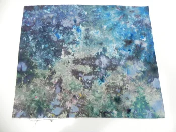
Then there's a more standard and striking ice-dye. I tweaked up my current-fave combo of Teal and Black (629? Can't remember which I used) by adding in some Intense Blue. I very much like that combination. This is one that'll sit on my cutting table for awhile so I can play "Rorshach Test" with it: IOW, "What does this design look like to you?"
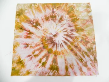
And, finally, I spiraled this fat quarter the same way I did the twist-front t-shirt, but in this sample you can really see the spiral.
Again, this is the Antique Gold and Old Rose combination. I think I could like it as long as I'm not wearing it. It's kind of weird, but sometimes weird can be good. (It looks a hair more green in this picture than in real life--lighting is such a difficult thing!)
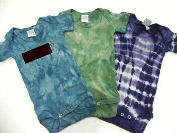
I also did a few more onesies as a gift for a new grandma in our guild. (I'm posting this after she'll get the gift so it should be okay!) The baby is a boy so I went for the gender-stereotyped-darker colors. It was fun playing around with mixing my dyes to get colors I liked. I used Ann Johnston's trick of having a piece of fabric that you drip a little of your dye combination onto to see what color you're making and what you might want to add to it. Helpful, plus I'm developing quite a fun piece of fabric with multi-colored splatters on it!
I photo-edited a big black box over the one that's personalized. You can see the last letter because last time I posted photos of a onesie I'd personalized without showing the actual personalization for privacy reasons, I got a couple of requests to see how the lettering worked.
And here's a closeup of the lettering. This is done with a stencil and Color Magnet. I've learned that Color Magnet works best with diluted versions of the dye color; that way, it's more obvious where the Color Magnet has drawn more dye. If the dye is too saturated, the Color Magnet disappears altogether.
The stencil has sort of a "Disney's Animal Kingdom" feel to the font. If I'm going to keep personalizing stuff, I should probably buy more lettering stencils. But it's kind of a pain and time-consuming to do so I don't see a ton of it happening in my future.
I had a few other results too, but can't post them at the moment for reasons best left unexplained. Until later. I've already got ideas for what I want to work on next in my dye studio, but it's likely to be another couple of weeks before I can get back down to the basement--which means I may completely change my mind about what happens once I'm there!


