Some promised pictures of pretty fibers

How was that for alliteration?

I'd talked in a recent podcast episode about the fibers I'd bought at the Fibre Garden in Jordan Village, Ontario (Canada). I'd said then that I'd post pictures...and then I got distracted by, oh, you know, work and life and such. 

So, belatedly but nonetheless still pretty...

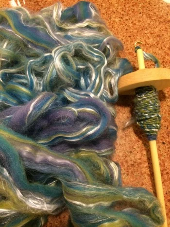
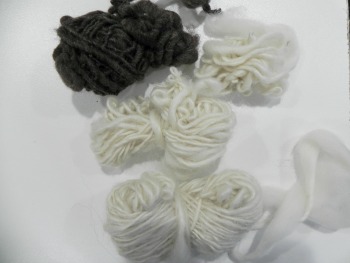
Two bags of pulled sari silk*--one group is called "Paint Box" and the other is "Warm Tones." I can't wait to play with these. I'm not good enough at spinning yet to be able to spin slippery and shorter fibers, so I will be using these as embellishments somehow. (Oops--just realized one of the bags was upside down when I took the picture. Sorry if I'm messing with your perspective, there!)

The long tube of dyed roving is named "Sorbet." I'm not normally a pastelly-kind of girl but this one grabbed me for some reason. I imagine it'll spin beautifully.


I have already started spinning the other tube of dyed roving that I bought. I was anxious to test out the new, slightly heavier top-whorl spindle I bought at the shop. The new spindle does work better with the thickness of yarn I'm able to spin at this stage. The more I practice, the thinner yarn I can manage. For now, though, my yarn is still thick enough that it needs a spindle that'll stand up to it. 

This spindle also has a notch carved into the side of the whorl which has been tremendously helpful in holding the yarn in place as I'm spinning. (I tried to carve a notch into one of my other spindles but couldn't make a dent in the darn thing.) This spindle is also able to be used either as top or bottom whorl, which may come in handy, although I've not tried to use it as a bottom whorl yet so I don't know how well it works that way.

And that's it! Not a big quantity of stuff, but the roving allows for plenty of spinning play time so I'm definitely getting a lot of bang for my buck!

*If you've not heard of it before: "sari silk" is recycled silk fibers from old saris. They're all the rage now in the fiber arts world because they're just so darn yummy! I think this link will take you to some Google images of saris, and this link should take you to images of recycled sari silk fibers.

Banned Books Week--My Challenge Project

Home again, home again, jiggity jig--so now it's time to talk about my own Banned Books Week project. Admittedly, it's a bit weird as quilt projects go, and it's not going to be numbered among my favorites, but I had a lot of fun putting it together and got to play with some new stuff. So it's all good.

This year, instead of doing a book I'd already read, a few months ago I looked over the lists of banned and challenged lists to choose one that I'd not read before. I landed on the book The Complete Persepolis by Marjane Satrapi. I chose this book for two reasons: The subject matter of the book is one close to my heart, addressing issues of women's freedoms, education, and oppression; and it also has a fantastic story of the attempted ban of this book in a school district and how the ban was fought by students themselves.

The Complete Persepolis is an autobiography in two volumes done as a graphic novel. Satrapi describes her life in Tehran during and after the revolution in 1979, an event which occurred when Satrapi was nine. Satrapi was the only child of two avant-garde parents who were very committed to the liberal education of their daughter. Prior to the revolution, Satrapi attended a French-Persian bilingual coed school. After the revolution the children were put into gender-exclusive schools with a curriculum subject to the revolutionaries' educational mandates. Satrapi describes the oppression, violence, and fear that she and her friends experienced daily. She's very honest about the impact that kind of setting also had on her and her friends, how they began to pick up on the violence themselves, and how it affected their relationships. The second volume of the book describes her high school years when her parents sent her to Vienna with relatives in fear for her safety, and her return to Tehran for college.

This book was removed by a district directive from all Chicago public schools in 2013 due to concerns about graphic illustrations, language, and student readiness for the subject matter. As word spread about the directive, the students themselves created a multi-media campaign including social media, writing articles for student newspapers, staging protests, checking out all the copies of the book from the school libraries, contacting the author, and appearing on local radio and TV programs. Eventually the directive was reversed and the book remained on reading lists and on the shelves in the school system.

I was taken strongly by the irony that a book about freedom would be banned. And I was taken strongly by the fact that the students who got it reinstated would so excellently show freedom in action. Students of Chicago rock! I'm proud of you!

And so...with all that background...let me now introduce you to...

"Subversion" 

Subversion.jpg

The image that inspired my project is from the second volume that describes Satrapi's experience as a young adult art student in Tehran.

"We confronted the regime as best we could," she says. "In 1990, the era of grand revolutionary ideas and demonstrations was over. Between 1980 and 1983, the government had imprisoned and executed so many high-school and college students that we no longer dared talk politics. Our struggle was more discreet. It hinged on the little details. To our leaders, the smallest thing could be a subject of subversion. Showing your wrist. A loud laugh. Having a Walkman. In short...everything was a pretext to arrest us. I even remember spending an entire day at the committee because of a pair of red socks. The regime had understood that one person leaving her house while asking herself: 'Are my trousers long enough? Can my make-up be seen? Is my veil in place? Are they going to whip me?' No longer asks herself: 'Where is my freedom of thought? Where is my freedom of speech? My life, is it livable? What's going on in political prisons?'....Showing your hair or putting on makeup logically became acts of rebellion."

subversionsockdetail.jpg

I was really struck by the image of red socks as a symbol of protest and subversion.

The socks are composed of a variety of fabrics to represent the freedom of diversity of human expression.

I wanted her feet to be in motion, symbolizing Satrapi's travels, as well as her ability to move forward through life despite obstacles.

I also created "stones" that both depict a street in a realistic way at the same time that they represent obstacles that those under oppression face, stumble over, and need to overcome to survive.

I'd had the image of the socks in my head for several months before I had time to actually sit down and create this project. As images in our heads tend to do, it kept getting more and more complex over time. At first, I was going to just do a basic fused applique of red socks under a fused applique black garment. Then I wanted to add stones. Then I wanted to do a dimensional garment using stiffened fabric. Then I wanted to make the socks out of scraps. Then I wanted all of the pieces to be dimensional. Yep--every one of those pieces is a 3D piece with batting, each its own little unit.That's why I took the pictures outside, so you could see the shadows the pieces cast. (All the fabrics except what's in the socks are my own hand-dyes, although that doesn't symbolize anything except they worked best for the parts I used them on.)

Each step created it's own issues I had to solve--not the least of which was how to attach everything to the quilt! I'll talk about that a little more in my podcast episode (hopefully tonight) because it's probably something better explained verbally than having an even longer blog post than this already is. 

I neglected to spread the word locally about Banned Books Week this year (it was a busy summer, but I feel terrible!) so mine is the only project being displayed in my local public library. I handed it over to my guild-friend-librarian and said, "Have fun figuring out how to hang this thing up." She solved the problem by mounting it on foam board. Brilliant woman!

Don't forget to check out everyone else's Banned Books Week quilts in the Flickr group! You've got through Saturday to enter yours. I'll be doing my drawing on Sunday; Tanesha will be doing hers on Sunday as well--she's got some great stuff in her giveaway too so be sure to check it out!. 

By the way--missed it this year? You can start thinking now about Banned Books Week in September 2015--this seems to have become an annual thing for us!


A Finish and a Craftsy Class Review: Thread Art with Lola Jenkins

Online Quilting Classes

Let me just start by saying, I had a ball with this!

The Craftsy class at hand is Thread Art with Lola Jenkins. My project ended up varying greatly from what she did in the class--so what you see here is inspired by, but not an exact replica of, the techniques she teaches in the class.

I'm hoping you'll see what fun I had with this and want to hightail it right over to Craftsy to sign up for her class!

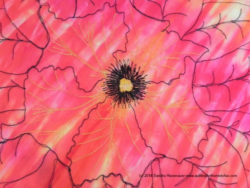
Hawaiian flower, my own photo taken in 2010

Hawaiian flower, my own photo taken in 2010

The foundation of the class project is using a copyright-free image to base your artwork upon. She gives a lot of ideas about where to get your copyright-free images, and provides one in the class materials (The Girl with the Pearl Earring); it was one I do really like and debated doing myself. But I generally don't want to do what I know a bunch of other people are doing, and it wasn't a portrait I had ever wanted hanging in my house. I went back to one of my own photos (taken in Hawaii in 2010)--one I've always intended to translate into fiber in some way or another.

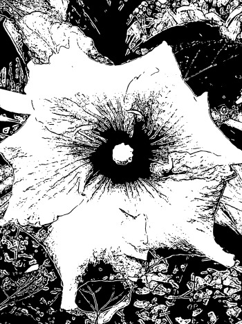
Photoshopped outline of flower

Photoshopped outline of flower

I'm not particularly good at drawing realistic things freehand, so I used PhotoShop to get an outlined version--more or less. There was at least enough outline for me to follow and trace the main parts. 

I stuck to the outline of the flower and each petal, plus the center stamen. I knew I'd be doing later quilting to give it more dimension.

I chose to do it on a white background so that the oranges and yellows of the flower would really show up well. I used one of my PFD fabrics as I had nothing else white in my stash that didn't have any print to it.

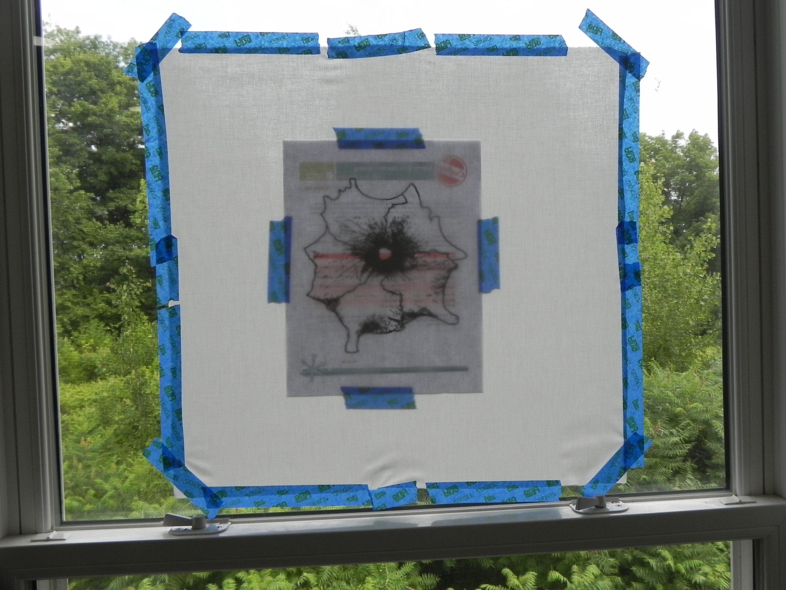
Windowpane light box

Windowpane light box

Then I used my trusty built-in lightbox (!) to do the tracing. Someday I'll have neighbors in that currently-empty-lot and and they'll wonder why the crazy lady next door keeps taping things in the window. I should come up with  messages to write on the back of the images I'm tracing. "Call the Mothership." "The Bear Flies at Midnight." "Send brownies." Messing with the neighbors' minds: always a good time.

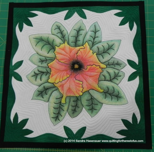
Lola Jenkins makes several suggestions in the class (for which you're going to need to buy the class to find out!) about other things to do to your design, but none of them were speaking to me for this particular image. I finally landed on what I think was probably my most brilliant idea of the whole process. I pulled out my Hawaiian quilt block book, chose a block design that had a great outside edge to it, and used only that part of the block to create a frame for the project from one of my hand-dyes. Love it. May have to do that more often! I also free-hand drew leaves around the outside of the flower to help balance the entire thing. I drew the leaf I'm most comfortable free-handing. @Nonnie_p pointed out that it looked suspiciously philodendron-esque. Hey, when you find what works, stick with it. 

I knew I'd be able to shade the leaves fairly well--I've done that before. The flower was a bit intimidating, though, with all the ruffley bits. I kept going back over and over again with slightly different colors or adding in a line here or there, and I'm fairly pleased with the way it turned out. 

Dimension in the petals

Dimension in the petals

I debated for awhile what color thread to use in the petals to make the dimension even more obvious. Black would be too heavy. But invisible thread may not be interesting enough. I had finally settled on red thread until I actually sat down to do the stitching...the red wasn't jazzing me as I pooled it on the petals to test it out. Then I realized--wait! I had all those Superior "Try Me" special variegated threads I'd been picking up lately. Bingo! One in orange, yellow, and red variegation. FTW.

I had a lot more fun stitching the petals than I thought I would--I was a bit nervous about this part, as I knew it could go from helpful-dimension to way-wrong-angles in the blink of an eye. But, again, I was pretty happy with the way it turned out. And that thread really is pretty. I also did some thread painting in the black center, and you can nearly see a corner of the stamen. I'd used a yellow thread to do circles in the stamen area, but the circles are so dinky and I could see what I was doing so poorly that it ended up being more of a scribbly-fill. But it worked, so I moved on.

I stuck to the theme of Hawaiian quilting and echo-quilted both the flower and the border, and I went with a simple fused binding with one of my black hand-dyes--nothing fancy.

And so, my finished class project!

And the back looks pretty spiffy too! (Used another of my hand-dyes)

And the back looks pretty spiffy too! (Used another of my hand-dyes)

And so, for my review of the class itself:

1. I had a ball doing this. It was a fun combination of quilting with my old fave hobby, coloring. (Coloring in geometric design coloring books was my main form of stress relief in college, in my pre-quilting days.)

2. I learned a new technique that can be applied in many ways in future art quilts.

3. I got more comfortable with free-form thread sketching, contouring, and so forth.

4. I realized I'm actually not too bad at shading and drawing. Still no Van Gogh, but hey, good enough for horseshoes!

5. Lola Jenkins is a very artistic person and I enjoyed hearing her tips and suggestions for tools, techniques, and different ways to achieve results. Please note that the description of my approach above is inspired by her class but doesn't follow it exactly. You really should check out her class to see how she does things. I have a few take-away ideas that I can easily see myself putting into practice in other projects even if I didn't use them here.

The Basics:

  • 11 lessons, ranging from about 6 minutes to 35 minutes
  • She addresses choosing materials, supplies and resources, how to set up your sewing machine, etc, and then has one full lesson on finding copyright-free art with some very helpful ideas.
  • The next lessons are about turning a photo or image into something you can trace on fabric, adding other elements to the design, transferring the designs onto fabric, creating your quilt sandwich, stitching it out, coloring (over two lessons, with specific tips about eyes, lips, and shading), and final steps to set the color. The last lesson is a gallery of her own work which gives plenty of inspiration!

I really enjoyed this class. Two thumbs up! 

One more time, that's Thread Art with Lola Jenkins. Get out your colored pencils and get ready to have fun!

(Transparency statement: Clicking on Craftsy links in this post helps support this blog and podcast. Thanks!)


Sundry Catch-up Items

A few things I never really talked much about in recent podcasts or blogs...

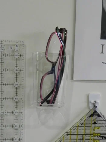
I bought a couple of new 3M containers for my quilt studio/home office. Really. It's an addiction.

glassesholder.jpg

I have drugstore readers all over the house at this point. This pair was designated for my cutting table/sewing machine area. As you may guess, they often end up under piles of fabric scraps, buried under the quilt project at the machine, on the floor....

When I saw this little container, the perfect solution hit me. Now my readers live on the wall within easy reach of my cutting table. I'm pretty good about putting them back in there when I'm done with them, too!

Another problem that has arisen for me of late is spools of thread. I have good storage for thread that's not in use, but when I'm switching back and forth between projects, or switching threads mid-project and thinking I might go back to a previous one, the spools in circulation get in my way. I don't want to put them back on the rack or in the drawer because I don't want to lose track of which I'm using, but I get tired of moving them around or having them roll off surfaces while I'm working.

Bingo.

This container is for toiletries or some such--I think it had nail polish in it in the display. But it's exactly the right size to hold a few spools of thread and bobbins that are in a holding pattern. Immediately to my right, I can quickly drop a spool in or pull one back out. It's been extremely useful!


So those are my organizational tips for the month. I love these things.

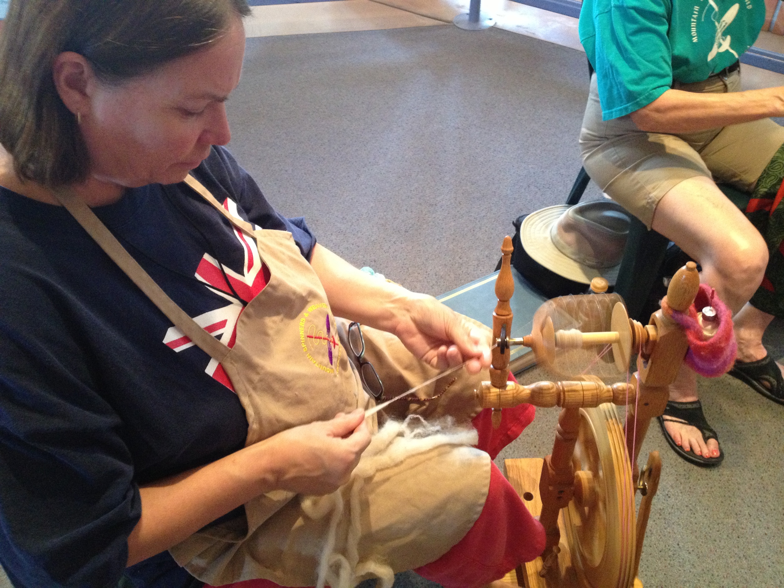
The other catch-up item is my hand-spinning. I mentioned in my podcast that I had a two-part class this month: The first week we worked with drop spindles, and the second on a spinning wheel. I won't go into detail here since I did talk about it on my podcast. But here are some before-and-after-and-during pics.

First, here's a progression of my spindling. The ones at the top are earlier attempts, the ones at the bottom are more recent. I tossed a couple of very early ones because they got all tangled when I pulled them off the spindle. Still n' all, you can see my improvement in evenness and thinness in these samples. They don't all have to be thin, and they don't all have to be strictly even, but I'd like to learn the control so I can be thin and even when I want to be!

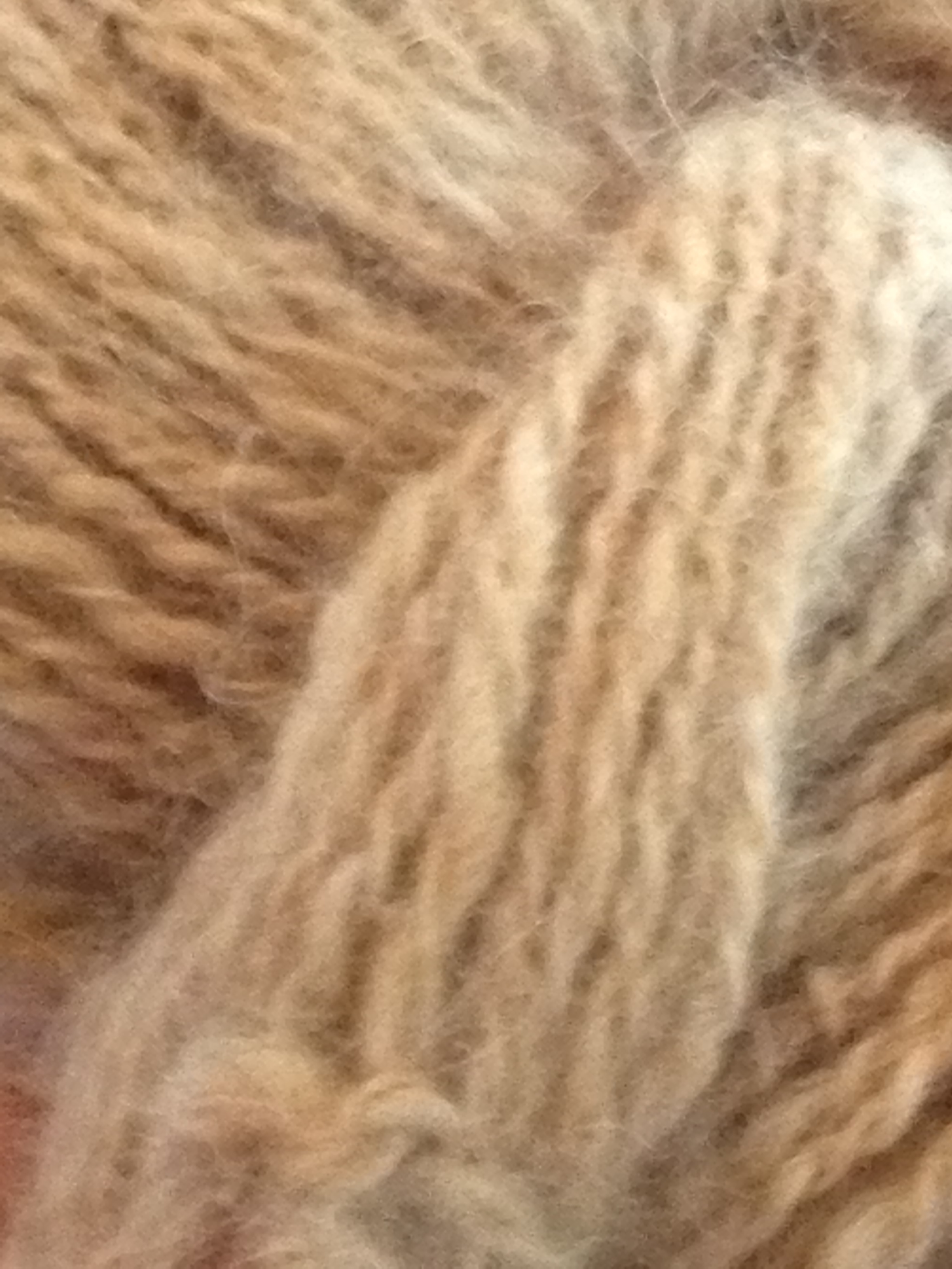
This picture is a two-ply yarn spun and plied completely on my drop spindle the first week of class. I believe it's alpaca, but don't quote me on that. It was called "cookies and cream" because the roving had brown and white together. Delicious. I'll buy more of this when I go to the fiber festival again in a couple of months. I'd like to treat it the way it deserves to be treated.


This picture is the two single yarns (another two-tone roving on the right--so much fun!) and then the ply of them together done on the spinning wheel the second week of class.

I struggled with the plying on that one because there was no lazy kate so the yarn balls were just flying around at my feet. Hard to get into a rhythm. But it was fun to try.


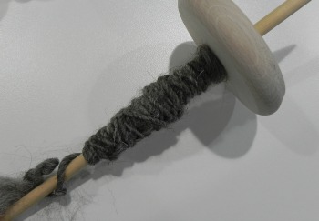
And last, here's what's on my spindle now. Still need to get a little more even but this is a different fiber and I'm just getting used to it. I think it's Louen wool...does that sound right?

Anyway...just some sundry stuff keeping my hands busy and out of trouble!


Gift Project Complete

A friend commissioned me to make a gift for her daughter who graduated from high school a few weeks ago. Yes, "graduate-d." I missed the deadline a bit. But still, she hasn't started college yet so it's still good. Isn't that in the etiquette books somewhere?

In any case, it took me a long time to decide what to do. When I'd asked my friend whether she wanted me to hand-dye something or quilt something, she said, "Whatever you want to do!" So, as it turned out, I did both. This projects is done on my hand-dyed fabrics, and its quilted. To within an inch of its life, actually.

I decided to do a word quilt. I chose a Scripture that felt to me like it fit her daughter, who is a tremendous vocalist, planning on continuing music in college, and whose faith is very central to her life. Since I didn't have it in me to do a lot of words, I just cited the verse. I thought it might be a little intuitive, anyway, since it'll make people have to go look it up. I'm a teacher at heart, I guess. That's my story and I'm sticking to it.

I started out by using a new product: Sticky Fabri-Solvy.

I. Love. This. Stuff.

This photo is from my test sample--I kicked up the contrast in the photo so you could see it well enough. You can run Sticky Fabri-Solvy right through your printer. So after I designed my lettering in some software or another, I just printed it right off on the stabilizer. I didn't have to reverse it or anything, because it has a paper backing that I peeled off and it adhered to the right side of my fabric. I then stitched around the design, and soaked  the stabilizer off the fabric. Easy Peasy.

I decided to do it that way after my chalk-stencil method was a big fat fail (the chalk wouldn't stay in place long enough for serious stitching); and this was just so much faster. And, to be honest, I wanted to play with the stabilizer to see how it worked. The test sample worked beautifully, so I went right to work on the real thing. After I soaked the stabilizer off, I put my quilt sandwich together and then just outline-stitched the lettering again. That also gave the letters two thicknesses of thread/outline, which helped set it off even more.

I did have a bit of a glitch at that point.

I'd practiced on a test sandwich to set my tension and everything--it was all working beautifully.

I started stitching away on the real thing and it all felt like it was going swimmingly. I'd flipped up the back and checked after the first half inch of stitches or so, and it looked fine.

I should've paid more attention to how the bobbin was sounding. Something got unhooked somewhere and chaos was breaking loose on the back. I didn't see it until I came to the end of the word. Out came my new electric seam ripper. And then the Havel. And then my traditional seam ripper. Eventually, between the three of them, I did get it all undone. (Each seam ripper has its special gifts!)

That being said, that was really the only major snafu in the whole project. Everything else went pretty well, given how many new-to-me techniques I was throwing in this thing.

Free-motion feathers, using techniques I learned from Ann Petersen.

Background quilting circles and straight lines--the straight lines particularly being a design thought I got from Cindy Needham.

Shiva Paint stick highlights--it's been awhile since I got to play with my paint sticks and I haven't used them on a quilt like this ever.

Metallic thread--which I haven't used in probably over 10 years.

And bling. I've never blinged before. What a hoot.

And so...the end result. (Drum roll please.....)

Psalm 98 quilt complete. Approx 14'x16".

Psalm 98 quilt complete. Approx 14'x16".

And, because it's hard to see the sparkle in that lighting...

(Actually, the picture above is also the result of what I've been learning in my Craftsy photography class. To try to get the sparkle to show, I worked with some settings I recently learned that I have on this camera. But more about that class in a different blog post.)

Can you see the metallic thread outlining the feathers in this picture?

It's subtle, but it's there.

I'll probably talk more about this in my podcast episode this week (which, as of this writing, hasn't been recorded yet). I'll talk about using that metallic thread, especially, and some other slight hiccups along the way, and what I did about them.

So, there it is. Of course, as I look at it, I see all the things I'd have liked to have done better. But it's done, and it's not bad, and I think both the mom and daughter will enjoy it. And I had fun doing new stuff. Though, admittedly, it'll be awhile before I'm ready to sit down and stitch little bitty circles and very-close-together lines again.


Hand-Dyed Results--A Little More Experimentation

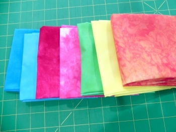
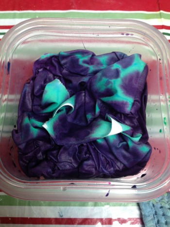
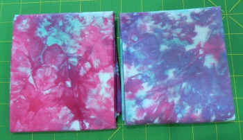
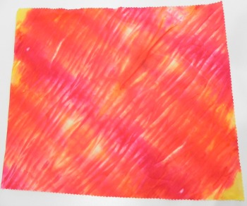
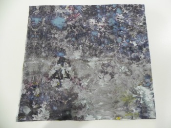
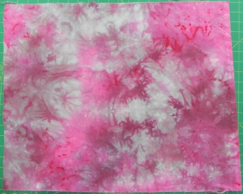
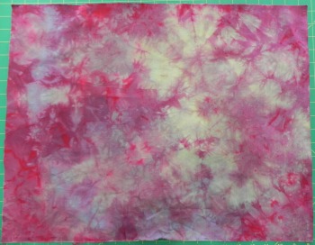
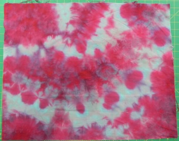
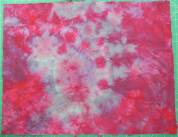
I did some more ice-dyeing last weekend; I'm not entirely thrilled with some of the results but that's the serendipity of this method--you never entirely know what you're going to get. Most times, it's a wonderful surprise and you get funky-fun things you could've never managed if you'd tried to control what was going on. Once in awhile, though, you get the other kind of funky. The not-so-good kind. That being said, beauty is the in eye of the beholder so who knows?

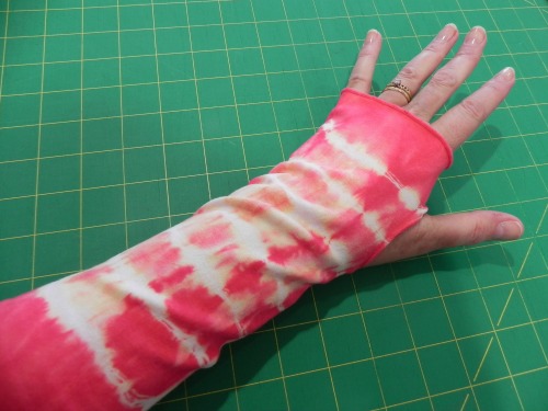
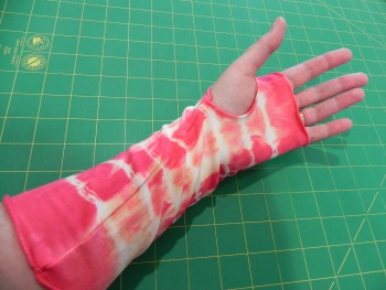
Some background: I've been testing out different types of dyeable clothing and accessories to see what I might want to continue working with. So far, I've not landed on anything other than scarves--and possibly the wrist-wrist warmers--that I've loved. Well, other than baby clothes. Those are just dang cute. In any case, you'll see here some more of my testing.

First up: A tshirt done with Fuschia, Grape, and Boysenberry dyes.

I ended up piling too much ice on this one in an attempt to cover all the pieces I was doing in this one dye bath. The items were therefore soaking in dyed ice-melt and blurred some of the normal ice-dyed effect. I'm also not keen on the way the t-shirt fits, although it's wearable. So, the results are nice enough but nothing to dance a jig over.

Twist-shirt front

Twist-shirt front

Next up, another style of t-shirt. This one has a twist in the center. I actually own a few store-bought shirts in this style, so I was jazzed when I saw a dyeable version on Dharma's website. However, I'm also not keen on the way this one fits--I ordered it in the larger size I used to wear rather than the size I'm wearing now, knowing that typically dyeables run a bit small. And yet, it's still tighter than I like. I knew that before I dyed it so I was more willing to try out a new color combination as well as a new fabric-manipulation technique on the shirt as I had nothing to lose--I wouldn't be wearing it in public anyway. (BTW, I've now ordered one in a size larger than I've ever worn in my life. We'll see if that one works!)

Twist-front back--the spiral is a little more evident here, as is the migrated purple dye

Twist-front back--the spiral is a little more evident here, as is the migrated purple dye

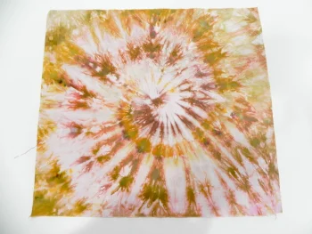
This one was done with Antique Gold and Old Rose, and I spiraled the shirt before putting it under the ice to echo the twist on the front. I think I sort of like the color results, although it's not a combination I can wear myself--not particularly flattering for me. Yellows are generally not my friend. I do like the spiral effect, though you can't see it as well on the shirt as you can on another example coming up. What I'm a little annoyed at with this one, though, is that I followed a tutorial on a hand-dyer's blog about using Retayne and she swore she dumps all her colors in one bucket and has never had a problem. I trusted her. And yet, some of the purple migrated onto this shirt. I'll be going back to separating my colors. Not blaming the blog--there are just too many variables.

And then, just for kicks n' giggles, I threw in a few scrunchies.

They're not exciting, though not bad (although the gold/rose is a little more muddy on these). It's not worth doing ice-dye on them because there's not enough surface area to really see that effect. So if I do more of these in the future I'll use different techniques.

And then there was the fabric.

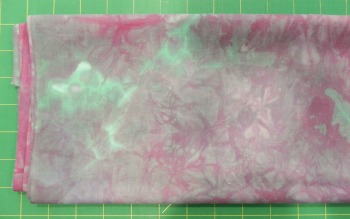
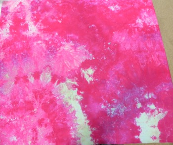
First, one that was in the fuschia/boysenberry/grape container--I like this color combo. I'll probably use it again in the future.

However, again, too much ice = too much water = muted ice-dye effect. Nice, but not exciting. Still n' all, I could see this being a background for something or getting cut up into smaller pieces for a scrappy-project or...whatevs. It's nice enough.

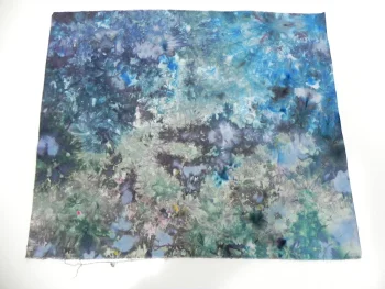
Then there's a more standard and striking ice-dye. I tweaked up my current-fave combo of Teal and Black (629? Can't remember which I used) by adding in some Intense Blue. I very much like that combination. This is one that'll sit on my cutting table for awhile so I can play "Rorshach Test" with it: IOW, "What does this design look like to you?"

And, finally, I spiraled this fat quarter the same way I did the twist-front t-shirt, but in this sample you can really see the spiral.

Again, this is the Antique Gold and Old Rose combination. I think I could like it as long as I'm not wearing it. It's kind of weird, but sometimes weird can be good. (It looks a hair more green in this picture than in real life--lighting is such a difficult thing!)

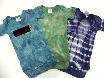
I also did a few more onesies as a gift for a new grandma in our guild. (I'm posting this after she'll get the gift so it should be okay!) The baby is a boy so I went for the gender-stereotyped-darker colors. It was fun playing around with mixing my dyes to get colors I liked. I used Ann Johnston's trick of having a piece of fabric that you drip a little of your dye combination onto to see what color you're making and what you might want to add to it. Helpful, plus I'm developing quite a fun piece of fabric with multi-colored splatters on it!

I photo-edited a big black box over the one that's personalized. You can see the last letter because last time I posted photos of a onesie I'd personalized without showing the actual personalization for privacy reasons, I got a couple of requests to see how the lettering worked.

And here's a closeup of the lettering. This is done with a stencil and Color Magnet. I've learned that Color Magnet works best with diluted versions of the dye color; that way, it's more obvious where the Color Magnet has drawn more dye. If the dye is too saturated, the Color Magnet disappears altogether.

The stencil has sort of a "Disney's Animal Kingdom" feel to the font. If I'm going to keep personalizing stuff, I should probably buy more lettering stencils. But it's kind of a pain and time-consuming to do so I don't see a ton of it happening in my future.

I had a few other results too, but can't post them at the moment for reasons best left unexplained. Until later. I've already got ideas for what I want to work on next in my dye studio, but it's likely to be another couple of weeks before I can get back down to the basement--which means I may completely change my mind about what happens once I'm there!

Birthdays all around!

birthdaytreat.jpg

Happy birthday to Bubba Jr, @ltdermdvm's Golden who's turning 14 today! Sammy sends birthday greetings and had a piece of birthday Milkbone in his honor. (It's blurry because although he posed for me he was a bit impatient to get at that treat! Princess Doggie's hindquarters in the background show her wagging tail as she quickly downed her birthday Milkbone. She's highly suspicious of cameras as a rule--no posing for her.)

Meanwhile, it's Craftsy's birthday too! They're having a big sale this weekend, through Sunday, May 11th, ad midnight Mountain Time. The banner on the right sidebar will take you to the sale, or you can just click here. Selected classes are up to 50% off. Yeah, I'll probably be checking it out myself, sigh. (Usual transparency statement: using Craftsy links on this page helps support this blog and podcast. Thanks!)

And, what am I doing for Mother's Day? Also a birthday of sorts--after all, it's a couple of births that got me the name "mother," right? Well, the day itself is still a bit under construction. I'm waiting for the first-born to let us know what hours he's working so we can plan around him. Meanwhile, yesterday the second-born came home from college for the summer, and she brought her bad cold with her. She ignored my pleas to pack those cold germs in a box and leave them there. I'm just hoping that cold doesn't turn out to be her Mother's Day gift to me.

I'm still recovering from a couple of back-to-back busy weeks with work, but I'm awake enough today to be decently productive. I got groceries this morning. Woo. Better than I did last weekend!

icedye51014.jpg

I also got this in the works.

Indeed, it's about 70-something degrees outside and our lilacs are a few days away from blooming, and yet I'm still ice-dyeing. I can't help myself. This batch is using some color combos I've not done before, and the one in the center is my new Antique Gold dye, so I'm anxious to see how that plays with the ice--as well as how it works with the Old Rose dye I combined it with. The one in front is Fushchia, Grape, and Boysenberry, and the one in back is Teal, Intense Blue, and a little Black (629, I think, but might be 628, not sure which one I grabbed off the shelf). I've got some fat quarters in each as well as some clothing items. Should be a fun rinse-out in the morning!

Groceries. Check. Ice-dye prepped. Check. Chicken breasts in marinade for grilling tonight. Check. Shower. Check. Lunch. Check.

Hmmm. I think it's time for some Scrapitude binding!

A Finish-- "A Walk in the Woods"

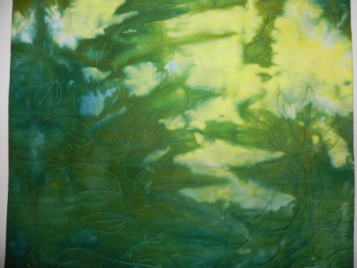
As I talked about in my most recent couple of episodes (154 and 155), I had some homework to do for my design study group around "luminosity." Luminosity, if you're not familiar with it, is making it look like there's an internal source of light in your quilt, as if it's glowing. This is a tricky thing to achieve--it all has to do with value and placement of colors next to one another and such. Just having contrast doesn't necessarily equal luminosity. (This is one of my favorite examples of a quilt with luminosity.)

In any case, I saw this as an opportunity to use one of my favorite hand-dyed pieces from last summer. This is one of several that I refer to as my "tapestry hand-dyeds," because they're a half-yard of fabric, measuring roughly 18" by 42" or thereabouts, and turned out such that I don't see myself ever wanting to cut them into smaller pieces; therefore, I imagine them becoming backdrops for some sort of a long, rectangular, "tapestry-like" wallhanging.

And so, I introduce you to "A Walk in the Woods."

Walk in the Woods complete

Walk in the Woods complete

I wanted the hand-dyed fabric to be the stand-out here, so I kept my quilting and choice of thread more subtle. As it turned out, perhaps I went a little too subtle: When it's on the wall and you stand more than about five feet away, you almost can't see that it's been quilted at all. Oh well, I'm still quite pleased with the way it turned out.

Quilting in progress

Quilting in progress

The above was a picture I took of my quilting in progress. I'm still learning my FMQ and decided to just haul off and have at this one, trying to stay loose and happy while I was doing it. It actually turned out pretty well. A few places got a bit whonky, but again, can't see it from five feet away anyway!

Detail of bottom

Detail of bottom

Detail of quilting around the middle-ish

Detail of quilting around the middle-ish

Detail of quilting at top

Detail of quilting at top

I also did a little perspective, though not religiously so, on the leaves--the ones at the bottom are, for the most part, larger, and the ones at the top are, for the most part, smaller. I tried to make it all one continuous vine but I did end up having two different places, if I recall, that I had to end and start over somewhere else because I worked my way into a corner and would have had to backtrack over my own lines further than I really wanted to. But you can't see it, so let's let that be our own little secret, shall we?

Faced binding detail

Faced binding detail

This was the first time I did a faced binding. I like it. I want to do it again. And again. And maybe even again. Thanks to Susan Brubaker Knapp for her tutorial!

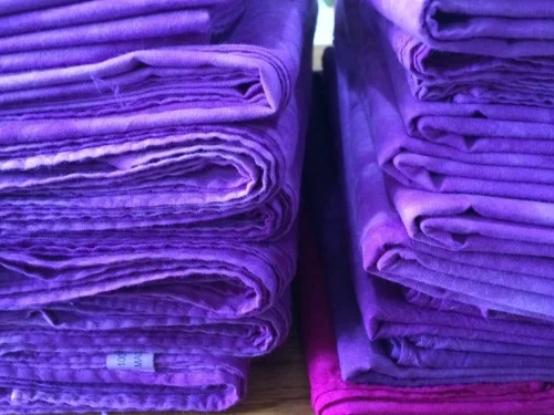
Oh, and I got all those purple scarves done.

(The ones on the bottom of the right-hand pile were my first three test scarves.)

Talkin' 'bout some hand-dyes, oh yeah

Yes, indeedy, the mad quilt scientist (who even has her own hashtag, 'cause she's just that cool) has been busy in the basement again.

The stationary tub has been cured. Oh, my, but water slurping down a drain as it should is such a lovely sound.

To catch up on dye progress since my last post on the subject...get ready for a boatload of pictures! (Some of the pics are singles, others are galleries. The galleries are set to autoplay but also have controls so you can move through them at your own pace. If you're getting this by email and the galleries don't work, you may have to view it on the website.)

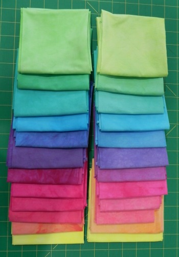
This time I re-did the pastel version of the gradations from the Frieda Anderson class in Lancaster (and her book). The Lancaster ones are on the right, the new ones are on the left.

Just as in the first gradations re-do, most are about the same but a couple of colors vary pretty significantly. And, just as in the first gradations re-do, there are oh so many possible reasons why.

I do think I didn't dilute my concentrate quite as much as we must have in Lancaster, since mine aren't quite as pastel-y. But I'm quite okay with that.

Still n' all, I like what I ended up with, so all's fair in the world of hand-dyeing.


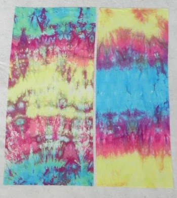
Then I did a different kind of gradation--gradation all on one piece of fabric.

I'd taken a picture of these in their dye baths so you could see the before-n-afters, but can't find the picture now. Sorry about that. I did sort of a loose pleat on one and a scrunch on the other, folded them in the middle to get them to fit the container, and laid them lengthwise. Then I poured three different colored dyes on them in sections--one in the reverse order of the other. These were still the pastel (diluted) versions of the dye concentrates--turquoise, fuschia, and yellow, which is why they look a little washed out. They're half-yard lengths, if you're curious. Don't even ask what I'll do with these. No idea, but that's not really the point for me!

And here's a gallery of other random bits I dyed trying to use up the rest of this set of dye concentrates so I could move on. I included the picture of one in the dye bath--it's a great example of how some colors are quicker to move into available space than others. That turquoise, he's an aggressive little fella. "Me first! Me first!"

And there was evening and there was morning, the second day. (Well, okay, a few "second days" later.)

This past weekend, I finally got myself over to Lowes to ask if they had the equivalent of a remnant bin of PVC pipes. I only needed sections about 12" or so long, and didn't want to ask them to cut that length off several different widths. I was hoping they'd have a scrap bin or something. Some of you may already have your eyebrows raised. "Has this woman never bought PVC pipe before?" Nope. I've now learned that home stores routinely carry 2-foot lengths of certain widths to be used as couplings or whatever. I am now the proud owner of four PVC pipe tubes ranging in diameter from 1 1/2" to 4". Whee! I was finally ready to do some shibori!

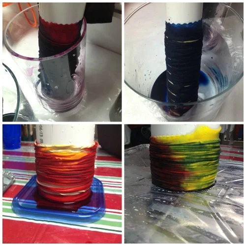
Shibori has all sorts of facets to it (I own this book for future playing), but what most people are familiar with is wrapping fabric around a cylinder and either tying it tightly with string or using rubber bands. The wrapped fabric then gets shoved down to the bottom of the cylinder creating a number of folds. When it's dyed, the folds create visual texture.

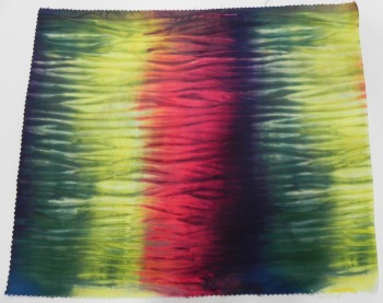
I was using Mixing Red, Lemon Yellow, and Deep Navy Blue on this one. The navy blue is a new dye for me so I wasn't sure how it would behave. Turns out, it's just as aggressive, if not more so, than the turquoise.

Here's a photo of the shibori dye bath.

shibori.jpg

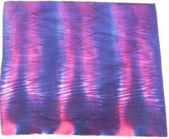
And that turned into these...

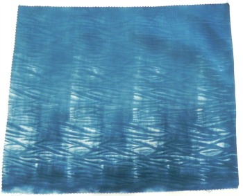
I did one with just the navy blue because I wanted sort of an indigo effect. However, due to it's aggressive nature, the blue paid very little attention to the resist of the rubber bands so the resulting shibori pattern is very subtle. I like it, but next time I'll dilute the dye more so perhaps it becomes a little more humble in its approach.

And then I went back to my ice-dyes. As I've mentioned before, ice-dyeing is the best way to break a compound color to see all the colors that go into making it. I decided to ice-dye my two black dyes (628 and 629) side-by-side to see if, by breaking down the colors, I could see a difference.

Here's 628.

Kind of fun to see all the blue, yellow, and a bit of red appear here and there!

And here's 629.

According to ProChem's website, 628 is more of a blue-ish black, and 629 has more of a green cast to it. They were described to me as one being a bit warmer and the other a bit cooler. I've yet to use either in a circumstance in which it seemed to make a difference, but I haven't really pushed the envelope yet either.

Going back in time a little bit: The weekend before last we had a spring snowstorm. Not altogether unusual around here, though the 11" in my backyard the next morning was pushing it, in my opinion. I decided to find the silver lining and did some snow dyeing.

Yummy. Love this one. I used Stormy Grey, Old Rose, Camel, and Ecru (ProChem names) because I thought these neutrals would break in interesting ways. I was right!

Next up, turquoise and fuschia. This one didn't have as interesting a result because (1) turquoise and fushchia are pure colors so nothing breaks and (2) they were the leftover pastel versions of the dye concentrates I'd mixed, and with the snow, they just became even more dilute. Still, pretty enough...

And, for the last bit of snow-dyeing, I went back to my standard favorite mix: teal and purple. I just can't stay away from these--different results every time but always gorgeous!

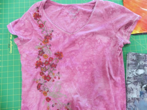
And the last little gallery--all the other bits I tossed into dye baths. Some more yellows since I'm working on "luminosity" for my design study group (although after this I found something else that's just PERFECT to use for that homework assignment...but I'll keep that under my hat until later); a tshirt of mine that had gotten stained so I tossed it into a dyebath of colors I had handy, not overly worrying about whether the color would work with the embroidery; and my first test run of wrist warmers. Which I love and have been wearing for the last two days, so I'll definitely be making more of those!


A Finish! Craftsy Class Review: Stupendous Stitching

I finally finished another Craftsy class, and this one has been a l-o-n-g time in process. I first started working on this sometime around January 2013, made a little progress, hit a stopper, and subsequently let it languish until sometime around mid-January of this year. That wasn't because it was difficult, or boring, or something I wasn't enjoying; it was pure "Dang, I can't finish this until I..." and then getting distracted before I completed the "until I..." portion.

But I'm done! Woot woot! And so, I can now officially post my review of...

Carol Ann Waugh's "Stupendous Stitching" class on Craftsy

I did have a whole lot of fun with this class!

Well, that is, I had fun once I finished this.

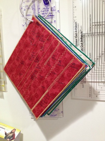
The first part of the class is making a "Stitch Bible." Carol Ann suggests starting out by creating a record of every stitch your machine can make. You start stitching each stitch in the default settings, then you make it wider, then longer. As she points out, some designs actually look like they're completely different stitches once you start monkeying with the settings. This was an extraordinarily helpful project--as she comments in this lesson, we probably have boatloads of stitches available to us on our machines that we've never used. Ahem. Yep. Now I've always got a quick reference. (And yes, they do look quite different stitched out for realsies than they do in the little diagram on my machine, so there's that, as well.) You can tell I didn't worry about having matching pages--I just used scrap fabrics and scrap threads so it's not a very pretty Stitch Bible. But I wasn't going for pretty. I was going for functional...and done.

Yes, this was the step that hitched me up and made this class take me over a year to finish. I made the first page or two, ran out of the stiff stabilizer I was using, and took about a year to get back to buying the supplies and creating myself enough pages to finish this. Over Christmas break this year, I got the remaining pages prepped so I could blast through and get the Stitch Bible complete. Boy, was that tedious work! Useful now that it's done, but mind-numbing to complete.

In this detail photo you can see the copious notes I took, ahem. Since I was generally using about the same settings every time, I didn't bother writing them down. It's enough for me to see the difference in stitch.

This was before I had an appropriately-sized grommet-maker. So I stabbed a hole in the corners with very sharp, pointy scissors. At that point, stabbing the pages over and over again with a sharp object was a bit therapeutic. This really was a tedious endeavor.

Ah, but once it was done, on to the fun stuff!

Carol Ann spends an entire lesson on how to choose a background for the Stupendous Stitching project. She does a great job showing choices that would work well and others that wouldn't work so well, and explaining why. It took me some deliberating to settle on which of my hand-dyes would work best for the actual class project. I needed something interesting, but not too busy.

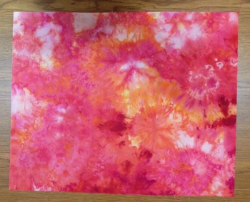
This was the winner. I thought the sort of circular "blasts" of color might give me some design inspiration as I went. (It looks a little more vibrant/busy in this photo than in real life. I think you'll see that better in the finished reveal.)

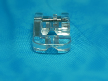
The first step is couching. You couch a few lines on the project that sort of lay the foundation for everything that comes next. I ended up buying a special couching (piping) foot as the foot my machine came with didn't have a deep enough groove for the couching I was doing. This is the "Pearls and Piping" foot--I believe it's the one Carol Ann recommends in the class. I love it. It's a great foot. The one trick is remembering to move the little plastic piece that sits on the bar where it latches onto the shank--that little plastic piece adjusts the placement of the foot in relationship to your needle, which changes where the needle hits in relationship to what you're couching. Got it? This caught me up a couple of times--I'd get started and take a few stitches, then realize I'd not adjusted the little plastic piece. Still n' all, a great foot.

I had a blast using some great sari ribbons and sari yarns--ribbons/yarns created from scraps of old Indian saris. Beautiful stuff, bought a couple of packages of them two or three years ago, never knew how to use them. Wow, did I have fun! Well, except that the sari ribbons had a lot of fraying along the edges that eventually caused a bit of a mangled rats nest under the needle.

I call shenanigans.

Fortunately, nothing broke, and after 10 minutes with a very sharp pair of snips, tweezers, and a quick vacuum with my mini-attachments, we were back in business.

I used three large sari ribbon pieces and one narrower sari yarn. They added great color and texture, but the three ribbon pieces were a bit visually overwhelming. I sent @knittyAJ (AJ of The Quilting Pot podcast and I Knit N Quilt 2 blog) a quick email, since she'd done this class last year at the same time I started, to get her suggestion. She suggested I get over myself. Well, okay, she said it a whole lot nicer than that and it was one of the options I'd said I was considering in the first place, so I agreed. Thanks for the "call a friend" lifeline, AJ! Very helpful. I decided to leave it until much further in the process to see if doing everything else would soften the impact.

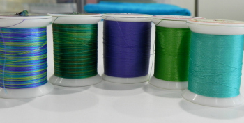
The next step is using your decorative stitches. Here I got to play with a whole lot of gorgeous threads I've collected over the years and, again, never really knew what to do with. (This was just what I started with--I added a lot more later!)

You do more lines with decorative stitches, and then you do some hand-stitching as well.

I had a whole lot of fun trying out some new stitches and getting ideas from the Creative Stitching book by Sue Spargo that I reviewed on a podcast episode awhile back. I got pretty good at French knots and lazy daisies, although my daisies were a bit hodge-podgey in size and petal direction. I choose to call it whimsical and move on.

Here's another example of my couching and some hand stitching.

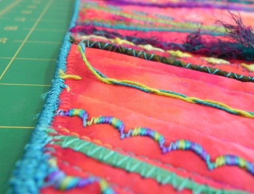
In this one, you can see my ultimate solution for those overwhelming sari ribbons. When I was doing my hand-stitching, I decided I could try hand-couching them down and seeing what happened. I liked it! Nothing had to get ripped out, and now they're all interesting texture without taking over the piece.

(The hand-couched ribbon is on the left. The thicker couching on the right was sari yarn machine-couched. Hand-stitched lazy-daisies, hand-stitched threaded chain on far right.)

And some more detail of decorative stitches, hand-stitching, and couching.

You can see how much fun it is to just cut loose and say, "What can I try to do next??"


By the way, when you take this class (and you know you will!) pay attention when she says to stop the hand stitching a fair amount inside the edge. I didn't. Oops. I cut through some of my knots when I trimmed up the edge and had to go back to hand-tack a couple of my hand-stitching ends back down. Glue may have been involved.

You can also see in this picture the rat-tail binding technique she shows--a new technique for me! I had a little trouble with it here and there because I was using a braided cord that frayed like the dickens when I cut the end, and I also had very thick couching pieces that my zig-zag had to wrestle its way over. I used my Pearls n' Piping foot again for this step and it worked much better than my regular presser foot. Still, I couched over it twice to be sure, and then had to shave off some frayed ends with my snips. It's a nifty technique, though.

So here's all the fun stuff I played with through this process in one shot.

Pretty threads from a variety of sources, hand-dyed perle cotton from Laura Wasilowski's Artfabrik shop (bought in Houston a few years back), sari ribbons and yarns from Meinke Toy (check out their "toy boxes").

And, of course, my hand-dyes. (Also a hand-dyed on the back but there's a reason that hand-dyed piece ended up as backing. It's not exciting enough for a picture, but it's similar colors to the front.)

And here's the final reveal:


Sure, there's some things I'd approach differently if I were to do this again. I enjoyed it, though, and I did learn a lot about my machine, using different materials, and hand-embroidery. I can easily see myself using the techniques I learned from this in other projects, or creating "stupendous stitching fabric" for other uses, as Carol Ann Waugh shows in the final lesson (see "Basics" below). And I could imagine doing a few 9" or 12" blocks with this technique, set into a wall quilt with other blocks. That could be cool. I could see adding beadwork, or including needle felting....Lots of possibilities here!

So, if you're in the mood to play, to use a lot of intriguing materials and methods, and just be foot loose and fancy free for awhile (her mantra through the class is "there are no mistakes!"), this is exactly what the quilt doctor ordered. I do recommend this class. Once that dang Stitch Bible was out of the way, it was just a-whole-lotta-rockin' fun!

Again, that's "Stupendous Stitching" by Carol Ann Waugh. You won't be sorry.

The Basics:

  • 11 lessons, ranging from 5 minutes (the last lesson) to about 30 minutes.
  • After the introduction, the first lesson is a very helpful overview of the kinds of materials you could use; then the next lesson talks about the Stitch Bible. The following lessons then take you step by step through the process, with a ton of helpful tips along the way.
  • Last lesson is about five minutes of ideas for other ways you can use Stupendous Stitching techniques--pillows, purses, shoes, tablet covers, and the like.
  • The downloadable materials were great reference, and one, the "No Mistakes Poster," is worth sticking on the wall in your quilt studio!

(Transparency statement: using the Craftsy links on this blog help support this blog and podcast. Thanks!)


Spring Postcard Swap and A Tutorial

(Looking for the 2014 Quilty Resolutions Check-in Giveaway and Linky Party? It ends at midnight Saturday! Click here. Meanwhile...)

Kati and I both got one another's postcards, so I can now do "the big reveal" blog post!

Kati of Kati's Quilting and Sewing (and one of my #twilter peeps!) and I were partnered up by Sandi of Quilt Cabana Patterns for Sandi's Spring Postcard Swap. I love doing these postcards! It's a great, bite-sized way to try out new techniques, play with design principles or color combinations, and just all around have a good time.

Here's the postcard Kati sent me--a much-needed glimpse of spring while it was still snowing outside (despite the calendar).

It's wonderful! I love the colors she used, the shape of the tulips and the leaves, and the stitching designs. I especially like how the leaves look like they're jumping right up off the postcard. They're so happy!

Thanks so much, Kati! It's still sitting on my desk, reminding me that yes, spring WILL come eventually!

And here's the postcard I sent Kati.

I was double-dipping and used the postcard as homework for my design study group. We were supposed to do something using a triadic color scheme, so I chose purple, orange, and green. I made the "binding" by fusing narrow strips of one of my hand-dyed fabrics down, intentionally cutting it so I'd get the gradation of color along the edges.

I would've been happier if I'd used a brighter white background, I think. The cream color sort of tones everything down more than I'd like. Overall, though, I was pleased with the results. I mailed it in an envelope, though, as I wasn't sure the thread fabric would survive if I didn't!

Here's a detail shot--I was trying to catch the light so you could see the sparkles in the orange center. That's caused by the Angelina fibers I included in the thread fabric.

You can also sort of see that I did a running stitch a little in from the edge of the thread fabrics to tack it down securely but allow for some fringing on the outside all the way around.

I got to play with a couple of techniques on this.

The background and leaves were basically crumb blocks I made using random pieces of fabric--no foundation. I just started stitching stuff together until I made something big enough that I could then use to cut my shapes/background from. It's an age-old method, though I used Victoria Findlay Wolfe's 15 Minutes of Play book for inspiration. I've not done it before, though, so it was fun to mess with!

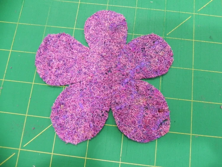
The petals and center are made from "fabric" I created using thread and water-soluble stabilizer. I did this technique once a year or more ago as a test project. This time, I wanted to see what would happen if I created a larger piece to cut into shapes. It worked great, though you need to use it for something you really want fuzzy edges on.

I've showed this to a couple of people and they wanted to learn how to do it, so I'm including a tutorial here. I didn't make this up myself, but have seen the technique in so many places now I honestly can't remember where I saw it first, and I just do it off the top of my head with no reference to specific instructions anywhere. So don't give me credit for the technique...just for this particular explanation of it!

I didn't remember to take pictures of each step, so I've added the pictures I did remember to take here and there; sometimes they relate to the step, sometimes they're just so you can see a little detail here and there. I'm also posting them slightly higher res than usual so you may be able to click in closer to see the detail of the thread fabric.

Thread Fabric Tutorial

To do this, you need:

  • Water soluble stabilizer. There are several options for this type of stabilizer; yours may not look like mine as mine's quite old at this point (Sulky brand, inherited from Mom, probably at least 5-7 years old or more). You just need a stabilizer that dissolves in water, regardless of brand or appearance.
  • An embroidery hoop that will easily fit within the throat space of your sewing machine, and is narrow enough to be able to fit under the presser foot. (Mine's an 8" diameter plastic cheapo-model; works great for this!)
  • Thread in the color of your choice to use for anchoring everything down (variegated is very nice; type of thread doesn't really matter much--whatever works best for you in free motion quilting);
  • Scraps of yarn, funky thread, cording, tiny scraps of fabric, Angelina fibers, or other textiles to create the fabric. Avoid anything too nubby as it might rip the stabilizer while you're working.
  • A bowl of water or a sink, and a drop or two of fabric softener (optional)

A note about color choice: Use whatever you want--the funkier the better! Make sure you've got at least some color variation for interest, but also keep in mind that the more you stitch, the more the colors of textiles will get blended into your stitching thread. On my orange piece, I went back in with a different variegated thread at the end because it had blended too much and didn't have quite enough color variation for my taste. That's the beauty of this technique, though--you can keep stitching away until you're happy with the results!

The Play-by-Play

1. Cut two pieces of water soluble stabilizer approximately the same size, a few inches larger than you want your finished piece to be.

2. Lay one piece inside one half of your embroidery hoop. (It's easier to do this now than move it into the hoop later when it's covered in scraps!) Make sure enough extends outside the hoop that it holds firm when the hoop is assembled. Press the stabilizer down so it's sitting on the table surface, and squish the sides over the sides of the hoop as much as possible--the less the scraps get shaken around later when you put the hoop together, the better.

3. Randomly spread your scraps of textiles, fibers, and so forth, on the stabilizer within the space of the embroidery hoop. Be sure to leave enough margin around the edge that you'll be able to get your sewing machine presser foot as far to the edges of your scrap pile as possible. You can pile scraps on top of each other, but try to keep the level of the pile fairly even all the way across. The thicker/more evenly spread your pile, the more opaque your thread fabric will be; a looser, more spread out pile will give a lacier effect. You don't have to be exact about it, but it helps in the stitching if things are pretty even. Higher spots can catch the presser foot and cause problems. If you have a longer length of yarn, loop it around on itself a bit to create interesting designs. Adding some Angelina fibers can create fun sparkle. Cut loose and play with what you can throw in there!

4. When you're satisfied with your collection, lay the other piece of stabilizer on top of it and secure it in the embroidery hoop. Note: Have it so that the stabilizer lays flat on the surface when it's in the hoop, not raised from the surface. In other words, it should be the reverse of what you'd normally do if you were embroidering by hand. Does that make sense? (You should be able to see that in the picture here.)

5. Now comes the really fun part! With a great thread in your machine, and your machine set up for free motion quilting, slide that puppy under your needle and go to town! Stipple, loop-de-loop, jiggidy-jaggedy...just make sure you've stitched enough to secure all those little bits and scraps down. As mentioned above in the "piling your thread" section, stitching more densely makes a more opaque thread fabric, stitching more spaced apart makes a lacier effect. Just make sure you stitch enough that the fabric actually holds together when the stabilizer is removed.

What's even better? Tension doesn't matter! If you see skipped stitches or "eyelashes" on the back, who cares? You're creating fabric! Thread nests can be easily disguised simply by stitching over them again--they become part of the texture of the fabric. (Ahem. Ask me how I know.)

The only problem that can occur in this step is if your stabilizer tears apart while you're stitching. (Again. Ahem. I know these things because....) This can happen if your pile is uneven or you have a textile that's too nubby, as mentioned above. Dull needles may also cause it. Small rips--just back up, and stitch over it to make sure the thread fabric is intact. Big rips, carefully dismantle the hoop and lay a third piece of stabilizer over the top, then start stitching again.

6. When you're happy with where you're at, take a deep breath, grin, then pop that sucker out of the embroidery hoop. If you want to avoid too much extra goop having to dissolve, you can trim off any excess stabilizer as I did in the picture here, but it's not necessary. Soak your thread fabric in a bowl of warm water to dissolve the stabilizer, or follow the directions on the package. I found it helpful to soak it for awhile, then rinse it under running water and rub it gently in my fingers, and then soak it again. I think I did this maybe three times over the course of a couple of TV shows that evening. In the last soak, I added a couple of drops of fabric softener--it helps release the last of the stabilizer and make a more pliable thread fabric.

I don't know exactly how long it takes to dry, since it was a full day before I had time to get back to it again, but I'd allow a few hours to be on the safe side. You can always hit it with a blow dryer as well, depending on what fibers you used.

Use good fabric scissors to cut it into shapes if desired. In fact, if you can, try to use really, really good applique scissors--the kind with the little grippy teeth work great to slice right through the variety of textiles without shredding. Again, I just used a straight-stitch about 1/8" in from the edge all around to stitch mine down, but you can attach it by hand, or tacking it in a few places--all depends on the effect you want in the end.

This is a super-super fun technique. I've gotten in the habit of saving all the raveled threads off the edges of my newly-washed hand-dyes for future use as thread fabric!

So, gonna try it? Huh? Huh?


Hand-dyed Results ('n link to 2014QR giveaway)

If you're looking for the 2014 Quilty Resolutions Check-in Giveaway and Linky Party blog post, click here!

Meanwhile, back at the ranch...Here's what's been going on in my life while y'all have been checking in and linking up!

Despite a flooding stationary tub crisis and dyeing my hand a rather funereal shade of blue (which, actually, was partly related to aforementioned flooding crisis)...

I finally managed to get my most recent set of hand-dyes rinsed, washed, dried, pressed, and photographed!

If you recall my previous blog post, I started out by redoing some of the gradations I'd done in Frieda Anderson's dye class while I was in Lancaster. I wanted to be able to more closely follow the process and take notes on recipes and so forth. Somehow I hadn't managed to bring home the handouts from class, so I was going by the recipes in her book Fabric to Dye For.

The gradation at the top of this photo was the first one done in Frieda's class. The one on the bottom was the one I did at home this weekend. Most look more or less the same, but a couple are slightly different, and others are very different. There are several possible reasons for that--variations in recipes, variations in procedure, variations in water...

In any case, I'm not sweating it. I'm keeping samples of the ones I did here at home as representative for my notes with the recipes I used and all sort of other useful-for-the-future factoids.

And then, just for fun, I'd thrown in...

...some bamboo socks (PFD from Dharma Trading). These were dyed in straight Fuschia, Turquoise, and Lemon Yellow dyes (ProChem names). You can see that, due to aforementioned flooding crisis, I had to fast-track the rinsing process and thereby ended up with some color migration. Minor-league frustrating, but since these socks are for me and I'll only be wearing them under jeans, no one will see that. So shhhh...keep it just between us.

And then...

A pareo (I finally remembered the word!) for myself this summer. A pareo is the cloth you wrap around yourself when you're wearing a bathing suit. I couldn't get the whole thing in one picture, so this is one half of it...

...And then the other half...

I mostly took this second view because you can see more of the tangerine dye in this one (upper right). That was one of the new colors I was experimenting with. It looks very brown in powder form, so I was gratified to see what a beautiful orange it turns into. This was ice-dyed, by the way. It looks a little less mottled because there was a whole lotta fabric and only a little ice, so it doesn't have quite as strong an ice-dyed effect as others.

I may do more of these--they're fun. Anyone want a pareo? Tee hee.

And then--because who can resist?--more baby stuff!

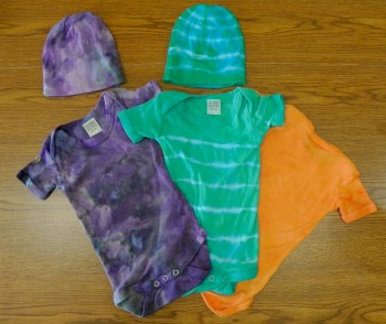
I'm so pleased! These turned out great! And ya gotta love the little caps too! Don't you just want one? Again, it's all bamboo. The one on the left was ice-dyed, purple and teal. Probably my favorite combo to ice-dye because it just gives the most interesting results. Love the shades of gray that appear!

The middle one was rubber-banded and dyed in a teal-ish mixture. Trying to get those rubber bands off in a hurry (did I mention the flooding already?) is what caused the blue fingers. Rubber bands and rubber gloves don't mix, so I finally bagged the gloves. I love the effect of the onesie, when I don't let myself think, "Gee, kinda looks like an old-timey prison uniform or something." 

The orange onesie on the side is upside-down because I used Color Magnet and stenciled my grand-niece's name on the front. It turned out great, but I don't want to broadcast her name without permission. The Color Magnet draws more dye to the spot where you use it, so her name is a darker orange than the rest of the onesie.

Fortunately, no dye migration on any of the baby clothes. I'm really pleased with how they all turned out.

Mr. Plumber showed up bright and early this morning, and we're hoping the flooding issue has been solved. However, he also informed me that the pump is well past it's average life span. Bully. Just another appliance to add to our list of "everything needs to be replaced at the same time."


Some Unexciting Hand-Dyeing

Well, I *did* get back into my dye studio this past weekend.

Of sorts.

I finally cleaned up way-old dye concentrate. The last time I'd had a big dyeing session was probably the end of October or early November. Perhaps even before that. I hadn't dumped my dyes because I fully intended to get back down there to use them up. Never happened.

You see, dye concentrates are really only expected to last maybe 2-3 weeks (as long as you've not added soda ash), although I've stretched mine a couple of times as much as 5-6 weeks and there wasn't a noticeable difference. My basement is chill enough, which is probably key.

But. Ahem. Four months was likely seriously pushing it. However, because I'm big into experimentation, I decided to throw a few pieces of fabric into a few Way Old Dyes just to see what happened. The results are unexciting. What happens is that Way Old Dyes lose their chutzpah. The colors aren't as strong and didn't catch as well--it felt like a lot more was washing down the drain than usual.

grays.jpg

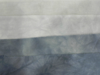
I did four fat quarters parfait-style (stacked one on top of another in a tall cylinder), and used up the leftover black dye concentrate, adding water so I'd get graded fabrics, the ones on top being lighter than the ones on bottom. And it worked, but they're all lighter gray than I think they would normally have been.

The one on the top in this photo is the lightest; I'd refer to it as "Ever-So-Slightly-Gray." It's basically a foggy white. The next one down is slightly darker although that's hard to see in this picture. The other two differ from each other mostly in the middles--the one on the bottom is more consistently dark than the one right above it.

I'm keeping them all, of course. I mean, really--who hasn't gone into their stash thinking, "I wish I had a really good foggy white"?

red1.jpg

The next set was also stacked parfait-style, but this time I used four different colors. I knew, with the colors I chose, I could end up with sort of a muddy yellowy-brown thing going on, but I dig muddy yellowy-browns. I think they're interesting.

In this set, the colors clearly came out more dulled than they would usually, And the bright red spots you see here and there are the visible evidence of the fact that the red dye concentrates had gotten distinctly crusty. Chunky, even. A bit of a crystallization thing happening.

red2.jpg

I believe (don't really remember now) that the four colors I used were Mixing Red, Mixing Blue, Golden Yellow, and Fuschia, one on top of the other. There's a couple of ways to do parfaits where you get more distinct separation between the layers of color while still getting some artistic blending. But I was just dumping stuff in to empty out dye bottles. Like I said, I wasn't particularly worrying about results--I just wanted to see how Way Old Dye would change.

red3.jpg

I won't say I'm happy or unhappy with the results. I actually got about what I expected to get: I had assumed Way Old Dye would lose some oomph. I have distinctly less oomph at 48 than I did at 28, so why would dye be any different?

I'm not excited by any of these fat quarters, but they're still usable. In fact, I'm thinking they might be fun to use to practice free motion quilting on. I won't feel like I've got anything to lose and if it turns out looking nice, so much the better!

red4.jpg

I wasn't able to use up all my Way Old Dye in these samples--I did end up dumping the rest down the sink. But now all my bottles are cleaned out and ready to go for when I've got the time to mix up fresh Spry New Dye.

Next week, when I'm at the AQS QuiltWeek in Lancaster, I'll be taking Frieda Anderson's hand-dyeing class. I have her book and have already used her dye techniques, but I haven't done the gradations using the recipes in her book, which is what we do in this class. So I'll have more fun hand-dyeing pictures in a couple of weeks! (And I'll be using Spry New Dye for that!)

Craftsy Class Review--Spindling from Fluff to Stuff

I finished two classes while on vacation this past week. Well, to be honest, one of those "finishes" was simply, "thinking about it awhile and needing to make a judgment call." That'll become clear in my review below. I'll review the classes in separate blog posts, however, so I have a little more room to go into detail.

Photo Jan 22, 2 35 21 PM.jpg

The first class I'm reviewing, Spindling from Fluff to Stuff with Drucilla Pettibone, is a great example of mental bunny trails.

I started hand-dyeing fabrics. "Gee," I thought, "this is great fun! What else can I dye?" The dogs quickly disappeared out of sight, but I began thinking about other fibers. "Wouldn't it be fun to dye my own perle cotton to use as embellishment on art quilts? Wouldn't it be fun to dye my own yarn to use for embellishments? Dye my own yarn? Maybe I should be *spinning* my own yarn!"

Someone stop me before I hurt myself.

Actually, in that, I'm channeling my father in a big way. I've mentioned before being a child of the Back to Nature Movement. I talked on one podcast episode about Dad not only getting into leather tooling, but eventually even learning how to tan hides himself (and I'm not talking the euphemistic, "I'll tan your hide, dang you!" that parents have been known to say on occasion). I don't know that Dad became particularly skilled at tanning hides as--vegetarians may want to close their eyes here--there was still visible hair on the leather he used to make his own briefcase. Not artistically so, either. In any case, if Dad was going to learn a craft, he was going to drill down to the most basic, fundamental component of that craft. I'm probably only one step away from asking my husband if he'd mind having a sheep or two in the back yard.

Well, not really. I've had up-close-and-personal-time with sheep. They're not all that cute and cuddly, despite the Easter cartoons. Digressions aside, I thought it might be fun to learn how to spin yarn, so I went to a Fiber Festival and bought a bunch of different fibers, and bought a drop spindle on advice from a woman demonstrating them as well as from one of the friends I was with who'd done some spindling herself. When I got home, I bought this Craftsy class.

I've now watched it straight through several times and have been practicing, although not as consistently as I should. I'm still not very good, but where I had to make the judgment call was that the only thing that will get me better is more practice--I could watch these videos until the cows (or sheep or alpacas!) come home and it won't add to my mental knowledge at this point. The knowledge know has to come from muscle memory and trial and error. Therefore, I'm now considering this class complete though I've got a l-o-n-g way to go before I feel comfortable spindling.

Did I like this class? I can't say that Drucilla Pettibone's teaching style really grabbed me. That's not a big deal for me as I can still learn, but it didn't make me really want to jump right into watching the next lesson, as other classes have. I also struggled a bit with certain aspects of spindling, and began to wonder if watching someone else's technique might help. I'd gone back and re-watched certain portions of this class several times and still didn't feel like I was "getting it." That could be me, or it could be the teaching style, or it could simply be that I have to do it for a few weeks more before something clicks. Since I have no experience in the world of spindling, it's hard for me to judge that.

Photo Feb 08, 12 17 48 PM.jpg

I even decided to go ahead and buy the kit that went along with the class so I'd be using her spindle and her fibers, hoping that would help. The main benefit to having done that is my original spindle, bought at the festival, was top whorl and somewhat lighter weight than the spindle that came with the kit: a bottom whorl that was a few ounces heavier. That meant I could feel the difference in spin and how they behaved--different spindles work well with different fibers and give you different types of results. She does talk about that in the class but until you feel it in your hands and can watch it in action, you don't really know. So I certainly feel that buying the kit, even though I already owned a spindle and a whole lotta fibers, was still a good expenditure for my learning curve.

There is one big downside to this class, though, which I'm hoping is just a temporary thing. Drucilla seems to be a bit hit-and-miss about answering questions on the platform recently. One of the things I like best about Craftsy is the interaction with the teachers. Some of them are quicker on the uptake than others. But they all answer, even when their classes are a couple of years old. However, Drucilla seems be a bit less responsive to questions of late. I posted about three things in the class and haven't heard back from her on any of them, and can see other students' unanswered questions building up. I saw a little activity from her a few days ago so maybe she's trying to catch up now. I suspect (from researching her blog) she's gotten involved in other interests and isn't as active with the Craftsy class at this stage. And that's fine--people need to be able to be released from responsibilities; I certainly get that one! But if you're not going to be responsive, it would simply be a good idea to let people know that.

In terms of me continuing to learn spindling: Enter listener Daisy F W and her email to me recommending Abby Franquemont's spindling video and book, both entitled Respect the Spindle, available through Interweave Press. They were both on sale that weekend, so I was able to buy the video as a download and the ebook, each for $5. (They're not on sale as of this writing--sorry!) I immediately connected with Abby's teaching style, and Abby's backstory is fantastic--she grew up in the Andes as the child of anthropologists and learned how to spin in very traditional methods from Peruvian women who thought it was pretty shocking that the five-year-old Abby had never held a spindle.

I haven't finished watching the video or reading the book yet, so the jury is still out as to whether I find it more helpful than Drucilla Pettibone's Craftsy class practically-speaking, however. I just have to keep watching and practicing.

To be fair to Drucilla, this is the first Craftsy class I've taken in which I've been starting at a complete ground zero. Every other class I've had at least a certain amount of knowledge--I've been cooking for a long time, and quilting for awhile, and have done a fair amount of work in photography. So the teachers were just building on knowledge I already had. But spindling? This was my first time out of the gate. So Drucilla had a lot of work to do with me.

Therefore, I think I can say that Spindling from Fluff to Stuff is a good introduction to spindling. It did get me going, taught me some fundamentals, and encouraged me to practice; and I did get some yarn made, even if it's not very pretty yet or, perhaps, even usable. But I can see the future if I choose to stick with it, and that's a good thing. Connecting with someone's teaching style is a very personal thing--other students in the class seemed to love her, so you may love her too. Watch her introduction to see what you think. If you decide to take this class, I would recommend buying the kit--it usually is helpful when you're new at something to start out using materials the teacher is using so you're not having to mentally translate every step of the way. I think that slowed me down a bit at the outset.

But I would also recommend, if you're interested in spindling or spinning of any kind, that you check out Interweave Press as well. They have several books and videos--Abby Franquemont's as well as others--on the topic.

The basics:

  • 9 lessons, ranging from about 6 minutes to 30 minutes. (The 6 minute lesson is the introduction.)
  • One lesson covers tools and different types of wools, how they each behave and considerations for each.
  • Through the various lessons, short-draft and long-draft methods are each covered, as well as "park and draft," although that comes later in the lesson line-up than I'd have liked as, from my understanding, it's more of a beginner method than the others.
  • Other lessons cover plying fiber, finishing yarn (soaking, winding into balls or hanks, etc.), other types of spindles, spinning art yarn (thick-and-thin spins, as well as adding other materials into your spinning). As you might imagine, my favorite lesson in here was the one about spinning art yarn--there was some pretty cool stuff in that one. I'm also really interested in the Navajo spindle she demonstrates--looks like cool stuff.
  • One short lesson at the end is "Using your yarn." This one didn't seem to make a lot of sense to me as it would seem that most people interested in spinning are probably already people who have been using yarn for something or other in the first place. But I could easily be mistaken in that.

Have you taken Spindling from Fluff to Stuff and want to chime in with your opinions? Please do! Everyone benefits from hearing reviews!
A Finish! Design Study Group Homework on Analogous Colors

My design study group is meeting tonight so I'm scheduling this post to go live after I'm already at the meeting...so thanks to the wonders of technology you'll get the "reveal" at the same time they do.

Our group is currently working with A Fiber Artist's Guide to Color by Heather Thomas, going through one workshop a month. For this month's meeting tonight, we were to do something using analogous colors, while also keeping in mind all the other design principles of balance, unity, repetition, and so forth.

peruviantoad.jpg

On one of my vacation days in December I took myself on an artist's date to our local art gallery and planned on studying such things as use of light, color, line, texture, and other things I could carry into my quilting.

While in the ancient art section, I fell in love with this guy. I just knew he'd end up in a project somewhere.

His face is just too funny.


peruviantoad2.jpg


He's a "Stirrup spout vessel: frog," from the Moche culture of the north coast of Peru, circa 300-450 CE.

Later, when I was pondering what I might do on analogous colors, I decided to challenge myself to use only 2 1/2" squares already cut in my scrap bin, plus hand-dyes if I chose. Once I made that decision, a design popped into my head.


Yep, Mr. Froggie-Fella was part of the design. Here is the end result.

FrogFellaProject2014.jpg
Photo Jan 27, 8 37 36 PM.jpg

I also had fun figuring out how to make the 3-D leaves. I've seen a lot of techniques for doing it in magazines, in blogs, and in classes; I've done some similar dimensional work before. I tried out a couple of different methods before finding a technique that worked well for this project. Different techniques apply themselves to different circumstances.


Photo Jan 27, 9 20 57 PM.jpg

But you've just gotta love that face, don't you?

(If you're curious, Frog Fella is made out of my hand-dyes and a thread that matched amazingly perfectly.)

Although it doesn't have an official name, I've found myself thinking of this as the Frog Fella Project.


Photo Jan 26, 9 42 57 AM.jpg

By the way, I did also make that chocolate babka from the Artisan Bread class that I'd mentioned. Yum.

No, that's not burnt on the top there. That's all nummy nummy dark chocolate.

Godiva dark chocolate chips.

60% cacao.

Can you tell I'm a fan?


Hand-Dyeing Results

As you're reading this, I'm driving far, far away... 

I'm heading a bit south for a packed week of back-to-back meetings, starting as soon as I get out of my car at my destination on Wednesday afternoon. I get home next Tuesday, so I'm making this quick post to tide us all over until I'm home and might actually be able to accomplish something again. (Well, accomplish something other than getting some sleep.) 

You may recall that I did some more dye experiments on Sunday afternoon. The results are in!

102013DyeCollage.jpg

 Top and bottom left: I was testing out a new technique picked up from Ann Johnston's DVD. I soaked the fabric in soda ash, then laid it out on a table (one of my newly-recovered-with-vinyl tables!), and then slowly poured a little dye on at a time and rubbed it in with my hands. Top picture is using gray dye and very intentionally creating folds and pleats in such a way to create some directionality. The bottom left looked a lot better wet--it's actually a mix of three colors (gray, yellow, and yellow green). It would make a nice background if one were looking for that particular, slightly odd shade of yellow-green-gray, but it's also a good candidate for over-dyeing or some other surface treatment. It simply wasn't what I was picturing would happen. And that's why I love dyeing so much. I so rarely get what I was thinking I'd get--it keeps me on my toes!

Bottom right: two purple scarves I did as testers for someone to look at during my meetings this weekend. I'm probably going to be dyeing about 50 scarves in all, by next September, for us to give out as gifts at one of our events. The one on the left is silk, the one on the right is cotton, both the same dye and dye strength. Just gives you a sense of how different fabrics react to the same dye.

Center left: Just playing with a couple of other cotton scarves I had on hand. Not overly keen on the way either of these turned out--the colors aren't as vibrant as I'd have expected. I'll have to look up what type/weight of cotton this is because it definitely takes the dye color differently than my usual fabric does. 

Center right: 100% cotton yarn, done in an ice dye parfait. Interestingly the one on the bottom is the one that ended up with a lot of white left. I must not have loosened it up as much as I thought when I put it in the container. No biggie--I'm thinking I'll overdye it with yellow.  The yarn is slightly thicker than 8 perle cotton, I think. I'll be interested to work with it and see what it feels like.

And now for the really impressive ones. I did another ice dye parfait because I wanted to "break" my black and teal dyes to see what component colors would come out. Ice dyeing is one of the best ways I've found to break a dye. And what a fantastic way to see what colors go into making black and teal! 

This one was the bottom layer.

blacktealicedyebottom.png

This one was on the top. 

blacktealicedyetop.png

All I can say is, wowzer. I'll be breaking a lot more of that teal dye!  

Oh, and I did get all my print scraps cut for #Scrapitude, finally, and started plugging away at the background. I plan on doing a marathon session of cutting when I get home next week. And then I'm home for a few weekends so I have hopes of catching up!

A Bit More about My Banned Books Week Quilt

The completed project

The completed project

I've had a couple of folks ask how I put together "If You Walk By." Fortunately I'd taken pictures during the process, half-thinking I might do a photo-journal of it, but that idea got put by the wayside this past week while I was completely immersed in work. (It was an "event" week that tied me up day and evening, even though I was home.)

So here it is, such as it is. I would definitely do a few things differently next time but I do want to use the basic process again. 

Rather than having a solid background, I wanted there to be distinct changes in the texture to give it a little more interest. This meant either piecing or fusing. I choose fusing whenever possible, especially when I'm under a deadline. So I decided to create freezer paper "templates," cut everything out, fuse it back together, and then satin-stitch over the "seams" to create line and definition. 

I also had the purple and yellow thing in my head from the get-go, and later realized I could also use this for one of my assignments in my Quilt Design Study Group. We're working our way through this book and the assignment was on complementary colors. Bingo. Since I'm a bit of a purist on my homework assignments, I needed to also use purple or yellow thread for the surface design. Fortunately, I had a great variegated yellow in my thread collection.

The rest of this photo-journal will be in the captions to the photos. 

Free-hand sketch of design directly onto freezer paper (matte side). The way I was going to be fusing this, I didn't have to worry about reversing anything so I just drew out the design the way I wanted it to end up. I also didn't worry too much abo…

Free-hand sketch of design directly onto freezer paper (matte side). The way I was going to be fusing this, I didn't have to worry about reversing anything so I just drew out the design the way I wanted it to end up. I also didn't worry too much about exactness--whatever I cut was going to fit back together so at this stage I worried more about making sure the general design was what I wanted.

This little 18mm rotary cutter is just the ticket for free-hand cutting of smaller pieces. 

This little 18mm rotary cutter is just the ticket for free-hand cutting of smaller pieces. 

I put fusing on my fabric. I'd have put it on the wrong side if there were a wrong side--these are my hand-dyes so it didn't matter which side it went on.  This is Pellon 805 if you're interested.

I put fusing on my fabric. I'd have put it on the wrong side if there were a wrong side--these are my hand-dyes so it didn't matter which side it went on.  This is Pellon 805 if you're interested.

I then cut out my freezer paper templates. I remembered to label them after I had the first couple cut out. If this were a more complex project, I'd have created myself a second drawing to use as a "map," but didn't feel the need on this. I also did…

I then cut out my freezer paper templates. I remembered to label them after I had the first couple cut out. If this were a more complex project, I'd have created myself a second drawing to use as a "map," but didn't feel the need on this. I also didn't leave any seam allowances because I didn't need them for this technique. 

I then pressed the freezer paper templates onto my fabric, where the fusing was on the back. This way, when I cut them out, they'd be ready to fuse in the direction I wanted them to appear. Again, I didn't have to worry about reversing anything in t…

I then pressed the freezer paper templates onto my fabric, where the fusing was on the back. This way, when I cut them out, they'd be ready to fuse in the direction I wanted them to appear. Again, I didn't have to worry about reversing anything in this technique. Very straightforward. 

And here I've reassembled the pieces in order. I'm fusing them onto a very thin piece of batting. I wasn't planning on doing much quilting and didn't want the "quilted" look, so I found a scrap of the thinnest batting I had. If I recall, it might ha…

And here I've reassembled the pieces in order. I'm fusing them onto a very thin piece of batting. I wasn't planning on doing much quilting and didn't want the "quilted" look, so I found a scrap of the thinnest batting I had. If I recall, it might have been a little leftover "Fusiboo," which is a fusible bamboo batting. I did overlap just by a hair a couple of the purples and yellows, because I thought that might give me more of a pieced look. In retrospect, I wouldn't do that again. It was unnecessary and there's a little shadowing in the finished project.

I press-tacked it all down (which is just tapping the fused fabric with the iron long enough to hold it in place but not be permanent) then carefully removed the freezer paper template pieces. When they were gone and I was satisfied with the placeme…

I press-tacked it all down (which is just tapping the fused fabric with the iron long enough to hold it in place but not be permanent) then carefully removed the freezer paper template pieces. When they were gone and I was satisfied with the placement, I pressed it to permanently fuse the layers. You'll see here I now also have a background fabric on the other side of the fusible batting, so everything got fused together at once. 

By the way, you'll note in the fused piece above that alot of the joins between colors aren't clean. The beauty of the satin stitch was that I knew most of that would be covered up. I did use my thread snips to clean up some of the edges, but not much.

I did a couple of tester stitches on my practice quilt sandwich I keep by my sewing machine for just this purpose--I wanted to make sure I had the width of the satin stitch where I wanted it. I then used the satin stitch on all the "seams". I haven't done a lot of satin stitching to date so I was pretty happy with the way that part of it turned out. Again, in retrospect, I'd have worked out the center a little differently--the way the stitching came together in the middle of the flower is a bit awkward. However, I will say that satin-stitching is fairly forgiving. I was able to go back in and stitch over a few places with new seams to clean it up some.

I don't have a picture of the original binding. I tried a new-to-me technique of cutting the backing enough bigger to fold it and bring it to the front, and then machine stitch it down so it's self-binding. I used the satin stitch there too. Hated the results. The stitching skipped over bulkier areas and I couldn't get the corners to look like clean miters. I set the project aside for a day because the binding really ruined the whole project and I wasn't sure how to fix it at the moment. In the interim, I finished a project I'd been working on for Laura Wasilowsky's Craftsy class and did her fused binding method. Bingo! I went back to this project and just fused a binding over the top of the original satin-stitched binding. Completely covered it up and looked a zillion times better. A little decorative stitch with that same yellow variegated thread, and I was suddenly happy with the project again.

So now I'm adding to my repertoire of "how to fix errors quickly" (a repertoire which includes Sharpies and rotary cutters), fused bindings. Very handy. 

Again, there are a few things I'll do differently the next time I do this, but I am planning on using this method again. I like having the look of a pieced background without having to figure out how to do the piecing. 'Cause I'm just kinda lazy that way.

And now, back to working on #scrapitude. 

Hand-dyeing, and Finally Organized

As I talked about in my most recent podcast episode, I had this past Sunday as a Pajama Day to recover from hosting the weekend's festivities. (More about that in a future post.)  As I wasn't entirely sure at the start of the day that I was up to handling sharp objects and having to measure accurately, I decided to spend a couple of hours in the basement doing more hand-dyeing. That just requires a little bit of math, and if I'm off by a splash here and there, there are no tragic consequences.

So this time, I tried one new ice-dyeing technique I'd read about  ("Dye Your Own Iced Parfait," by Carol Ludington in Quilting Arts Presents Dye Your Own Fabric, available from the QuiltingDaily.com website). We now have a vase that will likely never hold flowers again.

Ice-Dyeing Parfait--three fabrics each layered with ice and dye. It's in a bucket to catch any possible spill-over as ice melts.

Ice-Dyeing Parfait--three fabrics each layered with ice and dye. It's in a bucket to catch any possible spill-over as ice melts.

I *think* this was the bottom fabric--I didn't label these. I twisted the fabric and used red and fuchsia dye powders.  The orange shows up because this floats in dye water from all layers once the ice melts.

I *think* this was the bottom fabric--I didn't label these. I twisted the fabric and used red and fuchsia dye powders.  The orange shows up because this floats in dye water from all layers once the ice melts.

Second layer. This one was pleated and then rolled in a cinnamon-roll fashion; I used fuchsia and golden yellow dye powders on this level. It gets some of the red dye from the first layer, but not as much as the first layer gets. 

Second layer. This one was pleated and then rolled in a cinnamon-roll fashion; I used fuchsia and golden yellow dye powders on this level. It gets some of the red dye from the first layer, but not as much as the first layer gets. 

Top layer. This one looks the most like a recognizable "ice-dye," with the water-patterns in the dye. That's because, since it sits on the top, it's not soaking in a multi-color dyebath after the ice melts--it's floating on top of the other two fabr…

Top layer. This one looks the most like a recognizable "ice-dye," with the water-patterns in the dye. That's because, since it sits on the top, it's not soaking in a multi-color dyebath after the ice melts--it's floating on top of the other two fabrics. This one had some rubberbands scrunched in but not many; it was then just scrunched under its ice layer. I used golden yellow and red dye powders on this layer. 

And then, because I had a prepped fat quarter and some extra ice that wouldn't fit in the vase, I did one more "normal" ice-dye.  

Fabric was pleated and folded back on itself lengthwise. Teal and purple dye powders. 

Fabric was pleated and folded back on itself lengthwise. Teal and purple dye powders. 

Seriously cool. 'Nuff said. 

Seriously cool. 'Nuff said. 

Then I did more work on the Sedona series. I'm very, very pleased with these results. This is definitely the version of orange-brown I was going for. I'll do more with values in the future, but I'll be using this basic recipe. I don't think I'm going to give out the recipe, though, since I just might start selling my fabrics--maybe. In any case, "Trade Secret" and all that. (Those of you who have seen Sedona/Red Rock, what do you think? Is this more or less it? The lightest one reminds me of what the cliffs looked like when the evening sun hit them.)

Because this was just a test, I took one fat quarter and divided it into four pieces, so each piece is quite small. I'd be able to do an itty-bitty art quilt with these, which just might happen!

sedonaseries.jpg

And I worked on greens. I don't own a green dye powder, intentionally. I wanted to figure out how to get my own greens without having to purchase a pre-fab. I have nothing against green dyes--I'd probably eventually buy one just to have some consistency. But for now, I'm having too much fun doing the art-science myself. 


Greens created with various proportions of two different blues, two different yellows, and a little bit of black once in awhile. 

Greens created with various proportions of two different blues, two different yellows, and a little bit of black once in awhile. 

And then, rather uninterestingly, I played with ecru. You may recall a few weeks ago I'd dyed a sample fabric with my then-newly-obtained ecru dye and couldn't figure out the result. I decided to test it out again--this time the pure ecru sample turned out much more like I would expect ecru to look. I then did a series of dye baths that were 2/3rds ecru and 1/3rd another color. What I learned? Ecru has no backbone. You can really barely tell on most of them that ecru was even involved--it's an ever-so-slightly muddier version of the color. The only one where I see a significant difference is in the yellow. The red looks pink only because there was so little red dye in proportion to the water, so it's a value thing. So, I know to use ecru if I want to muddy a color up a little bit, but that I should probably use even more in proportion to the color for the difference to be at all noticeable.


Mix colors: yellow (although here it looks more green than it really is; it's actually sort of a mustard yellow); blue;  "old rose"; gray; camel; red; black; pure ecru. And another thing I've learned about ecru--virtually impossible to get an a…

Mix colors: yellow (although here it looks more green than it really is; it's actually sort of a mustard yellow); blue;  "old rose"; gray; camel; red; black; pure ecru. And another thing I've learned about ecru--virtually impossible to get an accurate picture of it. It's far too dark gray in this picture; it's actually a light off-white, heading towards an extremely light beige.

cards.jpg

I finally figured out half of the organizational system, by the way. I've settled on a way to track my swatches and recipes. I'm going to use index cards in a box. Back to basics. This will allow me (1) enough space to track info I need, (2) a decent-sized swatch, (3) ability to sort and re-sort color swatches as I keep creating more, (4) ability to flip through them quickly to find the one I want. And it's cheap. Yay for cheap.

I have another thought about how to track fabric samples as I'm dyeing them: I'll keep you posted after I test it out.

And yes, I'm still working on that baby quilt. But no pictures since grandma-to-be reads this blog... (Nyah nyah nyah nyah nyah :-P pbbbbttpbptpbptptpbbt)

Reverse Dyeing (better known as: Discharge), and Some Food

I finally got around to doing something I've been wanting to play with for months: discharging dye. This is a process whereby you remove the dye you so painstakingly put in there in the first place.  

Remember: mad quilt scientist. It's not supposed to make sense. It's art. 

Tee hee.

I don't recall if I posted pics a few months back of the fat quarters I'd dyed using the two blacks available through ProChem. One is supposed to have a warmer cast, and the other a cooler cast. Honestly, I had difficulty seeing the difference when I had my dyed fabrics side-by-side, but that may simply require more experimentation. I also didn't end up with the graded values I'd hoped for using the technique I did. But that's okay, since I still came up with eight great fat quarters ranging from very, very black to mostly black. I can live with that. 

Now I'm working on adding texture through pattern. So this time I'm working with discharges and color magnet.  

Photo Aug 27, 8 47 26 PM.jpg

Once upon a time, there was a stencil languishing on a shelf.

Along came some deColourant Mist Spray and some black fabric.  

spirals.jpg

24 hours later, and a hot steam iron, and the stencil was pleased to see that she had helped make this happen. 

(I was surprised to see blotches appear, then realized the steam was making them come out more. I decided I dug the effect and steamed the heck out of it from there. A hot, dry iron makes the resist work. A hot, steam iron makes the resist work even more. So there's even a lot of room for playing in the end game.)


brushandstamp.jpg

Then the stencil called her friends, Brush and Stamp, to come play too. 

This time they invited Jacquard Discharge Paste to the party. 

(Unfortunately, Stamp gave her life to this job. She fell apart when being washed afterwards. Apparently Jacquard played a little rough with her. Or she was just old. We don't really know where she came from in the first place so her pedigree is uncertain. And next time we'd prefer to play with Brush's tougher friend with stiffer bristles, if we can find him.)

leavesandtexture.jpg

The nice hot steam iron made magic happen! 

(This is a technique I can definitely improve but I love love love love the brush stroke effect.) 

leavesdetail.jpg

I'm thinking this one might even be worth a close-up. 

Dig that crazy brush-stroke, man. 

I'll save the color magnet results for my next blog post.  


Turkey Burgers with Cranberry Herb Mayonnaise

And now, for a quick foodie post. I made my first-ever homemade turkey burger with homemade cranberry herb mayonnaise this week. I was inspired after having yet another very bland, very dry turkey burger at a burger joint earlier this week. "I know it's possible to make a good turkey burger," I whined to my husband. Said husband then promptly skipped town for a few days so I decided it was a good time for some experimentation. What I offer here is inspiration, not an actual recipe, because as usual I didn't measure a darn thing when I was making it.

turkeyburger.jpg

I mixed ground turkey (96% lean) with the same herbs I usually use on my roast turkey: garlic powder, onion powder, ground thyme, ground rosemary, white pepper, kosher salt. Ummm, might have been some sage in there, maybe some celery seed, and perhaps a touch of savory--that last one I don't remember for sure. (I used my usual sniff-test method to decide what I wanted to add in.) I added just a titch of olive oil--maybe about a tsp or less--to make sure it was moist.

For the mayonnaise, I mostly followed the recipe that came with my Cuisinart: egg yolks, Dijon mustard, a little fresh lemon juice, emulsified with olive oil. However, I added fresh rosemary and thyme from my garden, then threw in dried cranberries at the last minute. I also used more lemon juice at the end. It turned out pretty well for a first try, but in the future I want to decrease the Dijon, and increase the lemon juice or use some white vinegar as well, so it's a little lighter in flavor. And having dried rosemary in the burger with fresh rosemary in the mayo really made me want to name this a Seriously Rosemary Turkey Burger. So I'd be a little more light-handed with that next time, though I'm a fan of rosemary.

By the way--the toast was originally because I didn't have burger rolls on hand. But it turned out to be the perfect accompaniment--crunchy, warm, toasty. A regular roll wouldn't have done it. And the lettuce helped with crunch too.

And my son (who was home for dinner and did the grilling--perfectly!--for me) is now a convert to turkey burgers and cranberry herb mayo.  

Hey, keep an eye out: I'll be posting more about #LDSI and the Banned Book Challenge tomorrow!  

My World Spins (or: Something I May End up Doing Eventually)

In my most recent episode of the podcast, I talked about seeing the spinning demonstration at the Sharlot Hall Museum in Prescott, Arizona. Yes, it's tempting! 

Here are the pictures:...

The spinning guild members demonstrating their skills

The spinning guild members demonstrating their skills

A close-up of the spindle (at least, I think that's what this part is called) 

A close-up of the spindle (at least, I think that's what this part is called) 

Feeding the roving onto the spindle. (If I recall, this was some that had been koolaid-dyed, but don't quote me on that.)

Feeding the roving onto the spindle. (If I recall, this was some that had been koolaid-dyed, but don't quote me on that.)

A different model of spinning wheel. They're so pretty! 

A different model of spinning wheel. They're so pretty! 

A hand-spindle. I'd think this would take some wrist strength, but nicely portable. Good for business travel.... Hmmm.... 

A hand-spindle. I'd think this would take some wrist strength, but nicely portable. Good for business travel.... Hmmm.... 

A very bad close-up of the hand-spindle (dang camera phone), but it gives you an idea of how fast that little thing is going. 

A very bad close-up of the hand-spindle (dang camera phone), but it gives you an idea of how fast that little thing is going. 

Ahem. Shed much? Yarn made from Golden Retriever fur. I would happily mail her some extra that I just happen to have laying around my house!

Ahem. Shed much? Yarn made from Golden Retriever fur. I would happily mail her some extra that I just happen to have laying around my house!

So the floor-model-style spinning wheels all had treadle foot pedals. My first thought was, "Way to be creative AND burn some calories!" And it was so cool watching these lumps of formless roving become really wonderful yarn. 

Yes, indeedy.

Tempting.