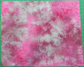
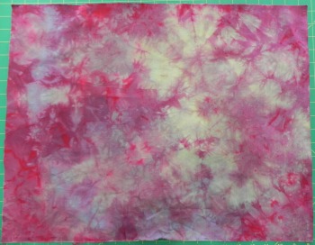
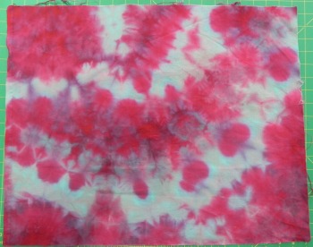
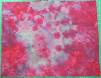
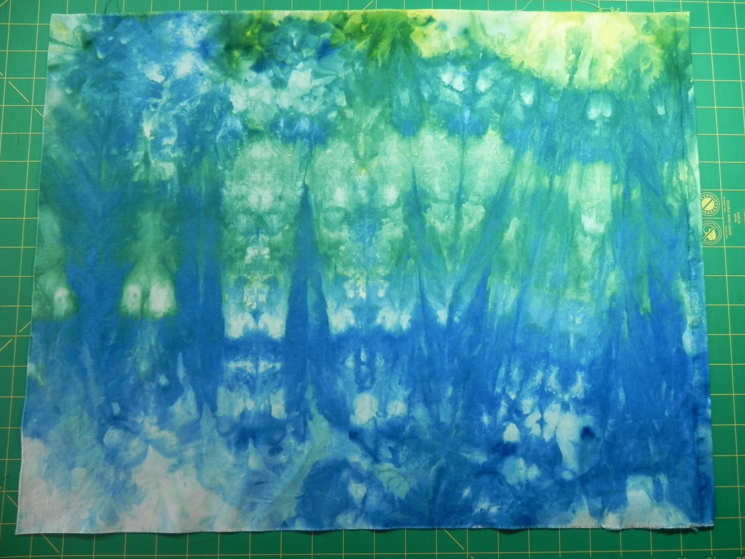
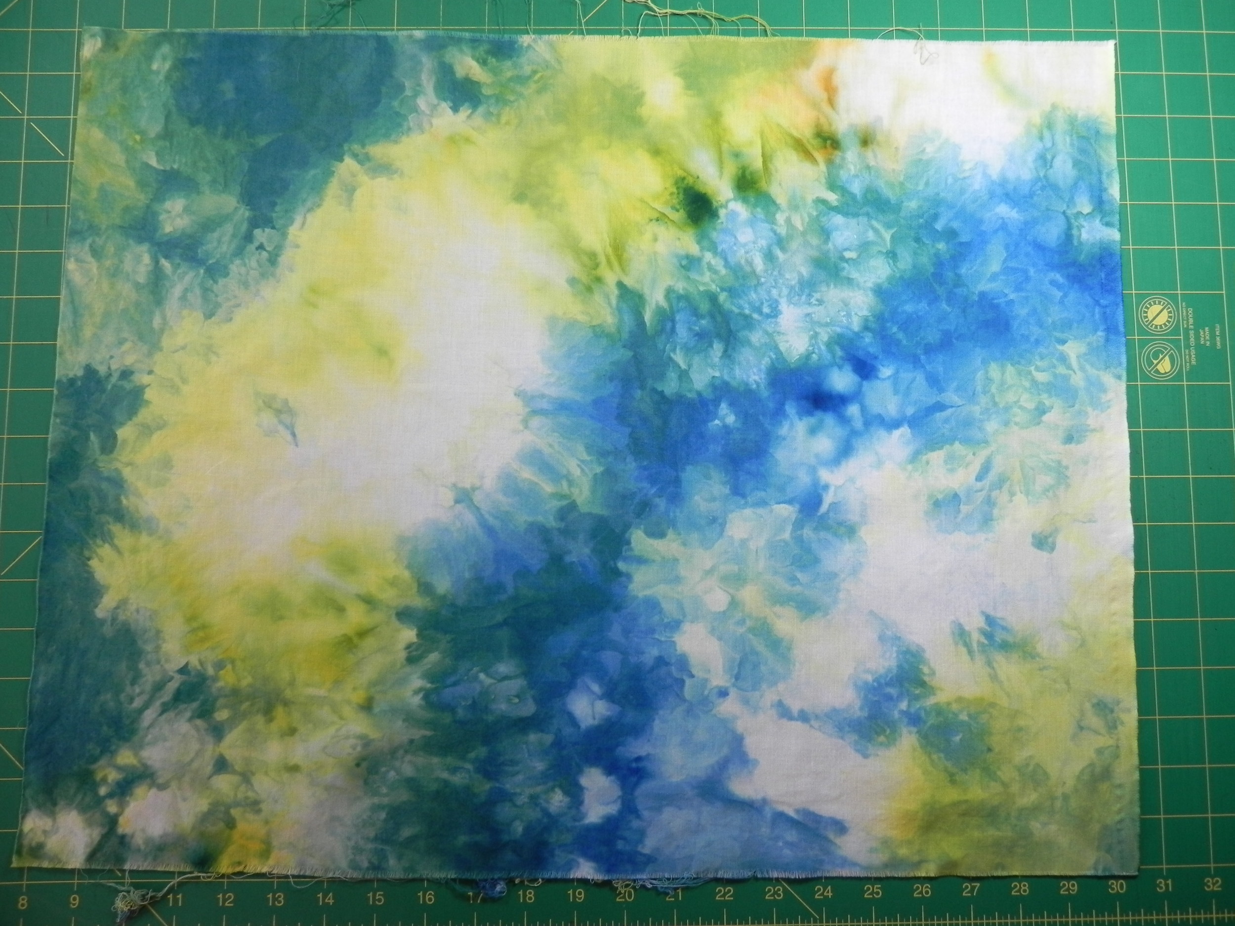
Hand-dyed Results ('n link to 2014QR giveaway)

If you're looking for the 2014 Quilty Resolutions Check-in Giveaway and Linky Party blog post, click here!

Meanwhile, back at the ranch...Here's what's been going on in my life while y'all have been checking in and linking up!

Despite a flooding stationary tub crisis and dyeing my hand a rather funereal shade of blue (which, actually, was partly related to aforementioned flooding crisis)...

I finally managed to get my most recent set of hand-dyes rinsed, washed, dried, pressed, and photographed!

If you recall my previous blog post, I started out by redoing some of the gradations I'd done in Frieda Anderson's dye class while I was in Lancaster. I wanted to be able to more closely follow the process and take notes on recipes and so forth. Somehow I hadn't managed to bring home the handouts from class, so I was going by the recipes in her book Fabric to Dye For.

The gradation at the top of this photo was the first one done in Frieda's class. The one on the bottom was the one I did at home this weekend. Most look more or less the same, but a couple are slightly different, and others are very different. There are several possible reasons for that--variations in recipes, variations in procedure, variations in water...

In any case, I'm not sweating it. I'm keeping samples of the ones I did here at home as representative for my notes with the recipes I used and all sort of other useful-for-the-future factoids.

And then, just for fun, I'd thrown in...

...some bamboo socks (PFD from Dharma Trading). These were dyed in straight Fuschia, Turquoise, and Lemon Yellow dyes (ProChem names). You can see that, due to aforementioned flooding crisis, I had to fast-track the rinsing process and thereby ended up with some color migration. Minor-league frustrating, but since these socks are for me and I'll only be wearing them under jeans, no one will see that. So shhhh...keep it just between us.

And then...

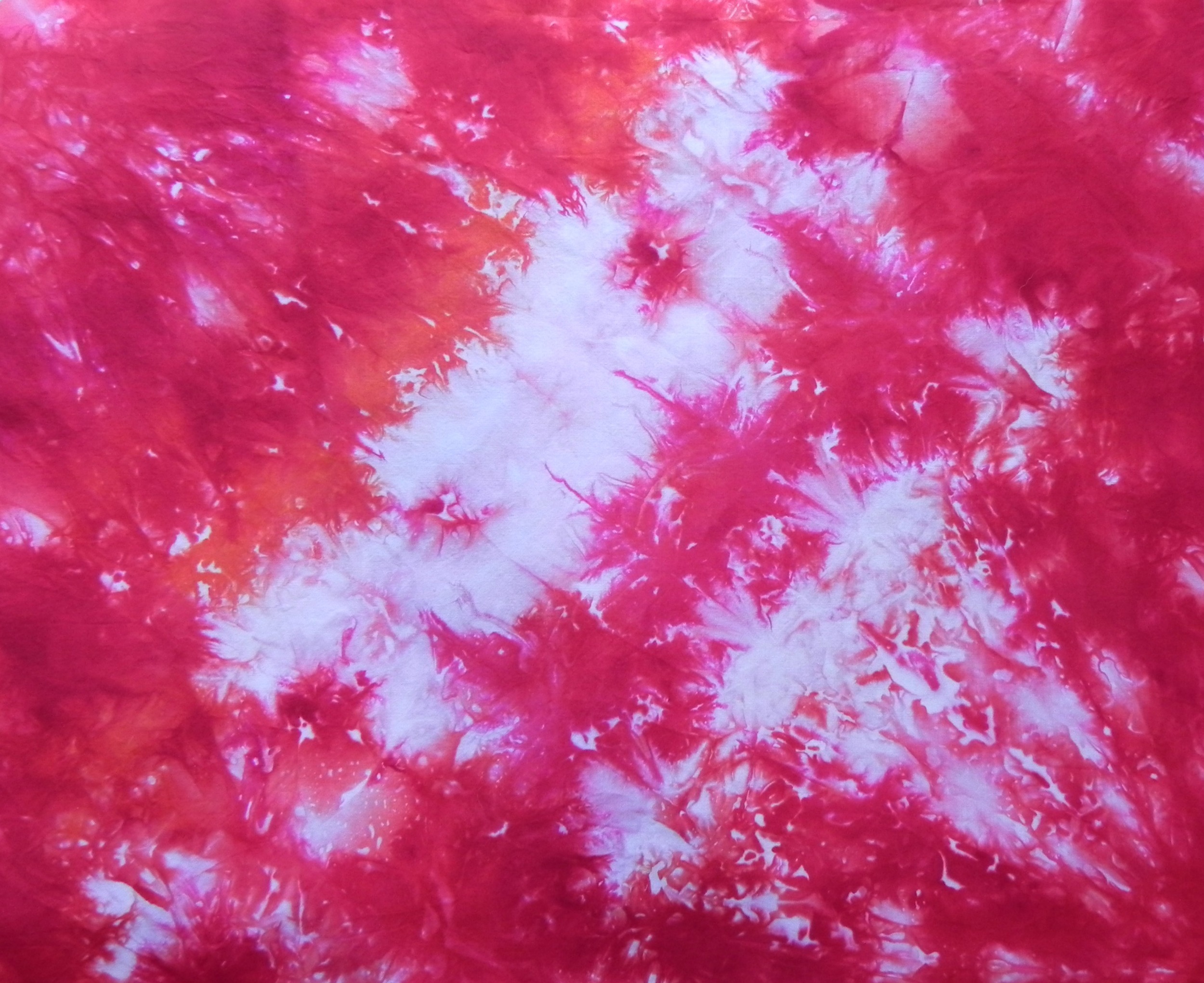
A pareo (I finally remembered the word!) for myself this summer. A pareo is the cloth you wrap around yourself when you're wearing a bathing suit. I couldn't get the whole thing in one picture, so this is one half of it...

...And then the other half...

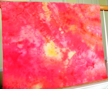
I mostly took this second view because you can see more of the tangerine dye in this one (upper right). That was one of the new colors I was experimenting with. It looks very brown in powder form, so I was gratified to see what a beautiful orange it turns into. This was ice-dyed, by the way. It looks a little less mottled because there was a whole lotta fabric and only a little ice, so it doesn't have quite as strong an ice-dyed effect as others.

I may do more of these--they're fun. Anyone want a pareo? Tee hee.

And then--because who can resist?--more baby stuff!

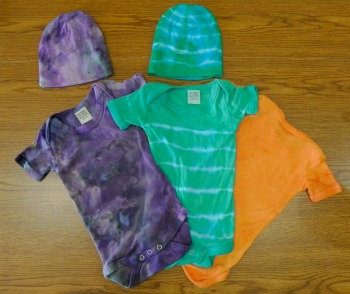
I'm so pleased! These turned out great! And ya gotta love the little caps too! Don't you just want one? Again, it's all bamboo. The one on the left was ice-dyed, purple and teal. Probably my favorite combo to ice-dye because it just gives the most interesting results. Love the shades of gray that appear!

The middle one was rubber-banded and dyed in a teal-ish mixture. Trying to get those rubber bands off in a hurry (did I mention the flooding already?) is what caused the blue fingers. Rubber bands and rubber gloves don't mix, so I finally bagged the gloves. I love the effect of the onesie, when I don't let myself think, "Gee, kinda looks like an old-timey prison uniform or something." 

The orange onesie on the side is upside-down because I used Color Magnet and stenciled my grand-niece's name on the front. It turned out great, but I don't want to broadcast her name without permission. The Color Magnet draws more dye to the spot where you use it, so her name is a darker orange than the rest of the onesie.

Fortunately, no dye migration on any of the baby clothes. I'm really pleased with how they all turned out.

Mr. Plumber showed up bright and early this morning, and we're hoping the flooding issue has been solved. However, he also informed me that the pump is well past it's average life span. Bully. Just another appliance to add to our list of "everything needs to be replaced at the same time."
 

Lancaster Report--Part 3 (The Haul)

Friday, Day 3 (with some Saturday, Day 4--homeward bound) thrown in

Friday was my day to see the show and visit the vendors. It was a very nice show, although relatively small. We started when the show opened in the morning and were able to see all the quilts by about lunch time--and that wasn't rushing through. I spent quite a bit of time studying a few that particularly held my interest.

I didn't check into the online posting rules for the show, so I'm not going to risk posting any photos here. Sorry about that. To tell the truth, though, I didn't even take that many pictures. After having seen a few national shows now, I have learned that I rarely actually go back to look at my photos later. I think I took all of about five photos of quilts with details I wanted to remember for my future reference later (you know, the "Hmmm....how did they do that?" photos). Indeed, I'd even handed off my good camera to my friend who'd accidentally left hers back in the hotel, and she was snapping left and right so I knew I'd eventually see the pics anyway.

I did get to see Katie's Corgi Fairytale quilt hanging--it's always a thrill to see a name you recognize!

I really enjoyed the show--the fact that it was small actually made it more manageable for me. I love Houston but I have to break the show up into segments so I don't get over-stim. There was a partial display of the applique quilts from Cairo that I'd seen in Paducah--it was nice seeing some of those again. They're beautiful. There was a nice inclusion of art quilts alongside the traditional, and there was a modern quilt challenge (where Katie's quilt was included). So, for a smaller show, they did a good job--in my opinion, anyway--of keeping it diverse.

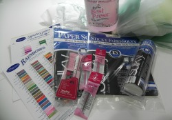
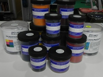
And then, of course, the vendors! You've already seen my purchase from ProChemical and Dye in a previous post. Here are pics of everything else that came with me.

Clarification: Most of this was purchased at the show, but we also visited Burkholder's Fabrics on the way home on Saturday based on several listener recommendations, and I included all of my purchases from both places together in the photos.

I've seen this batting sampler at every show I've been to. The first time, I thought, "Why would I want that?" (I was a pretty new quilter at the time.) The second time, I thought, "I could see where that would come in handy, but no." The third time, I thought, "I think I'd like to get that, but I'll wait and see." When I went back to the booth later, they were out. This time, the first time I saw them, I grabbed it and paid. I'm going to use it to practice machine quilting at the same time as I experience the different types of batting.
In the same vein, I'd decided I would pick up a variety of threads at this show--also to use in my FMQ practice so I could easily test them out.

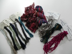
I got some bobbin threads in neutrals, some pretties and variegateds, and a few that were the ends of spools from the manufacturers (think: remnants). The remnant spools were sold three to a bag for something like $5.

Next, I picked up some great fabric scraps from a Thai fabric vendor. If I recall, everything in the bag (the stuff in the pile in the picture) was cotton but the rolled fabrics are nubby silk.

Boy, that was a fun booth. I could've bought a lot more but I restrained myself.

Way back in a dark and very chilly corner was a great vendor who met my needs for small bunches of funky yarn to use as embellishments. And he had a great accent, as he was from Australia. (@ozzypip!) Again, I could've bought a lot more but restrained myself. I picked up everything in the center and right from him. He told me he'd bought that wool right off the sheep. I responded, "Wow! She's a pretty sheep then, all burgundy like that." He looked at me blankly and said, "I dyed the wool after it was off the sheep." Okay, so he didn't get my joke. I'll assume he was just tired at the end of a long week.
The embroidery threads on the left were from a different vendor specializing in felted wool projects. I don't know if you can see it in this picture but the threads I bought from her are all really gorgeous variegated colors. Very subtle, but yummy.

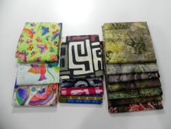
Next up, fat quarters. I only purchased the four African fat quarters in the center--referred to in my previous blog post about my string star quilt. The fat quarters on the left were from BFF/BQF Katie who had gotten them from somewhere but they weren't to her taste, so she offered them to me if I was interested. I'm not sure what I'll do with them, but they'd make a cute donation something-or-other. The batiks on the right were also a gift that all three of us received and divided up between us.

In the "Less Interesting but Useful" category comes my collection of tools n' notions.

A few new stabilizers, another marking pencil and different colored refills, some tulle to use in upcoming projects, thread cards for future reference, and a big ol' jug of my favorite scent of Mary Ellen's Best Press: Cherry Blossom. The only LQS that carries jugs of MEBP up here only carries the unscented, which is fine, but I do love me some cherry blossom. Well timed, too, since I used the last little bit of my previous jug of MEPB pressing the hand-dyeds from Frieda's class.

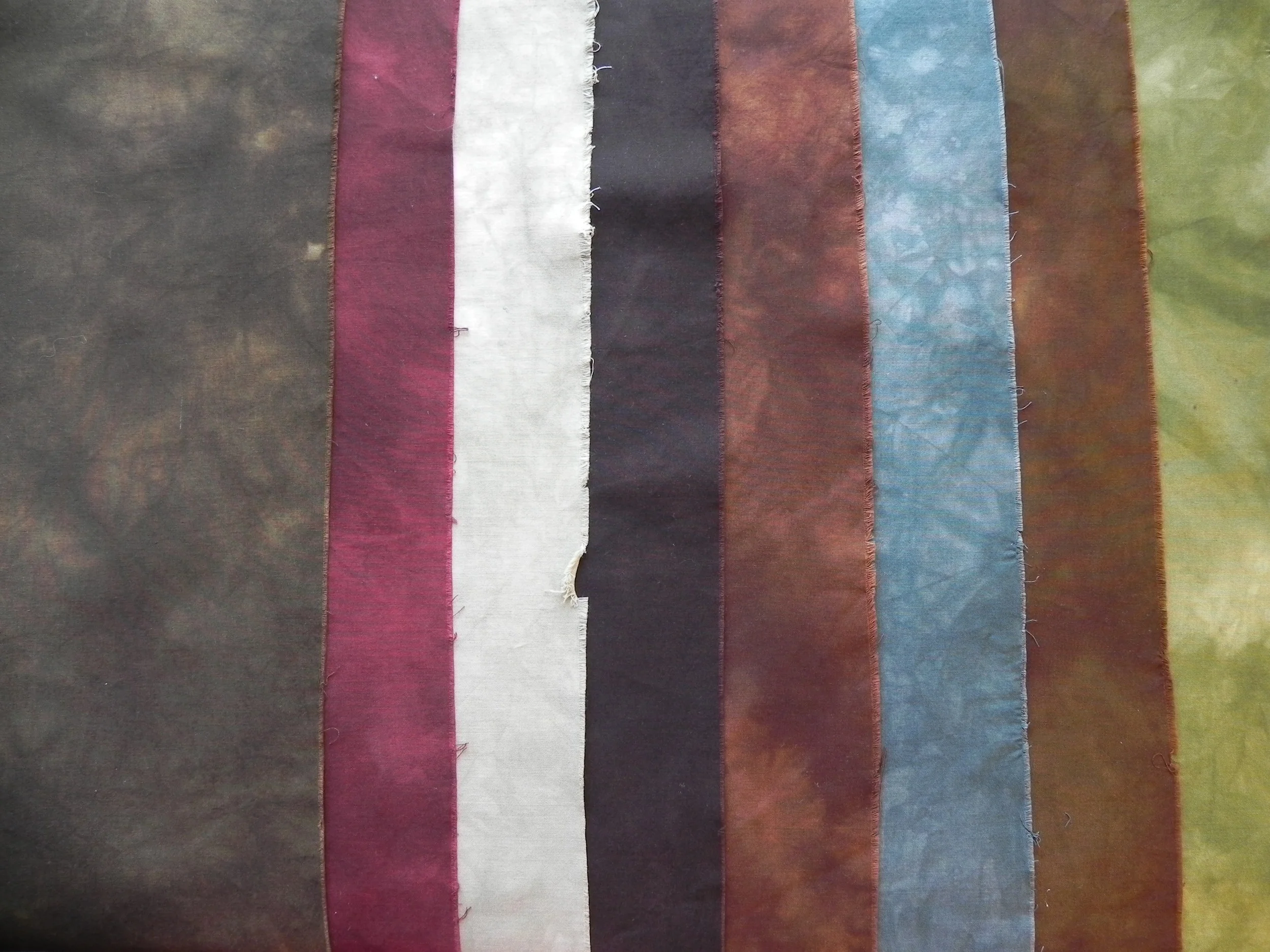
Oh--speaking of Frieda's class--I found a picture of a couple more fabrics I dyed there that I'd forgotten to include. I did two fat quarters "pot luck" style. IOW, I took some of the leftover dye from a couple of the gradations and dumped it on fabric in a baggie. They're not great on their own, but will make good backgrounds for practicing machine quilting.

Yep, I did get a couple of books. One is on Shibori techniques for hand-dyeing, something I'll be playing with this spring. The other is one that Katie found for me at Burkholders. You all complain about me spending your money--Katie is great at spending mine! Sue Spargo's stitching book is pricey, but fantastic. I'll be talking about it in my next podcast episode as I'm already using it.

Finally, this wasn't at all quilt related but it was something I couldn't resist. I've become a scarf/shawl person. They're great for travelers; when you spend so much of your time on planes and in conference rooms you never know whether you're going to be brutally hot or freezing cold. The secret is dressing in layers and having shawls that you can wrap up in or stuff in your purse. I have a bunch of shawls that I travel with, and I couldn't resist adding this gorgeous one to my collection.

I can't wear most wool, but this one was goat's wool and not at all itchy. I'm in serious love. (And, for once, in this vendor's booth I was able to spend Katie's money as I talked her into buying a different beautiful wrap that she'll be able to wear to the office.)

Friday evening

Friday night, Lori and I attended Ami Simm's "Worst Quilt in the World with a Gong Show Twist" presentation. It was an absolute hoot, and I ended up taking photos for Ami on her iPhone because I was the only one who'd admit to knowing how to use one after she stood there for a few seconds waiting for a volunteer! (Here's hoping the pictures came out!)

It was a great show, as we'd expected. Ami is a hoot. Have I said that before?


Saturday, Heading Home

We'd originally planned to go home on Sunday but by Friday night, the three of us decided we'd done everything we'd wanted to do at the show. None of us had signed up for anything on Saturday. So we decided to leave a day early and take our time getting home. We had breakfast at the Tomato Pie Cafe in Lititz, recommended to us by a Lancaster Visitor's Bureau volunteer at the show. And she did not steer us wrong! It was fantastic! I had a "flipper" (which is their name for an omelette) with goat cheese and roasted beets. A-freaking-mazing. We ate breakfast at 9a and didn't need to stop for lunch until 3!

Lititz is a lovely little town--definitely a place we'd visit again.

But then, there's Burkholders. Despite my GPS lady completely losing us in the countryside, we found our way there and I had the joy of my second meet-up of the week!

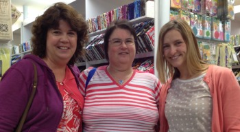
Great to meet Torie (@torieQWQ) and Nicole (@1c4quilting)! And Nicole's daughter who was our photographer and shall remain nameless for safety reasons, but was absolutely lovely and I had a good time with her too.

And then we were home again home again, jiggity jig.

I enjoyed Lancaster and will most definitely be going back again in the future!


Lancaster Report--Part 2

And there was night, and there was dawn, and so begins...

Day 2 (Thursday)

Mad Quilt Scientist in her element!

Mad Quilt Scientist in her element!

On the second full day of Quilt Week, Lori and I were both in Frieda Anderson's dye class for the whole day. (Lori has some pictures on her camera--when I get them, I'll post them here.)

Since I'm familiar with Frieda's dye method (I own her book), I wasn't really expecting to learn anything new. I was looking forward to spending the day playing in dye, and I was looking forward to doing it with one of my BFF/BQFs. We were to be paired up in the class, so Lori and I got to work together. Lori has done a little dyeing but not as much as me, so when Frieda suggested that one person of each pair would be the "clean person" and the other the "dirty person" in the morning, and then switch roles in the afternoon, I offered to Lori that she could be Dirty Girl all day. That actually worked quite well for us because we were able to get into quite the effective rhythm once we both got the hang of our roles. And yes, I was thinking ahead. Now I get to call her Dirty Girl next time we're in a guild meeting. FTW.

The only slight hitch was that there was a mistake in the supply list. The list had said to bring one bucket and one dishpan to share per pair; Frieda had actually wanted us to each bring one, so we'd have two per pair. That created a little bit of an issue with keeping our work stations clean because we ended up having a very small container to use as our rinse pan, and a small bowl for smooshing the fabric around in the dye before putting it in its final transport container.

The other small hitch was that Frieda had adjusted her plans for the class and rather than doing two gradations, with a total of 24 fabrics, she decided we'd do four gradations, 48 fabrics total. I had enough fabric with me to do that if I split them into smaller pieces, but Frieda had shipped extra fabric for the class so I bought some off her to be able to do 48 fat quarters rather than having to do some fat-eighths. The only reason it became a hitch was that I'd brought 24 containers with seals for transporting the fabrics home. Fortunately, I'd also thrown a couple of boxes of Zip-locs in the car in case we didn't have enough space for me to use the containers. Lori and I both had all our fabrics in the baggies at the end, which meant two large garbage bags filled with wet fabric in baggies. It could've been a recipe for disaster but it mostly worked out okay.

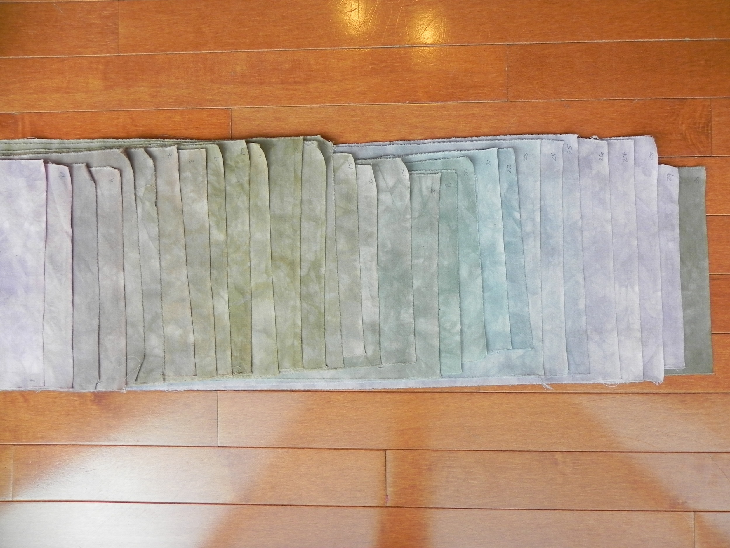
We labeled all the fabrics 1-12 for each gradation, but as I've talked about in previous hand-dyeing posts in this blog, black sharpie tends to disappear when you're dyeing dark colors. When I washed my fabrics at home, I lost several of the markings. Therefore, in this "Reveal" photo, I made my best guess at where some of the fabrics belong in the gradation. Ultimately it doesn't matter since I'll be breaking up the fabrics to use them anyway. I may do the gradations again sometime at home when I can control the results better, and label them more permanently for my records.

Meanwhile, aren't they pretty?

The first one on the left is"cool" yellow, red, and blue; the second set is that same set of colors diluted for pastels. The third set is a "warm" yellow, red, and blue; the fourth set is those warm colors mixed with black.

No, I didn't really learn anything new in the class, other than confirming for myself that I hate using baggies in dyeing. Give me a nice, hard-sided sealable container any day. But I really enjoyed Frieda Anderson. She's very laid back and funny, a great teacher (there were lots of dyeing newbies in the room and she did very well with them), and had lots of extra supplies for those of us, ahem, who may have had to grab a garbage bag out of the hotel on the way to class to use as a table covering only to find out it wasn't waterproof and was letting dye through onto the table underneath. In any case, I'd look forward to taking a class with her again.

And I just had to do her the favor of buying serious yardage of PFD fabric off her at the end of class, just so she wouldn't have to ship as much home. I'm such a kind person, really. Goodness of my heart n' all that.

By the way...all those raveled threads you have to yank off the edge of the fabric after it's been through the laundry?

Yummy!

Even if you just stash it in a jar and call it "decor," you're going to enjoy it. But oh, the things I can do with a wad of pretty thread!

So now, perhaps, you can understand why I hit a particular vendor at Lancaster before I even got to Lancaster...

(Some of these are simply replacing colors I'm nearly out of, some are new. Plus I bought samplers of acid dyes to use on wool, and a marbeling kit. Play Day!)

None of us had anything on the schedule for Thursday night so we hung out at the pool and actually got a decently-early bedtime. Friday was the first time I was actually going to see the show, so I was jazzed. Stay posted for another update...

Some Unexciting Hand-Dyeing

Well, I *did* get back into my dye studio this past weekend.

Of sorts.

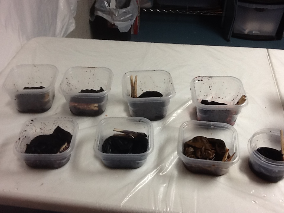
I finally cleaned up way-old dye concentrate. The last time I'd had a big dyeing session was probably the end of October or early November. Perhaps even before that. I hadn't dumped my dyes because I fully intended to get back down there to use them up. Never happened.

You see, dye concentrates are really only expected to last maybe 2-3 weeks (as long as you've not added soda ash), although I've stretched mine a couple of times as much as 5-6 weeks and there wasn't a noticeable difference. My basement is chill enough, which is probably key.

But. Ahem. Four months was likely seriously pushing it. However, because I'm big into experimentation, I decided to throw a few pieces of fabric into a few Way Old Dyes just to see what happened. The results are unexciting. What happens is that Way Old Dyes lose their chutzpah. The colors aren't as strong and didn't catch as well--it felt like a lot more was washing down the drain than usual.

grays.jpg

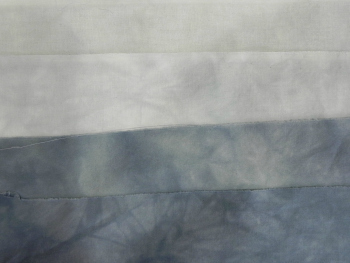
I did four fat quarters parfait-style (stacked one on top of another in a tall cylinder), and used up the leftover black dye concentrate, adding water so I'd get graded fabrics, the ones on top being lighter than the ones on bottom. And it worked, but they're all lighter gray than I think they would normally have been.

The one on the top in this photo is the lightest; I'd refer to it as "Ever-So-Slightly-Gray." It's basically a foggy white. The next one down is slightly darker although that's hard to see in this picture. The other two differ from each other mostly in the middles--the one on the bottom is more consistently dark than the one right above it.

I'm keeping them all, of course. I mean, really--who hasn't gone into their stash thinking, "I wish I had a really good foggy white"?

red1.jpg

The next set was also stacked parfait-style, but this time I used four different colors. I knew, with the colors I chose, I could end up with sort of a muddy yellowy-brown thing going on, but I dig muddy yellowy-browns. I think they're interesting.

In this set, the colors clearly came out more dulled than they would usually, And the bright red spots you see here and there are the visible evidence of the fact that the red dye concentrates had gotten distinctly crusty. Chunky, even. A bit of a crystallization thing happening.

red2.jpg

I believe (don't really remember now) that the four colors I used were Mixing Red, Mixing Blue, Golden Yellow, and Fuschia, one on top of the other. There's a couple of ways to do parfaits where you get more distinct separation between the layers of color while still getting some artistic blending. But I was just dumping stuff in to empty out dye bottles. Like I said, I wasn't particularly worrying about results--I just wanted to see how Way Old Dye would change.

red3.jpg

I won't say I'm happy or unhappy with the results. I actually got about what I expected to get: I had assumed Way Old Dye would lose some oomph. I have distinctly less oomph at 48 than I did at 28, so why would dye be any different?

I'm not excited by any of these fat quarters, but they're still usable. In fact, I'm thinking they might be fun to use to practice free motion quilting on. I won't feel like I've got anything to lose and if it turns out looking nice, so much the better!

red4.jpg

I wasn't able to use up all my Way Old Dye in these samples--I did end up dumping the rest down the sink. But now all my bottles are cleaned out and ready to go for when I've got the time to mix up fresh Spry New Dye.

Next week, when I'm at the AQS QuiltWeek in Lancaster, I'll be taking Frieda Anderson's hand-dyeing class. I have her book and have already used her dye techniques, but I haven't done the gradations using the recipes in her book, which is what we do in this class. So I'll have more fun hand-dyeing pictures in a couple of weeks! (And I'll be using Spry New Dye for that!)

A Finish! Design Study Group Homework on Analogous Colors

My design study group is meeting tonight so I'm scheduling this post to go live after I'm already at the meeting...so thanks to the wonders of technology you'll get the "reveal" at the same time they do.

Our group is currently working with A Fiber Artist's Guide to Color by Heather Thomas, going through one workshop a month. For this month's meeting tonight, we were to do something using analogous colors, while also keeping in mind all the other design principles of balance, unity, repetition, and so forth.

peruviantoad.jpg

On one of my vacation days in December I took myself on an artist's date to our local art gallery and planned on studying such things as use of light, color, line, texture, and other things I could carry into my quilting.

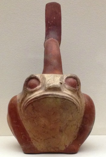
While in the ancient art section, I fell in love with this guy. I just knew he'd end up in a project somewhere.

His face is just too funny.


peruviantoad2.jpg


He's a "Stirrup spout vessel: frog," from the Moche culture of the north coast of Peru, circa 300-450 CE.

Later, when I was pondering what I might do on analogous colors, I decided to challenge myself to use only 2 1/2" squares already cut in my scrap bin, plus hand-dyes if I chose. Once I made that decision, a design popped into my head.


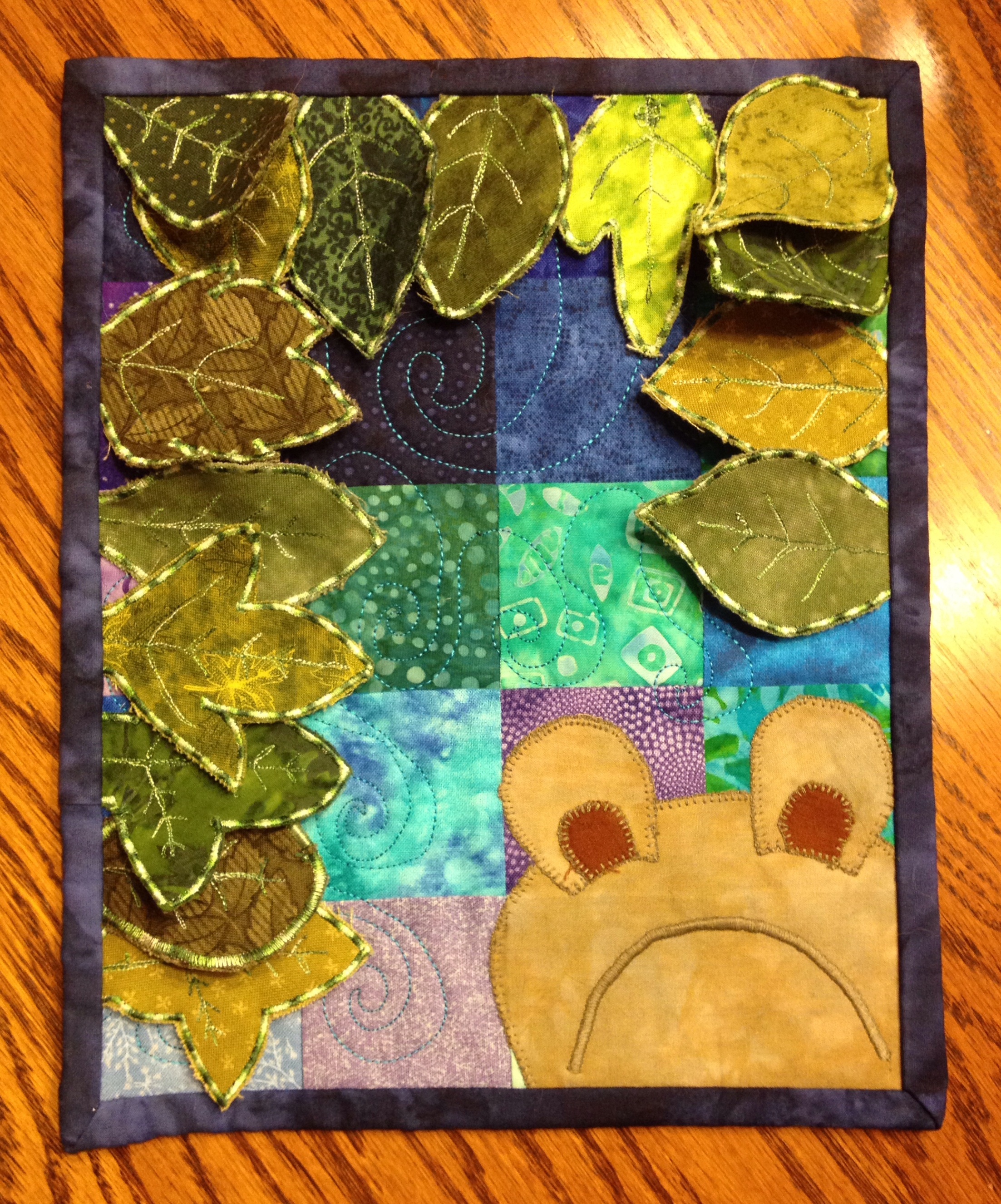
Yep, Mr. Froggie-Fella was part of the design. Here is the end result.

FrogFellaProject2014.jpg
Photo Jan 27, 8 37 36 PM.jpg

I also had fun figuring out how to make the 3-D leaves. I've seen a lot of techniques for doing it in magazines, in blogs, and in classes; I've done some similar dimensional work before. I tried out a couple of different methods before finding a technique that worked well for this project. Different techniques apply themselves to different circumstances.


Photo Jan 27, 9 20 57 PM.jpg

But you've just gotta love that face, don't you?

(If you're curious, Frog Fella is made out of my hand-dyes and a thread that matched amazingly perfectly.)

Although it doesn't have an official name, I've found myself thinking of this as the Frog Fella Project.


Photo Jan 26, 9 42 57 AM.jpg

By the way, I did also make that chocolate babka from the Artisan Bread class that I'd mentioned. Yum.

No, that's not burnt on the top there. That's all nummy nummy dark chocolate.

Godiva dark chocolate chips.

60% cacao.

Can you tell I'm a fan?


Postcard Swap Reveal

Whoopee! Let me start with a big thanks to Sandi of Quilt Cabana Corner for hosting a postcard swap this year. Those of us who participated had a great time--and pictures have been flying this week as people started receiving their postcards in the mail. My partner and I have both received our postcards so now we can do the Big Reveal! (Cue theme music...)

Here's the postcard I received from Beth:


bethpostcard.jpg

I love the way she did the snowflakes, and the different fabrics in the tree. And did you notice that trunk is thread-sketched? Very cool stuff! Love it, Beth!

And here's the postcard I sent to Beth:


2013postcard.jpg

The square motif is from an old Laurel Burch Christmas fabric. The background fabrics and fused binding are all my own hand-dyed fabrics.

I talked about how I did this in my most recent (as of this writing) podcast episode, Episode 136 In Which We Make Fabric Postcards. For what it's worth, anyway. My technique definitely needs some polishing, but I have fun with it, and that's the main point!

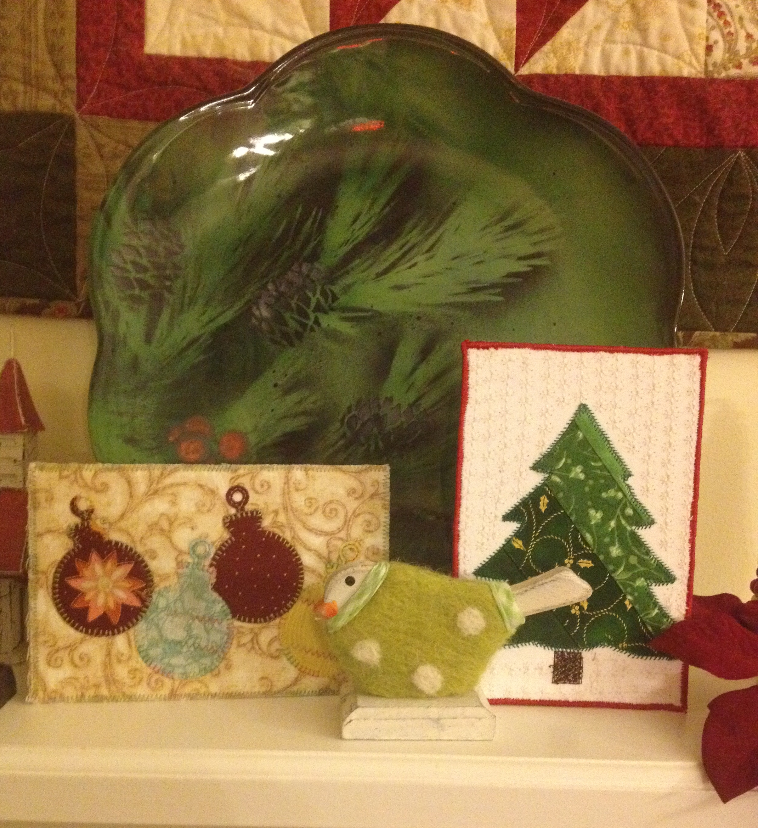
These postcards really do become a permanent part of my Christmas decoration collection. Proof: Sandi's postcard from last year and Beth's postcard from this year have pride of place on my mantel!

postcardsonmantle.jpg

Hand-Dyeing Results

As you're reading this, I'm driving far, far away... 

I'm heading a bit south for a packed week of back-to-back meetings, starting as soon as I get out of my car at my destination on Wednesday afternoon. I get home next Tuesday, so I'm making this quick post to tide us all over until I'm home and might actually be able to accomplish something again. (Well, accomplish something other than getting some sleep.) 

You may recall that I did some more dye experiments on Sunday afternoon. The results are in!

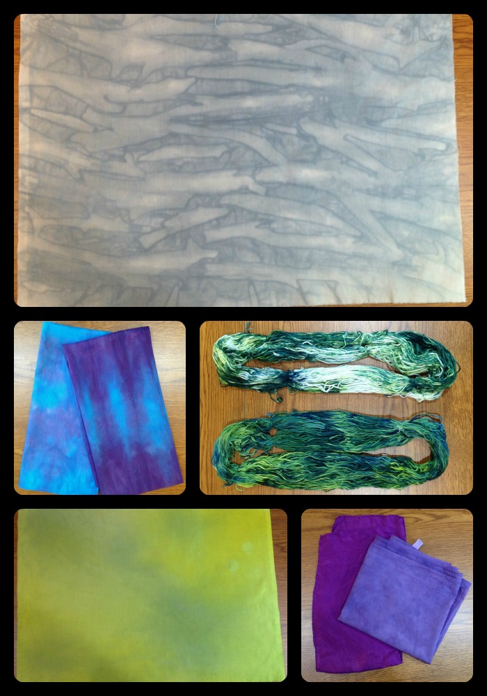
102013DyeCollage.jpg

 Top and bottom left: I was testing out a new technique picked up from Ann Johnston's DVD. I soaked the fabric in soda ash, then laid it out on a table (one of my newly-recovered-with-vinyl tables!), and then slowly poured a little dye on at a time and rubbed it in with my hands. Top picture is using gray dye and very intentionally creating folds and pleats in such a way to create some directionality. The bottom left looked a lot better wet--it's actually a mix of three colors (gray, yellow, and yellow green). It would make a nice background if one were looking for that particular, slightly odd shade of yellow-green-gray, but it's also a good candidate for over-dyeing or some other surface treatment. It simply wasn't what I was picturing would happen. And that's why I love dyeing so much. I so rarely get what I was thinking I'd get--it keeps me on my toes!

Bottom right: two purple scarves I did as testers for someone to look at during my meetings this weekend. I'm probably going to be dyeing about 50 scarves in all, by next September, for us to give out as gifts at one of our events. The one on the left is silk, the one on the right is cotton, both the same dye and dye strength. Just gives you a sense of how different fabrics react to the same dye.

Center left: Just playing with a couple of other cotton scarves I had on hand. Not overly keen on the way either of these turned out--the colors aren't as vibrant as I'd have expected. I'll have to look up what type/weight of cotton this is because it definitely takes the dye color differently than my usual fabric does. 

Center right: 100% cotton yarn, done in an ice dye parfait. Interestingly the one on the bottom is the one that ended up with a lot of white left. I must not have loosened it up as much as I thought when I put it in the container. No biggie--I'm thinking I'll overdye it with yellow.  The yarn is slightly thicker than 8 perle cotton, I think. I'll be interested to work with it and see what it feels like.

And now for the really impressive ones. I did another ice dye parfait because I wanted to "break" my black and teal dyes to see what component colors would come out. Ice dyeing is one of the best ways I've found to break a dye. And what a fantastic way to see what colors go into making black and teal! 

This one was the bottom layer.

blacktealicedyebottom.png

This one was on the top. 

blacktealicedyetop.png

All I can say is, wowzer. I'll be breaking a lot more of that teal dye!  

Oh, and I did get all my print scraps cut for #Scrapitude, finally, and started plugging away at the background. I plan on doing a marathon session of cutting when I get home next week. And then I'm home for a few weekends so I have hopes of catching up!

A Weekend Away

Just a bit off-topic, then back to our regularly scheduled programming. 

It's Sunday afternoon and we're back from our anniversary get-away to Niagara on the Lake, Ontario, Canada. We go every year because, forasmuch as we love to travel and see new places, it's nice to have one place to go you don't have to figure out. We know what restaurants we absolutely need to eat at, we nearly always try to see a play, and we pretty much always hike or walk most of the time we're there. Niagara on the Lake is a gorgeous town right on the point of connection between Niagara River and Lake Ontario, and it has a beautiful walkway along the Niagara Parkway and along the edge of the village. In October, it's beautiful.


Photo Oct 18, 11 26 00 AM.jpg

We were fortunate in our weather on Friday--a beautiful, crisp fall day. We walked almost all day; however, it started looking cloudy after lunch so on the spur of the moment we drove a half hour back down the road and spent the evening in Niagara Falls. Saturday was pretty cruddy--we got some walking in during the morning but it was wet the rest of the day, so we hung out in our room and read for awhile, then went to see a play and went out to dinner. Soggy, but relaxing.

I didn't take too many pictures, but I did throw them into a Flick album if you want to check them out. I had fun playing with the new panorama feature on iOs7. :-)

dyeing102013.png

When I got home, Mad Quilt Scientist took over and got busy in the basement again. 

In addition to some things I just needed to get done, I'm also testing out a couple of new techniques I saw on Ann Johnston's new "Color by Accident" DVD. I've been using her book for the last year but seeing her techniques on video is extremely helpful. I'll keep you posted.

Now, to get back on my sewing machine and finish off some baby quilts. Tomorrow is DS's 23rd birthday (not that I've aged a day) so we're taking him out to dinner tonight. I have just about enough time to finish the top of Baby Quilt Remix and maybe figure out backing... 


A Bit More about My Banned Books Week Quilt

The completed project

The completed project

I've had a couple of folks ask how I put together "If You Walk By." Fortunately I'd taken pictures during the process, half-thinking I might do a photo-journal of it, but that idea got put by the wayside this past week while I was completely immersed in work. (It was an "event" week that tied me up day and evening, even though I was home.)

So here it is, such as it is. I would definitely do a few things differently next time but I do want to use the basic process again. 

Rather than having a solid background, I wanted there to be distinct changes in the texture to give it a little more interest. This meant either piecing or fusing. I choose fusing whenever possible, especially when I'm under a deadline. So I decided to create freezer paper "templates," cut everything out, fuse it back together, and then satin-stitch over the "seams" to create line and definition. 

I also had the purple and yellow thing in my head from the get-go, and later realized I could also use this for one of my assignments in my Quilt Design Study Group. We're working our way through this book and the assignment was on complementary colors. Bingo. Since I'm a bit of a purist on my homework assignments, I needed to also use purple or yellow thread for the surface design. Fortunately, I had a great variegated yellow in my thread collection.

The rest of this photo-journal will be in the captions to the photos. 

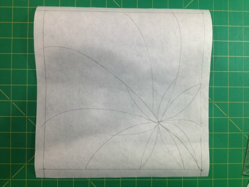
Free-hand sketch of design directly onto freezer paper (matte side). The way I was going to be fusing this, I didn't have to worry about reversing anything so I just drew out the design the way I wanted it to end up. I also didn't worry too much abo…

Free-hand sketch of design directly onto freezer paper (matte side). The way I was going to be fusing this, I didn't have to worry about reversing anything so I just drew out the design the way I wanted it to end up. I also didn't worry too much about exactness--whatever I cut was going to fit back together so at this stage I worried more about making sure the general design was what I wanted.

This little 18mm rotary cutter is just the ticket for free-hand cutting of smaller pieces. 

This little 18mm rotary cutter is just the ticket for free-hand cutting of smaller pieces. 

I put fusing on my fabric. I'd have put it on the wrong side if there were a wrong side--these are my hand-dyes so it didn't matter which side it went on.  This is Pellon 805 if you're interested.

I put fusing on my fabric. I'd have put it on the wrong side if there were a wrong side--these are my hand-dyes so it didn't matter which side it went on.  This is Pellon 805 if you're interested.

I then cut out my freezer paper templates. I remembered to label them after I had the first couple cut out. If this were a more complex project, I'd have created myself a second drawing to use as a "map," but didn't feel the need on this. I also did…

I then cut out my freezer paper templates. I remembered to label them after I had the first couple cut out. If this were a more complex project, I'd have created myself a second drawing to use as a "map," but didn't feel the need on this. I also didn't leave any seam allowances because I didn't need them for this technique. 

I then pressed the freezer paper templates onto my fabric, where the fusing was on the back. This way, when I cut them out, they'd be ready to fuse in the direction I wanted them to appear. Again, I didn't have to worry about reversing anything in t…

I then pressed the freezer paper templates onto my fabric, where the fusing was on the back. This way, when I cut them out, they'd be ready to fuse in the direction I wanted them to appear. Again, I didn't have to worry about reversing anything in this technique. Very straightforward. 

And here I've reassembled the pieces in order. I'm fusing them onto a very thin piece of batting. I wasn't planning on doing much quilting and didn't want the "quilted" look, so I found a scrap of the thinnest batting I had. If I recall, it might ha…

And here I've reassembled the pieces in order. I'm fusing them onto a very thin piece of batting. I wasn't planning on doing much quilting and didn't want the "quilted" look, so I found a scrap of the thinnest batting I had. If I recall, it might have been a little leftover "Fusiboo," which is a fusible bamboo batting. I did overlap just by a hair a couple of the purples and yellows, because I thought that might give me more of a pieced look. In retrospect, I wouldn't do that again. It was unnecessary and there's a little shadowing in the finished project.

I press-tacked it all down (which is just tapping the fused fabric with the iron long enough to hold it in place but not be permanent) then carefully removed the freezer paper template pieces. When they were gone and I was satisfied with the placeme…

I press-tacked it all down (which is just tapping the fused fabric with the iron long enough to hold it in place but not be permanent) then carefully removed the freezer paper template pieces. When they were gone and I was satisfied with the placement, I pressed it to permanently fuse the layers. You'll see here I now also have a background fabric on the other side of the fusible batting, so everything got fused together at once. 

By the way, you'll note in the fused piece above that alot of the joins between colors aren't clean. The beauty of the satin stitch was that I knew most of that would be covered up. I did use my thread snips to clean up some of the edges, but not much.

I did a couple of tester stitches on my practice quilt sandwich I keep by my sewing machine for just this purpose--I wanted to make sure I had the width of the satin stitch where I wanted it. I then used the satin stitch on all the "seams". I haven't done a lot of satin stitching to date so I was pretty happy with the way that part of it turned out. Again, in retrospect, I'd have worked out the center a little differently--the way the stitching came together in the middle of the flower is a bit awkward. However, I will say that satin-stitching is fairly forgiving. I was able to go back in and stitch over a few places with new seams to clean it up some.

I don't have a picture of the original binding. I tried a new-to-me technique of cutting the backing enough bigger to fold it and bring it to the front, and then machine stitch it down so it's self-binding. I used the satin stitch there too. Hated the results. The stitching skipped over bulkier areas and I couldn't get the corners to look like clean miters. I set the project aside for a day because the binding really ruined the whole project and I wasn't sure how to fix it at the moment. In the interim, I finished a project I'd been working on for Laura Wasilowsky's Craftsy class and did her fused binding method. Bingo! I went back to this project and just fused a binding over the top of the original satin-stitched binding. Completely covered it up and looked a zillion times better. A little decorative stitch with that same yellow variegated thread, and I was suddenly happy with the project again.

So now I'm adding to my repertoire of "how to fix errors quickly" (a repertoire which includes Sharpies and rotary cutters), fused bindings. Very handy. 

Again, there are a few things I'll do differently the next time I do this, but I am planning on using this method again. I like having the look of a pieced background without having to figure out how to do the piecing. 'Cause I'm just kinda lazy that way.

And now, back to working on #scrapitude. 

Hand-dyeing, and Finally Organized

As I talked about in my most recent podcast episode, I had this past Sunday as a Pajama Day to recover from hosting the weekend's festivities. (More about that in a future post.)  As I wasn't entirely sure at the start of the day that I was up to handling sharp objects and having to measure accurately, I decided to spend a couple of hours in the basement doing more hand-dyeing. That just requires a little bit of math, and if I'm off by a splash here and there, there are no tragic consequences.

So this time, I tried one new ice-dyeing technique I'd read about  ("Dye Your Own Iced Parfait," by Carol Ludington in Quilting Arts Presents Dye Your Own Fabric, available from the QuiltingDaily.com website). We now have a vase that will likely never hold flowers again.

Ice-Dyeing Parfait--three fabrics each layered with ice and dye. It's in a bucket to catch any possible spill-over as ice melts.

Ice-Dyeing Parfait--three fabrics each layered with ice and dye. It's in a bucket to catch any possible spill-over as ice melts.

I *think* this was the bottom fabric--I didn't label these. I twisted the fabric and used red and fuchsia dye powders.  The orange shows up because this floats in dye water from all layers once the ice melts.

I *think* this was the bottom fabric--I didn't label these. I twisted the fabric and used red and fuchsia dye powders.  The orange shows up because this floats in dye water from all layers once the ice melts.

Second layer. This one was pleated and then rolled in a cinnamon-roll fashion; I used fuchsia and golden yellow dye powders on this level. It gets some of the red dye from the first layer, but not as much as the first layer gets. 

Second layer. This one was pleated and then rolled in a cinnamon-roll fashion; I used fuchsia and golden yellow dye powders on this level. It gets some of the red dye from the first layer, but not as much as the first layer gets. 

Top layer. This one looks the most like a recognizable "ice-dye," with the water-patterns in the dye. That's because, since it sits on the top, it's not soaking in a multi-color dyebath after the ice melts--it's floating on top of the other two fabr…

Top layer. This one looks the most like a recognizable "ice-dye," with the water-patterns in the dye. That's because, since it sits on the top, it's not soaking in a multi-color dyebath after the ice melts--it's floating on top of the other two fabrics. This one had some rubberbands scrunched in but not many; it was then just scrunched under its ice layer. I used golden yellow and red dye powders on this layer. 

And then, because I had a prepped fat quarter and some extra ice that wouldn't fit in the vase, I did one more "normal" ice-dye.  

Fabric was pleated and folded back on itself lengthwise. Teal and purple dye powders. 

Fabric was pleated and folded back on itself lengthwise. Teal and purple dye powders. 

Seriously cool. 'Nuff said. 

Seriously cool. 'Nuff said. 

Then I did more work on the Sedona series. I'm very, very pleased with these results. This is definitely the version of orange-brown I was going for. I'll do more with values in the future, but I'll be using this basic recipe. I don't think I'm going to give out the recipe, though, since I just might start selling my fabrics--maybe. In any case, "Trade Secret" and all that. (Those of you who have seen Sedona/Red Rock, what do you think? Is this more or less it? The lightest one reminds me of what the cliffs looked like when the evening sun hit them.)

Because this was just a test, I took one fat quarter and divided it into four pieces, so each piece is quite small. I'd be able to do an itty-bitty art quilt with these, which just might happen!

sedonaseries.jpg

And I worked on greens. I don't own a green dye powder, intentionally. I wanted to figure out how to get my own greens without having to purchase a pre-fab. I have nothing against green dyes--I'd probably eventually buy one just to have some consistency. But for now, I'm having too much fun doing the art-science myself. 


Greens created with various proportions of two different blues, two different yellows, and a little bit of black once in awhile. 

Greens created with various proportions of two different blues, two different yellows, and a little bit of black once in awhile. 

And then, rather uninterestingly, I played with ecru. You may recall a few weeks ago I'd dyed a sample fabric with my then-newly-obtained ecru dye and couldn't figure out the result. I decided to test it out again--this time the pure ecru sample turned out much more like I would expect ecru to look. I then did a series of dye baths that were 2/3rds ecru and 1/3rd another color. What I learned? Ecru has no backbone. You can really barely tell on most of them that ecru was even involved--it's an ever-so-slightly muddier version of the color. The only one where I see a significant difference is in the yellow. The red looks pink only because there was so little red dye in proportion to the water, so it's a value thing. So, I know to use ecru if I want to muddy a color up a little bit, but that I should probably use even more in proportion to the color for the difference to be at all noticeable.


Mix colors: yellow (although here it looks more green than it really is; it's actually sort of a mustard yellow); blue;  "old rose"; gray; camel; red; black; pure ecru. And another thing I've learned about ecru--virtually impossible to get an a…

Mix colors: yellow (although here it looks more green than it really is; it's actually sort of a mustard yellow); blue;  "old rose"; gray; camel; red; black; pure ecru. And another thing I've learned about ecru--virtually impossible to get an accurate picture of it. It's far too dark gray in this picture; it's actually a light off-white, heading towards an extremely light beige.

cards.jpg

I finally figured out half of the organizational system, by the way. I've settled on a way to track my swatches and recipes. I'm going to use index cards in a box. Back to basics. This will allow me (1) enough space to track info I need, (2) a decent-sized swatch, (3) ability to sort and re-sort color swatches as I keep creating more, (4) ability to flip through them quickly to find the one I want. And it's cheap. Yay for cheap.

I have another thought about how to track fabric samples as I'm dyeing them: I'll keep you posted after I test it out.

And yes, I'm still working on that baby quilt. But no pictures since grandma-to-be reads this blog... (Nyah nyah nyah nyah nyah :-P pbbbbttpbptpbptptpbbt)

LDSI Recap, Project Hope Finish, and More!

What a great weekend! What a productive weekend! 

Of course, I didn't even approach getting everything done that I'd thought I'd get done over my extended Labor Day weekend, but then, I always tend to do that. Free time? Let's fill it up with a completely unachievable list of goals! 

Still n' all, it were fun. And what a great time we had on Twitter. I enjoyed Very Lazy Daisy's twitter giveaways and was glad that Pam of Hip to Be a Square and Katie of Katie's Quilting Corner hosted a Google Hangout, though I got so involved in one of my projects I completely and totally lost track of time and didn't realize it was time for the hangout until probably two hours later. Oops. Sounds like they had fun, though.  

And let me also say, thanks to all who played along with my giveaway. And I'm so pleased to give a great, congratulatory shout-out to Ethel, the winner! Woo hoo! (Everyone join in the happy dance for Ethel!) 

Now, what all did I get done? Lots!

I finally got the pillows done! Woo! And you'll hear more about those in a blog post later this week since I decided to describe the process I used in case you find it helpful. I also cut a few scraps, although not nearly as many as I actually need. Still poking away at that. I also finished cutting all the pieces for one of my two pregnant nieces' baby quilts; now it's sitting by my sewing machine waiting for blocks to be pieced. 

onesies.jpg

I got some baby gifts for the other of my two pregnant nieces done (the one whose mom does *not* read this blog).  

These two onesies were hand-dyed; I used Color Magnet and stencils to create the design. Note to self: Color Magnet works better in a lighter dye bath--there's more definition of design. These are okay, but I'd have liked the designs to be more prominent.  I have a third onesie in the works but that one I've dyed and will be using other techniques on. Pictures later.

maternityshirtcollage.jpg

This maternity shirt was ice-dyed (you're seeing the front and the back). Not sure I'm a huge fan of the results so I'll offer it to my niece with every assurance that my feelings won't be hurt if she doesn't like it either.  

pillowcase.jpg

I got a pillowcase made, when I went to cut a fabric into scraps and decided it would make a very cute pillowcase cuff. Boom. Pillowcase for donation. 

I got my project done for the Banned Books Week Challenge (see above). In fact, I actually finished it twice, when I decided I really hated the way the new-to-me binding method had worked on the first one and did a somewhat-new-to-me binding method instead. But I'm not showing it until BBW commences. So y'all will just have to wait.  (And I'll give more detail about the binding then.)

Sandyshouse.jpg

Second, I finally got the backing and binding done on this puppy.  

For simplicity's sake, I just named this one "Sandy's House." Not creative, but this was a class project and not something that felt like it sprang from my soul or anything. 
Although I did enjoy it! And here's the link to the blog post where I talk about the class and how this came together.  

I really like her fused binding method--in fact, it worked well enough on this one that I used it on my next finish.... Yes, drum roll please, I finally completed my Project Hope Online Quilt Show project, which has been languishing since last June.  

Somewhere.jpg

 This one is named "Somewhere." You can probably figure out the reference. 

I had a completely different idea in my head--an art quilt that may still someday get made. Meanwhile, I led a creativity challenge at my guild's May retreat in which we randomly drew words related to a beach party theme out of a bag and had to add something to an ongoing project somehow related to that word. This is done entirely with my own hand-dyes, btw. The first word drawn on Friday night was "Bucket and Shovel."  When I woke up Saturday morning, a pot of gold at the end of the rainbow was the image stuck in my head. "Sure, the pot is a bucket of sorts," I thought. The next word drawn was beach ball, so I added the gold coins (round like a ball) coming out of the pot (bucket).

duckie.jpg

The third thing I had people draw randomly out of a bag was a little rubber duckie.

Great variety packs of rubber duckies from Oriental Trading Company, by the way. I had a bunch of different ones. This little guy was the one I drew. 

Challenge participants could interpret their duck any way they chose. I decided to use his colors, so I have a purple and blue variegated thread in the words on my project.  

It was right around the rubber duckie that I realized where I was heading with this project and that it also met the theme of the Project Hope Online Quilt Show, and so it became that project. To me, hope doesn't always have to be a solemn matter, and silliness can often have a very deep point (witness Monty Python and Mel Brooks).

Somewheredetail.jpg

I did a lot of hand-stitching (as per Laura Wasilowsky's class), and then machine-quilted some clouds in the sky and used her fused binding method. I wanted to keep things relatively simple. But you'll notice this time I took a page from my Carol Ann Waugh Craftsy Class, "Stupendous Stitching," and ventured into a decorative stitch on my machine I hadn't really known was there before. I love it.  


My artist statement for this piece is: 

Somewhere there is hope. 

Somewhere there is peace. 

Somewhere there is love and joy and unity. 

It is our job and our calling to bring somewhere, here. 

(For more Project Hope Online Quilt Show, visit the Flickr group. Although our main show "ended" back in June, you're always welcome to add more quilts to the group!) 

Thus ends my LDSI recap. Again, be on the lookout for my next blog post all about the Banned Books Week Challenge!

Reverse Dyeing (better known as: Discharge), and Some Food

I finally got around to doing something I've been wanting to play with for months: discharging dye. This is a process whereby you remove the dye you so painstakingly put in there in the first place.  

Remember: mad quilt scientist. It's not supposed to make sense. It's art. 

Tee hee.

I don't recall if I posted pics a few months back of the fat quarters I'd dyed using the two blacks available through ProChem. One is supposed to have a warmer cast, and the other a cooler cast. Honestly, I had difficulty seeing the difference when I had my dyed fabrics side-by-side, but that may simply require more experimentation. I also didn't end up with the graded values I'd hoped for using the technique I did. But that's okay, since I still came up with eight great fat quarters ranging from very, very black to mostly black. I can live with that. 

Now I'm working on adding texture through pattern. So this time I'm working with discharges and color magnet.  

Photo Aug 27, 8 47 26 PM.jpg

Once upon a time, there was a stencil languishing on a shelf.

Along came some deColourant Mist Spray and some black fabric.  

spirals.jpg

24 hours later, and a hot steam iron, and the stencil was pleased to see that she had helped make this happen. 

(I was surprised to see blotches appear, then realized the steam was making them come out more. I decided I dug the effect and steamed the heck out of it from there. A hot, dry iron makes the resist work. A hot, steam iron makes the resist work even more. So there's even a lot of room for playing in the end game.)


brushandstamp.jpg

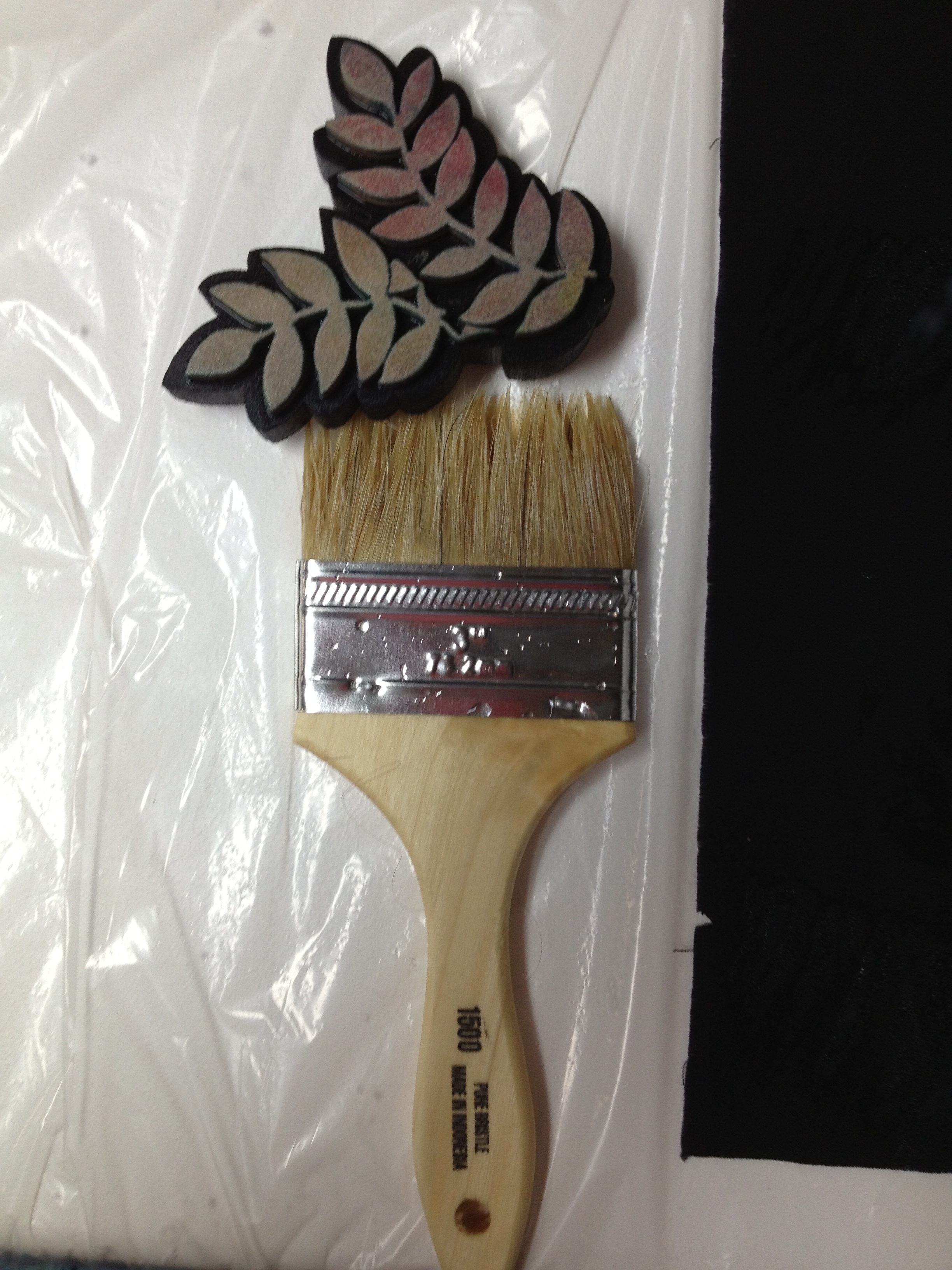
Then the stencil called her friends, Brush and Stamp, to come play too. 

This time they invited Jacquard Discharge Paste to the party. 

(Unfortunately, Stamp gave her life to this job. She fell apart when being washed afterwards. Apparently Jacquard played a little rough with her. Or she was just old. We don't really know where she came from in the first place so her pedigree is uncertain. And next time we'd prefer to play with Brush's tougher friend with stiffer bristles, if we can find him.)

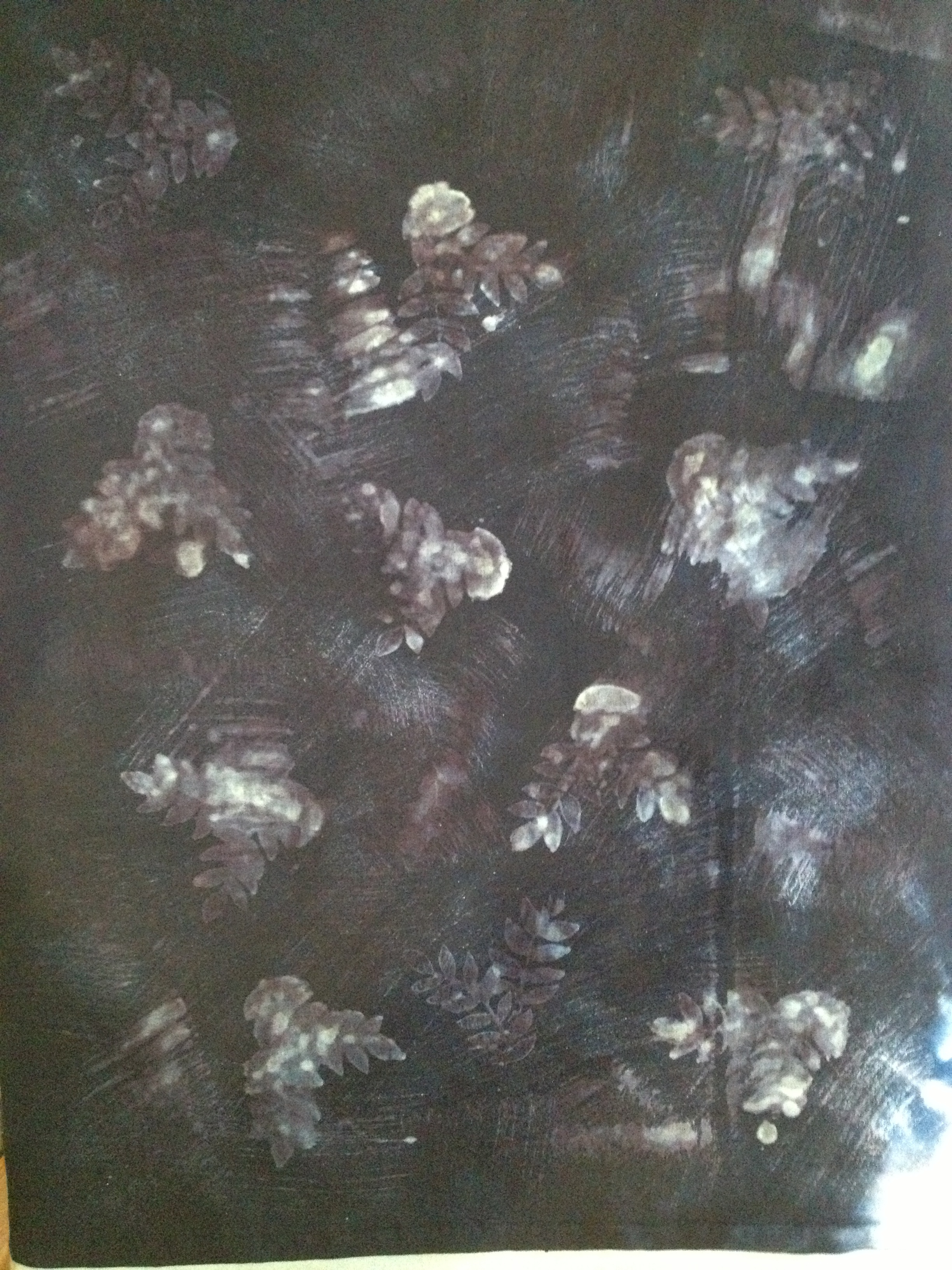
leavesandtexture.jpg

The nice hot steam iron made magic happen! 

(This is a technique I can definitely improve but I love love love love the brush stroke effect.) 

leavesdetail.jpg

I'm thinking this one might even be worth a close-up. 

Dig that crazy brush-stroke, man. 

I'll save the color magnet results for my next blog post.  


Turkey Burgers with Cranberry Herb Mayonnaise

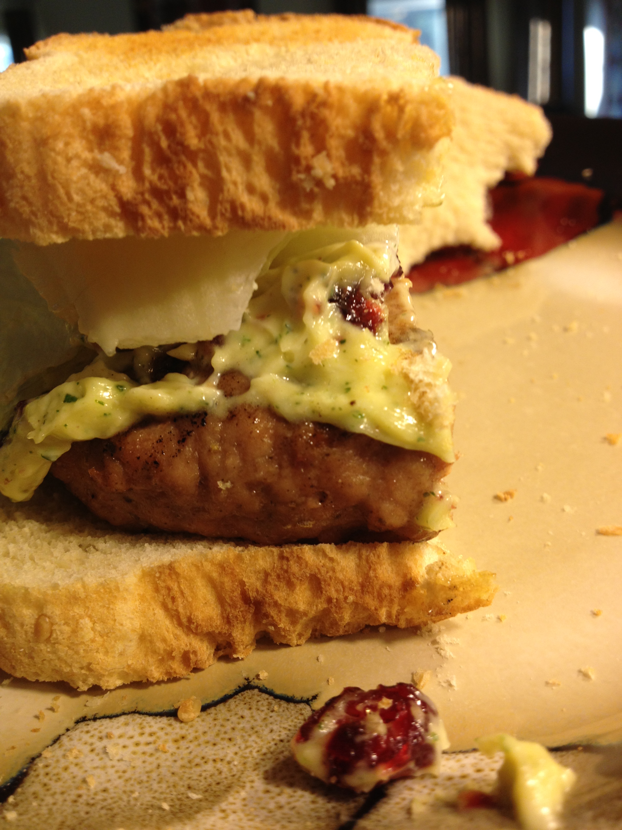
And now, for a quick foodie post. I made my first-ever homemade turkey burger with homemade cranberry herb mayonnaise this week. I was inspired after having yet another very bland, very dry turkey burger at a burger joint earlier this week. "I know it's possible to make a good turkey burger," I whined to my husband. Said husband then promptly skipped town for a few days so I decided it was a good time for some experimentation. What I offer here is inspiration, not an actual recipe, because as usual I didn't measure a darn thing when I was making it.

turkeyburger.jpg

I mixed ground turkey (96% lean) with the same herbs I usually use on my roast turkey: garlic powder, onion powder, ground thyme, ground rosemary, white pepper, kosher salt. Ummm, might have been some sage in there, maybe some celery seed, and perhaps a touch of savory--that last one I don't remember for sure. (I used my usual sniff-test method to decide what I wanted to add in.) I added just a titch of olive oil--maybe about a tsp or less--to make sure it was moist.

For the mayonnaise, I mostly followed the recipe that came with my Cuisinart: egg yolks, Dijon mustard, a little fresh lemon juice, emulsified with olive oil. However, I added fresh rosemary and thyme from my garden, then threw in dried cranberries at the last minute. I also used more lemon juice at the end. It turned out pretty well for a first try, but in the future I want to decrease the Dijon, and increase the lemon juice or use some white vinegar as well, so it's a little lighter in flavor. And having dried rosemary in the burger with fresh rosemary in the mayo really made me want to name this a Seriously Rosemary Turkey Burger. So I'd be a little more light-handed with that next time, though I'm a fan of rosemary.

By the way--the toast was originally because I didn't have burger rolls on hand. But it turned out to be the perfect accompaniment--crunchy, warm, toasty. A regular roll wouldn't have done it. And the lettuce helped with crunch too.

And my son (who was home for dinner and did the grilling--perfectly!--for me) is now a convert to turkey burgers and cranberry herb mayo.  

Hey, keep an eye out: I'll be posting more about #LDSI and the Banned Book Challenge tomorrow!  

Let There Be Light (and Color!)

My sewing room and home office are in one space (as well as my husband's computer, and formerly the kids' computer until they left home and I kicked it out!). It's a nice, big room--the bonus room over the garage--but it's pretty narrow and although it's got a nice big picture window at one end, it faces east so I get great sun for about two hours in the morning and then it gets progressively darker for the rest of the day.

And let's not even talk about November to March, when we're lucky to get even 10 minutes of actual sunlight in a day.  

My new lights ended up, just by a happenstance of scheduling, becoming a day-after-birthday gift to me. And what a birthday gift.

Before... 

Lighting-before.jpg

This was taken at 9:00a, when I should be getting the most light of the day. It was a gray, dreary day, so this is actually what I normally dealt with most of the late fall through early spring. (Yes, I blurred out the office side--you can see the sewing side.)

Note the number of floor lamps and table lamps trying desperately to give me working light. I'm standing right next to my design wall--the darkest corner furthest from all lighting available. Also note how yellow everything is. I had an Ott light at my cutting table and would have to pull fabric off the shelves and lay it under the light so I could see what color it really was.

After... 

lighting-after.jpg

Taken later the same day. It looks brighter outside just because it had stopped raining, but it was still just about as gray as it was in the morning. All the light you see is now electric. 

I had them install bulbs that were as natural-daylight-colored as possible. My fabrics look fantastic. The electrician really worked to figure out the best placement and number of lights to minimize shadowing when I'm at my cutting table. They're "cool" lights so they don't heat the room up at all.  

And, best thing--there's one right near my design wall. 

I can see!!!!  Woohoo woohoo woohoo!!! Serious happy dances up in here.

Best thing? I'm getting rid of the table lamp that's been taking up space on my cutting table for years! (I'll still keep the floor lamps around until I experience the room through all times of day and a few more months of seasonal light changes, but I think I'll eventually be able to ditch one or two of those too.) 

And, as another happenstance of timing to feel like it's a birthday present to myself, two color wheels I'd ordered from Dharma Trading came today. These are designed especially with fabric dyeing and painting in mind. 

cmyk-wheel-front.jpg

This is a "CMYK" wheel. Some dyes/paints apparently work better if you use the CMYK wheel when figuring out dye combinations rather than the traditional wheel. Joen Wolfrom also prefers to use this color wheel in general--her 3-in-1 Tool is based on it.

I like that it has percentages for mixing. If you look below the red where it has the tones, it has percentages written along the sides. In other words, if you create a dye solution that's 90% the pure color (red, in this case), and 10% of it's complement (cyan), you'd get the first color down from the red. If you have an 80/20 proportion, it's the next color lower, 70/30 is the next one down, and 60/40 is the lowest one. See? (Did you know that? Mix a color and it's complement and you work your way towards gray! )

CMYK-wheel-back.jpg

The back of the CMYK wheel has another very helpful tool in determining proportions.

Look under yellow. If you mix 80% of the pure color (yellow) with 20% white, you get the tint--which is the lighter swoop on the left. If, on the other hand, you mix it with 20% black, you get the shade, which is the darker swoop on the right. Next one down is 60/40, next is 40/60, and lowest one is 20/80.  

The graphic in the middle also gives you at a glance what the complement, split complement, triad and tetrads are, plus it shows analogous along each side of your chosen color.  

color-mixing-wheel-front.jpg

The second wheel I got is based on the traditional color wheel, but it has another very useful tool for choosing dye combinations.

Look at red, center top. You spin the wheel to see what color you would get if you added the colors at the top of the inner wheel. In this case, I've spun it to show what would happen if you added blue to red--you get the color in the window (which is violet). It may seem straightforward, but it's particularly useful in the tertiary colors. In other words, what's the difference between adding blue to orange, versus adding blue to yellow-orange? It will allow me to more easily fine-tune my color recipes. 

color-mixing-wheel-back.jpg

The back has the tints, tones, and shades again, with the graphic in the middle giving a quick-glance visual of complementary, split complementary, triads and tetrads of any chosen color.

So while there are a lot of similarities between these two color wheels, and between these wheels and other ones I'd already owned for quilting, there are some very useful differences for use in my hand-dyeing and fabric painting. I can't wait to get back in my dye studio and play.

And yes, my dye studio is also very well lit. We had them install new lighting in the basement as well and there's a natural-light florescent in the corner where Mad Quilt Scientist lives. All is right in my little fiber arts world!

In fact, you'll have some more hand-dyeing results soon--playing with discharges and resists and magnets (Oh My).  


Ice-Dyed Results

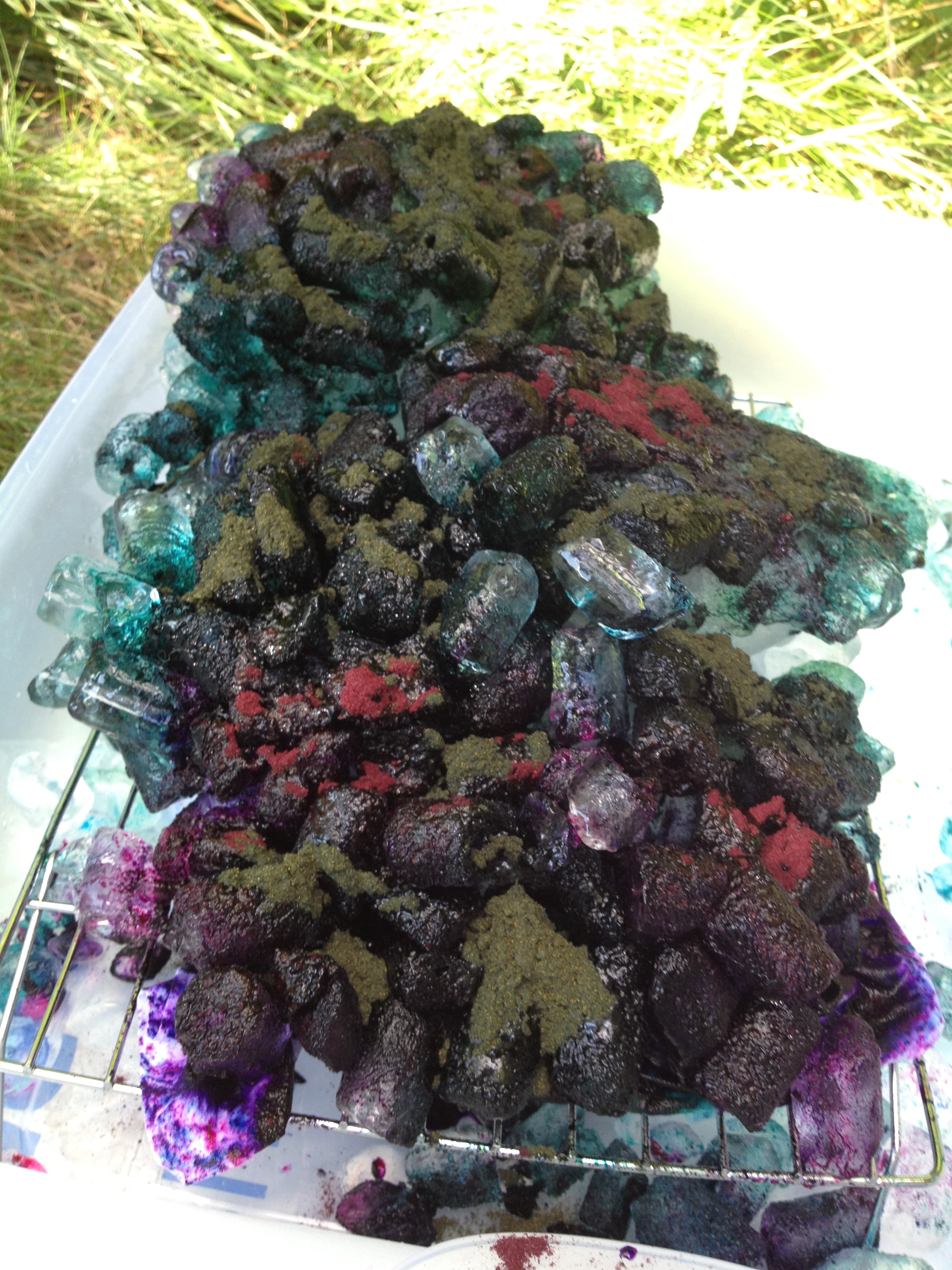
This.... 

fuschiaturquoiseice

Became these... 

Fabric placed underneath tray to catch run-off

Fabric placed underneath tray to catch run-off

Fabric scrunched on top of tray--note imprint of wire rack in colors. Great texture!

Fabric scrunched on top of tray--note imprint of wire rack in colors. Great texture!

And this... 

blueyellowice.jpg

Became these... 

Folded on top of rack

Folded on top of rack

Wadded up on top of rack. This one got much more "watercolor-y" results. Very cool.

Wadded up on top of rack. This one got much more "watercolor-y" results. Very cool.

And finally, this rather gruesome-looking mess...

tealpurpleice.jpg

became these... 

Fabric placed under rack to catch run-off. I laughingly called this on "The Hand of God" because the pattern in the middle looks like an open hand to me.

Fabric placed under rack to catch run-off. I laughingly called this on "The Hand of God" because the pattern in the middle looks like an open hand to me.

Scrunched on top of the rack. This one was probably the winner in the "Interesting" contest.

Scrunched on top of the rack. This one was probably the winner in the "Interesting" contest.

The last one was the crowd favorite at my guild meeting last night. Had to watch people to keep them from sneaking it out in their bags! Tee hee. I had them try to guess what two colors I started with and they couldn't. That's the beauty of this process, really: it's unpredictability. The teal dye completely broke into its component colors, and the purple partially broke. I really dig all the grays that turned up.

I don't know that this is a method I'll use often. It does use a lot of extra dye and it's messier and more of a pain to do than standard low-water immersion methods I've been using. However, I'm thinking through ways I might be able to edit the process and do it in my basement dye studio to decrease some of the variables--not to control the results (this method is all about surprise endings!) but to control the mess! 

One happy "mistake"--when doing this method outdoors one of the big issues is dye powder blowing where it shouldn't. In this instance, one of my blue/yellow fabrics ended up with a bit of a stain of a different color dye that blew onto it from one of the other ice baths. You can't really see it well in these pictures, but dang if it didn't turn out to be almost the exact color orange I was shooting for in my Sedona Series. So now I have another possible color combination to play with that hadn't occurred to me before.

That's what I love best about hand-dyeing. I'm learning a TON about color! 

Weekend Progress

As my last couple of days before I go back to work tomorrow, I didn't really push myself to be super-productive. My summer has been productive enough, thank you very much, where work is concerned--I needed some sloth time to get my brain unfried. That being said, I did make significant progress on a quilt that's to be a graduation gift. Since I'd be surprised if any of the people concerned read this blog, I'll go ahead and post a picture of it... 

gradquiltwip.jpg

Top complete. The picture stinks because I can't get far enough back from my design wall, and it's very dark in that corner. (The lighting issue is something I'm hoping to have fixed in the next few weeks.) But you get the gist. I'll do a better picture when it's finished.

It's a stack n' slash done with fat quarters from an old Jason Yenter/In the Beginning fabric line. I've had the fat quarters for awhile, and when I found out the grad-in-question's favorite color is purple, it seemed a perfect fit. I'd originally planned to do something a little fancier but when push came to shove, I just wasn't home enough to get anything done. Hence, the grad party being next week and me just getting off the starting block and doing yet another stack n' slash.  This is throw size--great for curling up in during late night study sessions.

I'd hoped to get started on quilting it today until I realized I have no appropriate fabrics for backing. I'll have to make a quick run out tomorrow to find something.  

pizzadough.jpg

Meanwhile, today was Betty Homemaker day. I currently have this rising in the kitchen, getting ready to do grilled pizza tonight. 

I roasted the few little beets we got from our CSA this week (it's been a tough year for produce hereabouts), and I have pancetta, sausage, pepperoni, spinach, red and green bell peppers, onions, Parmesan. mozzarella, and goat cheeses, so we can get as creative as we want. My husband and son are both gone today, unfortunately, but my nephew is coming over and he and my daughter really get into playing with their pizza combos.

readytogo.jpg

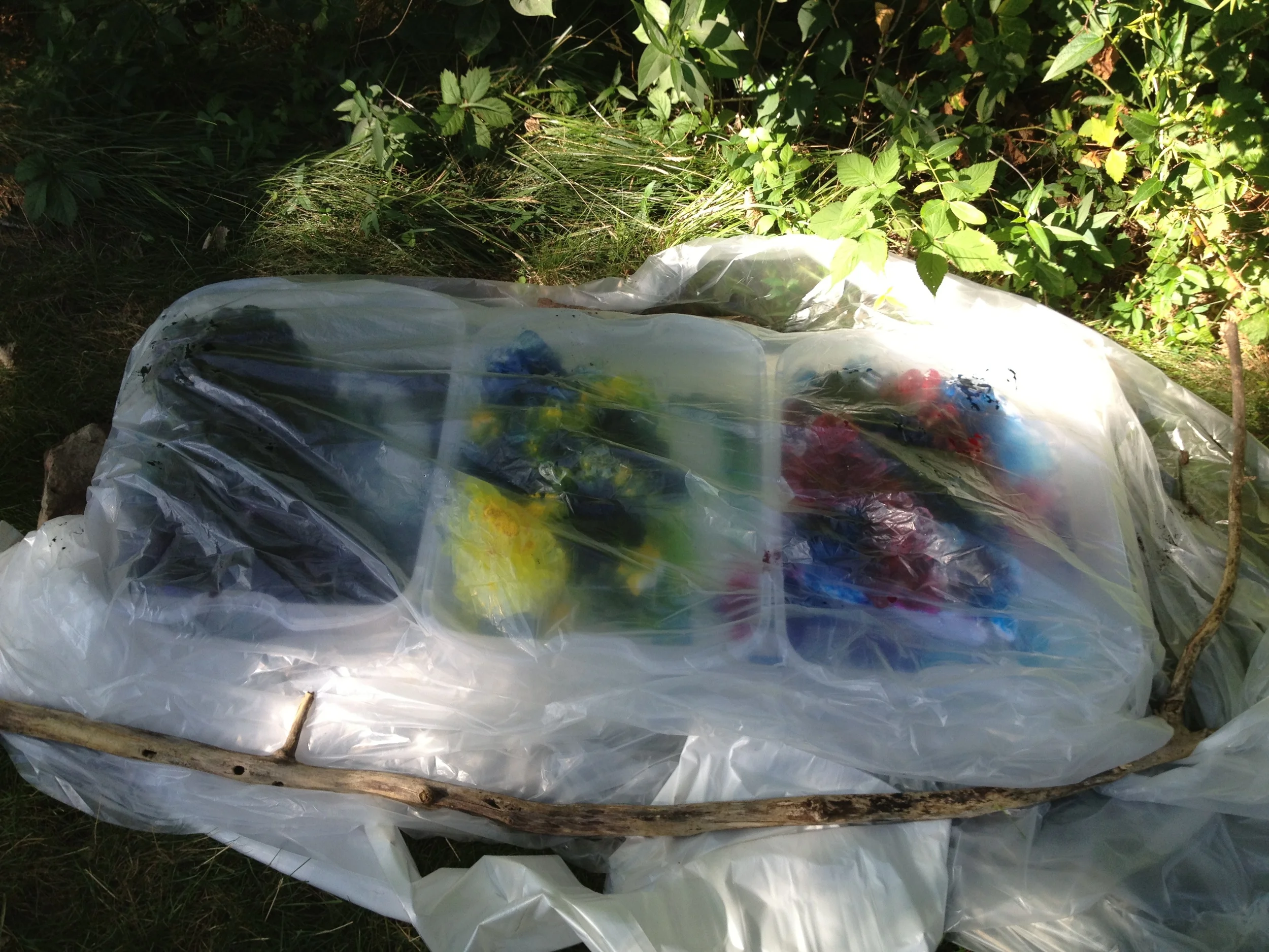
Finally, I'm taking another shot at ice-dyeing. I'm still not convinced this is something I'll want to do all that much. We'll see if the results blow me away this time--they didn't last time. It's a fair amount of mess (more so than standard dyeing) and uses about three times as much dye powder, if not more, so you really have to be committed to it as a style to want to do it often. 

Here's everything ready to go in a far corner of my back yard, so when I dump it out the CSI-style stains it leaves in the grass will at least be hidden in the woods and underbrush. (No ma'am, nothing happened here, ma'am!) 

fabricprep.jpg

If you've never done it before, here's the drill. Fabric is soaked in soda ash-water mixture for awhile first--15 mins minimum, but mine was in for well over an hour as I got other stuff done--then twisted, rolled, or put into whatever manipulation you want onto racks in a bin. I mostly do the scrunchy thing because I like that effect, but the long column one is pleated loosely. You can also put fabrics under the racks to catch the run-off, for different effects. You'll see in the first bin I did that, but not in the second. The third bin (not pictured) has fabrics above and below the rack as well.

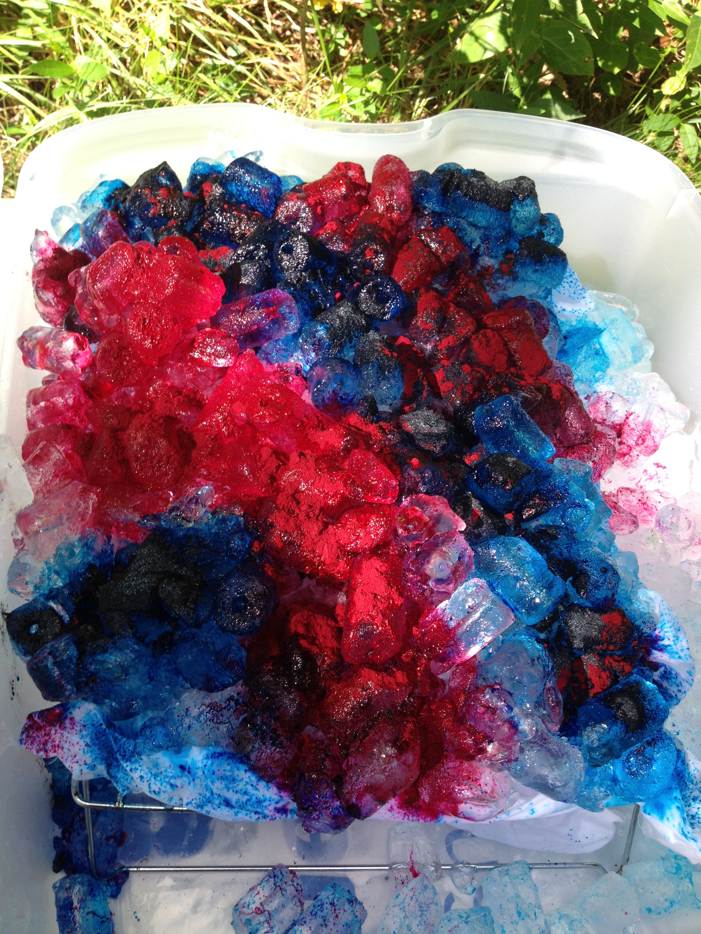
iced.jpg

Then you pile the ice on. 

This got tricky for me because I don't really have any flat spots in my yard so my bins are slanted enough that the ice didn't want to stay nicely piled on top. I propped up one end of the foam board with a stick to even it out some, but I still have edges of fabric with no ice on it. That'll just mean those spots may not get dyed much. I'll live with it.  (I did finish piling more ice on after I took this picture but I still have white space on the edges--we'll see what happens.)

By the way, yes, that's a spot of green you see on that fabric under the ice in the lower left. I noticed some nice leaves in the underbrush so laid them as flat as I could on the fabric to see whether they will act as a resist. I doubt it'll work that well since it's not completely flat, but it might be a hint of a leaf image. Always worth trying! 

Now, start working as fast as possible so the ice doesn't melt before you can get the dye on!

Photo Aug 11, 4 10 36 PM.jpg

Teal and purple mix. I work in teal and purple a lot because they're the signature colors of my organization and I'm always thinking about possible items for fundraisers. This is a test to see how this works: If I like it, I'm probably going to try doing some beach-y garments for next summer's fundraiser. I'm also experimenting with the teal and purple in general, since they're both blends and may break in really interesting ways. ("Breaking" is when compound dyes break into their component colors during the dye process. Ice dyeing often causes compound dyes to break, adding to the effect.)

turquoiseandyellow.jpg

"Intense Blue" and Sunny Yellow. That's my favorite blue dye so far although I was a bit sparing with it because there's some sort of shortage of one of the component ingredients so it's suddenly quite expensive and in limited supply. I hope I used enough to get a decent saturation. In any case, I should get some nice green blends from this combination.  

turquoiseandfuschia.jpg

And here's turquoise and fuschia.  Just 'cause. I love working with both these colors because, again, they're compound colors and often break in cool ways. And here's to a wonderful purple showing up here and there.

beddeddown.jpg

And everything's covered and bedded down for the night. Pretty sure I inadvertently trapped some buggies in there. Sorry, guys. I've got the plastic weighted down in case winds pick up but there's nothing predicted. That, of course, is meaningless. I don't call our house "Windy Hill" for nuttin'.

To wrap this post up, I'll just leave you with a few lovely pictures... 

ice1.jpg
ice2.jpg
ice3jpg
Photo Aug 11, 4 11 22 PM.jpg
ice5.jpg
ice6.jpg
ice7.jpg

Sedona Series Experiment #1

The results from my first attempt at recreating some of the colors I saw in Sedona:

2013-08-09 14.41.03.jpg

Fabrics #1, #3, and #6 were pure samples of new dyes I'd just bought: Camel, Ecru, and Stormy Grey. The Ecru looks much more light gray on my computer screen in this picture than in person--it's more a greeny-pink, or a pinky-green. Interesting, in either case. The others are blends as I tested various combinations of dyes I have on hand to see how close I could come to an orange/red/brown (not quite rust but almost). The last one, the green, was playing with other dye combinations just for fun.

I didn't quite get what I was going for this time around, although the results were really nice nonetheless. Seriously dig the Cabernet color I got in #2. I'll definitely be keeping samples of all of these for future use. Meanwhile, back to the dye studio to play with more combinations.

No, I'm not looking up anyone else's recipes to make this easier. 'Cause I'm ornery like that, you know. (I believe in experiential learning. I'll know more in the long run that way. Besides, playing is just a lot more fun.)  

Short break in the dye fun as I speedily try to knock out a few quilts I should've started months ago... 

Sauntering through Sedona

My husband flew out to Phoenix to meet me at the end of my work event, and we drove a little north to spend a few days in Sedona, with a brief jaunt up to the Grand Canyon via the Grand Canyon Railway.

I took tons of pictures. I even deleted a bunch after I got home, and still have a lot left in the album. Some pictures were just for a sense of place, but most were for color or texture or line inspiration, as we quilters are wont to do. 

If you're interested, I've embedded a slideshow of all my pictures here. (I captioned them so you know what you're looking at but I think you may only be able to see the captions if you're actually looking at them in Flickr, not in this embedded slideshow. And note that you can click on the little arrows symbol on the lower right if you want it full-screen.)

sedonaseriestobe.jpg

And yes, that color inspiration has led to my current dye experiments that I've termed my "Sedona Series." 

I'm about to go start the wash-out process now, so results tomorrow! 

Three Scarves and a Quilt (wasn't that a movie?)

If you're a podcast listener you know I was working on some things to be donated to my organization for our annual fundraiser auction. Pretty much every year I plan on contributing something quilted and in my 11 summers with the organization I've only managed to do that once. I'm very impressed with myself that I actually managed to get done what I wanted to get done this year!  Before I start stuffing things in suitcases, though, I figured you might be interested in seeing the results.

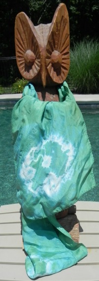
I hand-dyed three silk scarves. I was aiming for our organization's signature colors (purple for the women, teal for the girls). I bought a purple dye specifically for this that's pretty dang close to the purple in our women's logo. As for teal, I figured I could probably come close given the dyes I already had.  

What I learned is that although the dyes I'm using do work with silk, they work differently with silk than with cotton. (Still on that learning curve!) 

Purple scarf with diamonds

Purple scarf with diamonds

This is one of two "standard" scarves. I believe they're something like 11" wide by 60" long...? Don't recall exactly. I used rubber bands on the end of this for the detail and interestingly, the circles all came out more as diamonds. Lesson #1: Since silk handles differently than cotton, the geometry turns out differently--go figure. (Sorry about the tag showing in the picture--kept trying to prevent that but it's a little breezy today so I gave up.)


Purple scarf with diamonds detail

Purple scarf with diamonds detail

Here's a better shot of the diamonds. I did manage to get them roughly evenly spaced on both sides, just eyeballing it. Yay, me.

Purple cowl scarf

Purple cowl scarf

This is a funky scarf--a large circle that you loop around your neck to form a cowl. You can also flip it up over your head if you need to protect your hairstyle. Me, I don't really have a hairstyle to protect. 'Nuff said. 

Love the color again, but I'd hoped this would come out much more mottled so it would have a little more visual interest. However, (lesson #2 learned), silk wicks dye much more readily than cotton does, as it turns out. I had it scrunched pretty tightly and it didn't have a whole lot of liquid in the dye bath--if it had been cotton, it would've been extremely unevenly dyed, which is a really cool effect. This came out almost solid. You can see a little mottling here and there but it almost looks like a mistake rather than intentional. I think it'll still be a popular item. Our women sure do love their "signature color" items to wear to show their support!

Teal scarf

Teal scarf

This one was disappointing to me but my daughter loves it, so I'm getting over myself. The usual dye mix that I use at the moment to approximate teal looks very washed out done in silk.  (Lesson #3) Apparently some of my dye colors just naturally "take" to silk better than others. I had a mix of fabrics in dye baths all at the same time which meant I could do an easy side-by-side comparison. The purple dyed about the same on cotton as on silk. The blue/green quasi-teal is much more vibrant and saturated on the cotton than on the silk. Interesting.

For the detail on this one I used one large rubber band on each end and then stuffed the middle that protruded at the top, once I was done banding it, back down into the center. I do like that effect quite a bit.

Yep, already have plans for next summer's conference and what items I'll be hand-dyeing! 

Baby Quilt

Baby Quilt

There's always a theme for the auction, although generally very loosely interpreted. But this year's theme was a bit of a gimme for a quilter. The theme was "Oh, the Places You'll Go," as sort of a riff off a travel theme but also celebrating the future of the organization and so forth. I joked with the planning team, "Oh, I bet I could find fabric for that!" Certainly.  

I bought the panel and a collection of fat quarters from Fat Quarter Shop. I actually had it in both colorways--the one shown here and one in primaries (clearly meant to be girls and boys, but let's not be so gender-biased about all this!). After I put this one together, though, and started on the primary color version, the panel was giving me fits because it wasn't printed even close to being on square. It was so obnoxious to deal with I finally pitched the panel into the trash, declared with fervor, "No one even remembers I said I'd do one quilt, let alone knowing I'd thought I might make two!", and stalked angrily out of my sewing room.  

(Yes, because I know some of you just gasped in horror, a few days later, calmer heads prevailed and I fished the panel back out of the trash and stuffed it on my "to be given away" shelf. I have a friend who would probably love messing with it. More power to her. I just want it out of my life.)

I designed the quilt myself, in case you're curious. Nothing special, just sashing but playing with color placement. The binding was the remaining strips from the fat quarters that were left over, and the backing is pieced from the four remaining fat quarters that didn't get used anywhere on the front. I had to add narrow strips of a fabric from my stash to get the backing long enough but it was pretty close. And I just stitched in the ditch along all the seams--one, because I wanted it done; two, because I didn't want to have the text disappear behind quilting. But mostly one.

So that's my show n' tell. Here's hoping they do their part to raise much-needed funds for the organization! 

And for your entertainment...another entry in my "Dogs with Quilts" series, although this one should be "Dog with Scarf." He was none too sure about the model.*


Dogs with Quilts

Dogs with Quilts

*No actual owls were harmed in the writing of this blog post. 

Doing some catching up...recent hand-dyes

Back in June I finished up a couple more hand-dyeing adventures so it's about time I did some show n' tell. 

You may remember awhile back when I posted about having done the Stones & Shells Gradation sampler kit from Prochemical & Dye. Here it is again, just to remind you...

Stones & Shells Gradation Sampler Kit from Prochemical & Dye

Stones & Shells Gradation Sampler Kit from Prochemical & Dye

Someone asked what three dyes these were--sorry I hadn't posted that before. It's Procion MX Camel (5181), Old Rose (5220), and Stormy Grey (6160)--all names and numbers are the ProChem labels; Dharma would have different names.

I loved what came from the combination of those three dyes so much I now own each of those colors.

I had a second sampler pack kit named "Rainforest" that I finally got done in June.

rainforestgradationjune2013.jpg

By the way--I'm not entirely sure they're in exactly the right order. Here's the problem with dark dye baths: They tend to conceal the notes one made to oneself using a black Sharpie in the corners of the fabric pre-dyeing. Oops.

The three colors used here are Olive (708), Bright Green (7158), and Kilt Green (7218). I haven't bought any of these yet since largely I've been able to produce greens I like from dyes I already have. May well purchase some in the future, though--I especially liked the teal nature of the Kilt Green. I did find one thing very interesting: Note the Bright Green pure sample right in the middle of the bottom row, and notice how much it completely changes when only a half tablespoon of either Olive (to the right of it), or Kilt Green (to the left of it) are added. That has a much more drastic change than any of the other colors.

Finally, what I really wanted to start playing with was creating blacks and grays using value gradations. When I was in Paducah and doing some serious damage at the ProChem booth, I bought two black dyes: 628 and 629. They were described to me as one being a "warm black," and one being a "cool black." I dyed them side by side so I could see what the difference might be.  

Blacks value gradations

Blacks value gradations

628 is on top; 629 is on bottom. One can sort of see a bit of a difference, but not much. I suspect there may be more involvement when I'm mixing black with a color to get a muddier tone--then it may matter quite a bit which I use. Also, the method I used to get gradations didn't work very well in this instance; I'd probably have been better off doing the parfait method. They also lived in the dye baths for several days because I got quite busy suddenly and couldn't get to my rinse-out when I'd originally planned, so they are VERY dyed! 

My next plan with these blacks is to use them as an opportunity to play with some discharges. Wheee! 

Gifts from Kansas

Gifts from Kansas

Then, just because they're pretty and it was a wonderful moment, I must show you this too. I was gifted with some beautiful batiks in thanks for my keynoting at a women's conference in Kansas in early June. They know I'm a quilter, and one of the women on the planning team was also a quilter, so she knew the best thank-you gift they could give me! Apparently Kansas has a big shop-hop every year and Kaufmann Fabrics produces the sunflower batik especially for that shop-hop; I was told it was the only place you can get it. The women then had fun putting together several coordinating fat quarters for me. No idea what I'm going to use these for yet, but I can't keep my hands off them!  (If you're curious, they were from the Material Girls quilt shop in Wichita. I was also given a very nice clear vinyl totebag with zippered top from the same shop that is now my hand-embroidery project bag.)

Okay, I think that finally catches me up with show n' tell! I should have one more finish (new one) before the week is out... 

Been Busy in the Basement

2013-05-29 11.51.57.jpg

I've been hanging out in my basement again, partly because I went from this...​

Photo May 25, 12 47 10 PM.jpg

To this!

I was so excited about my bright, daylight-color florescent fixture I didn't even bother straightening up before I took the picture. But then, the basement doesn't have a lot of ambiance regardless, although my #twilters ("Twitter Quilters," with thanks to @verylazydaisy) all said that the industrial look fits my Mad Quilt Scientist persona. ​However, it's always a lot neater than that before I start a new project.

Back to the story..​

Memorial Day (#MDSI) was fairly warm and clear, so I took advantage of that to use up some old dyes with outdoor dyeing, and having the long weekend also meant I got to play with a new technique (see Sandi's blog at Quilt Cabana Patterns for the backstory to this), and finally use a sampler pack I'd bought from ProChemical & Dye in Paducah.

I don't have time to do a big long blog entry so I'm just going to embed a slideshow from Flickr. This is my first time taking this embed-slideshow-from-Flickr thing for a spin on this new website (which works a little differently than embedding Flickr on other sites) so hopefully this will work. If not, just go to http://www.flickr.com/photos/sandyquiltz/sets/72157633790172177/. The photos are captions with explanations although, again, not sure if those show up on the slideshow or not. Here's hoping for the best...

(LATER Editor's note: If you hold your cursor over the word "notes" just to the lower right of the slide show, it'll pop up the captions to the pictures. This dog has learned a new trick!)

Get the flash player here: http://www.adobe.com/flashplayer

I get my first CSA delivery of the season this afternoon--woot! Maybe I'll be able to kick Food Fridays back into gear....​